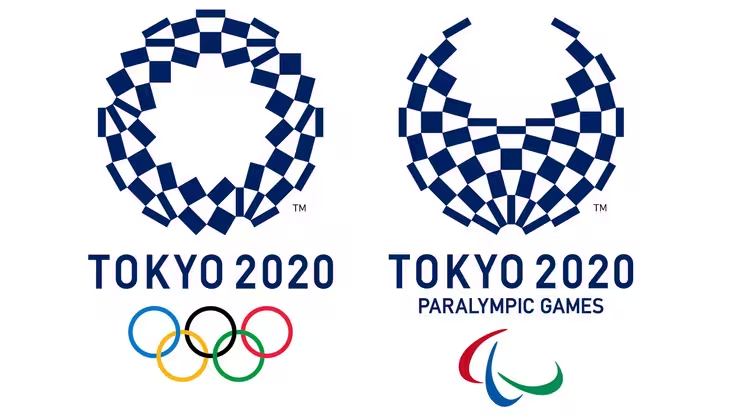
Today, the organising committee behind the Tokyo 2020 Summer Olympics announced its new logo: a circle that looks like a re-arranged chequered flag. Here it is, below. It’s pretty abstract, right? Inoffensive? A bit, well, meh?
That’s probably because the first attempt at a logo was lampooned by you, dear Web readers. In the summer of last year, one of Japan’s top graphic artists, Kenjiro Sano, proudly unveiled the below.
![]()
It’s nice, isn’t it? Clean, simple, and makes use of Japanese iconography. The official press release boasted,
“The black colour of the central column represents diversity, the combination of all colours. The shape of the circle represents an inclusive world in which everyone accepts each other. The red of the circle represents the power of every beating heart.”
But within minutes, the word “pakuri” began circulating on Japanese social networks. That word translates to mean “plagiarism”, because of its striking similarity to this logo, from a Belgian theatre, created in 2013.
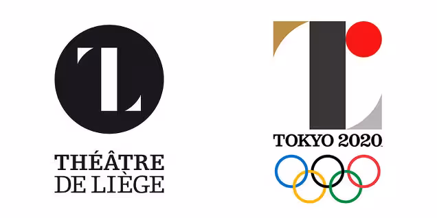
That lead to the designer of the theatre logo, Oliver Debie, to make this fancy gif to point out the copy.
Théâtre de Liège vs Tokyo 2020#Tokyo2020 #ThéâtredeLiège #plagiat? pic.twitter.com/u64MpWBAI2
— Olivier Debie (@OliDebie) July 28, 2015
Kenjiro Sano said that he’d never been to Belgium, or even seen the logo. The Japanese Olympic Committee stood by him, for a bit. That was until, Sano later admitted that his team copied graphic designs for a beer brand’s promotional campaign.
The International Olympic Committee then blocked Japan from using the design. Internet vigilantism: 1 Japan’s efforts to host an Olympic games: 0.
To sate the sense of injustice felt by fans of Belgian theatre, they held an open competition for anyone to submit alternatives. As we found with our logo redesign recently, people bloody love a logo contest.
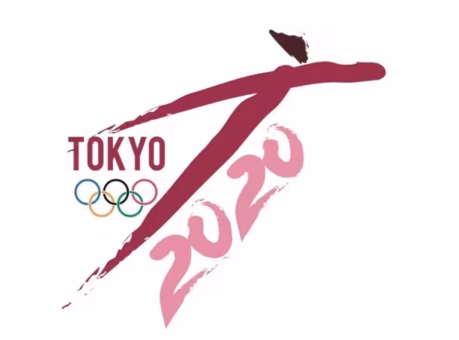
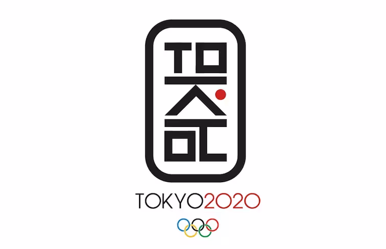
The results poured in. Some were great.
扇は末広がりで縁起がいいものとされ、古くから応援するときの道具として使われてきたので、オリンピックのモチーフとして最適&「和」も感じられていいかなと。「多くの人で支えられている日本(日の丸)」を扇の中で表現しています。 pic.twitter.com/4i0WJiInfj
— かんかん (@vivakankan) August 17, 2015
Some were colorful.
東京五輪エンブレム梅野案(私案)をブラッシュアップしました。
1.色の整理と明度彩度の微調整
2.形状の精度アップと合わせ、中心部を白円に変更。
3.パラリンピック版のデザイン変更
より「多様性と連帯」という意味合いを出す方向に変更。 pic.twitter.com/ym2WVRLBiF— umegrafix (@umegrafix) August 16, 2015
Some were of a, err… guy falling over?
There’s actually a whole site dedicated to submissions, which any discerning design fan should take a peak at. My favorite is Tom Watson‘s super simple vertical logo.
The games received 14,599 entries, but they decided to go with the Harmonized Checkered Emblem by Asao Tokolo, a Japanese designer. Organizers said the checkered design in the traditional Japanese color of indigo blue expresses a refined elegance and sophistication that exemplifies Japan.
I think they went with the safest logo possible, because no one likes to be trolled, even the Japanese Olympic Committee.
Get the TNW newsletter
Get the most important tech news in your inbox each week.