Remember when Mozilla launched a contest to design its new logo? Well, out of all the zany designs submitted, Mozilla seems to have gone with one of the most minimalist. Say hello to ‘moz://a’.
For comparison:
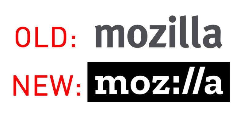
The company technically hasn’t officially revealed the new logo – which also heralds an artsy new brand identity – but the unlisted announcement video comes from company’s own YouTube account, so it’s fair to assume it’s the real deal. The video was first posted by German Caschys Blog. [Update: It’s official now, check below for more].
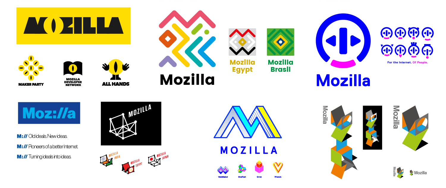
I think it’s pretty rad, even it’s not as crazy as some of the other submissions:
Engadget also points out that a previous version of the winning logo was a little more edgy:
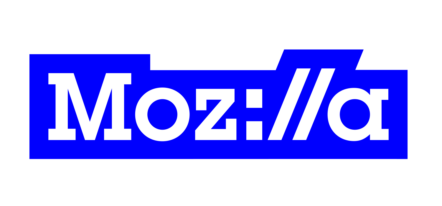
The new logo certainly screams ‘internet,’ is more clever than the plain-jane old one, and can be colorized for different uses (as shown in the video above). Of course, not everyone feels as good about it, with YouTube commenters using a myriad of ‘://’ face jokes. But then again, that’s the YouTube comment section. What do you think?
Update 10:55 AM ET: It’s official now. Mozilla goes into more detail about the logo in a blog post, and provides a few extra images. Just look at how meme-able the logo is!
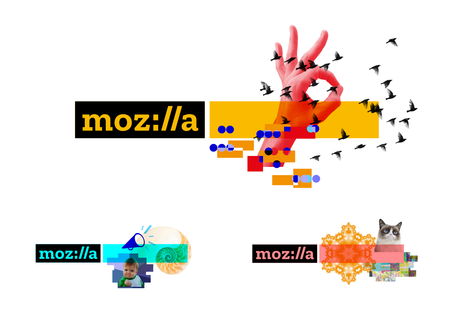
The logo uses a new font called Zilla, created by Typotheque. It’s a free, open-source font that’s meant to evoke both Courier – a classic for coding – and a ‘journalistic feel.’ As the Mozilla points out, anyone can basically create the logo by simply typing ‘moz://a’ in Zilla and highlighting the text.
There are a lot clever ideas regarding the new logo’s design process and implementation in the blog post — be sure to give it a read.
Get the TNW newsletter
Get the most important tech news in your inbox each week.

