Have you checked your inbox recently? Newsletters aren’t the new spam (yet), but you probably have legions of daily, weekly, monthly emails from businesses, non-profits, charities, and practically every place you’ve ever shopped online.
The thing is, email newsletters are still a major part of a company’s online marketing spend — they’re just boring. And they don’t give too much to those who use them either, as analytics are limited to click-through rates.
The goal of RebelMail, available today in beta, is two-fold: make newsletters actually useful for subscribers, and provide new kinds of analytics to help companies understand whether their audience is engaged.
“For analytics, we’re filling a middle ground in with color and tracking how people interact with the email,” Joe Teplow, co-founder of RebelMail, told TNW. “We’re not getting just clicks.”
Teplow and his team began RebelMail after his first endeavor, email-based micro-donation platform Good St., started seeing deep engagement in its emails. After reeling in companies on concepts and an MVP that provided a basic interactive email template, the company raised $2 million last year in seed funding, led by Vaizra Ventures and Boldstart Ventures.

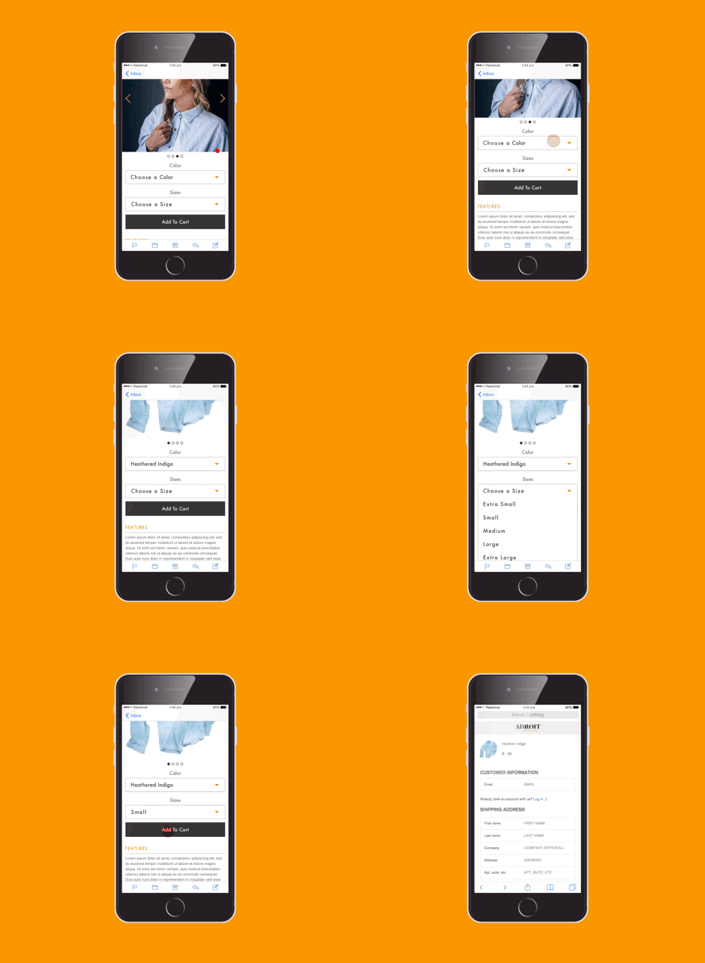
Today, the company has opened up a tool that allows companies to build their own email templates. Previously, Teplow said that RebelMail had spent plenty of time helping companies craft interactive emails that include drop-down menus, photo galleries, and connection to e-commerce platforms. Now, companies will be able to do that themselves via the platform.
“We’re sending different templates for different brands, and we’re iterating on the resulting activity,” Teplow explained. “We’ve learned really specific things perform on email, even down to thumbnails and animation.”
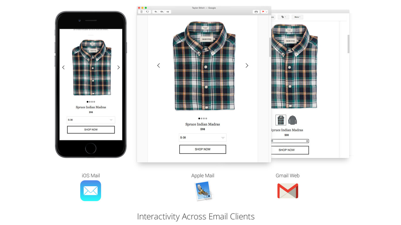
The platform’s build mode is a simple form — no HTML or CSS required. Brands can drop in their logos at the header and footer, and deploy a few interactive features from within the email. The result is a clickable, interactive email: users can scroll through galleries and even select from customized drop-down menus. Ecommerce brands can link items directly within the email, so selecting them will direct a user directly to the shopping cart for fast checkout.

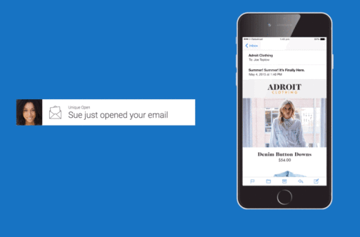
Depending on the template used, RebelMail provides analytics for every piece of the email a user interacts with. For example, a brand can see how many people clicked through a gallery, viewed the options in a menu, or clicked a button.
Teplow says that the introduction of a self-serve product won’t stop the company from creating specialized templates for brands that commission them. The company is also focused on testing email templates with different devices, so users with every phone can have a good experience.
“We’ve had to test a lot of functionality for these emails,” Teplow said. “And we’ll continue to test it at scale.”
Get the TNW newsletter
Get the most important tech news in your inbox each week.


