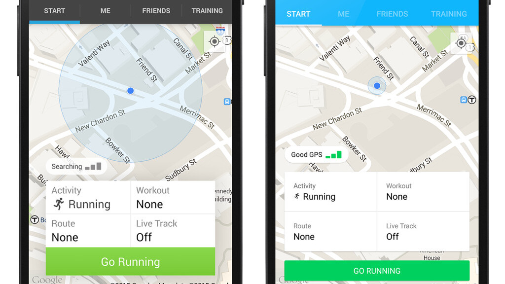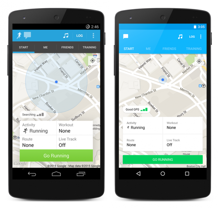
RunKeeper’s training app for Android devices has been updated to bring a new look and feel to the app.
Available to download now, one of the key differences is the activity list, which now sports a flatter look and will keep all your relevant running info at your fingertips. As well as polishing the transitions and other effects, the company has also tweaked the look of the Start, Me and Friends tabs as well to make it all look a bit cleaner.
It’s probably not be the feature overhaul that RunKeeper’s most ardent fans might want, but putting the info you need front-and-center for when you’re too tired and sweaty to go clicking around mid-run is still a welcomed decision.
➤ RunKeeper [Android]
Get the TNW newsletter
Get the most important tech news in your inbox each week.


