Once Apple released the iPhone 6 and 6 plus, app developers scrambled to make sure their wares looked good on the larger screens. Tempo is no different, but instead of just making everything bigger, it redesigned the app to make it easier to use.
 The updated Tempo app for iOS has reduced the visual clutter for a cleaner more refined look. This includes updating the fonts and a “simplified color palette.”
In addition to being nicer on the eyes, the app now has an updated Notifications Widget where you can knock off to-do items in addition to adding new events.
The week view now works in portrait and landscape mode and there’s a new new attendee autocomplete that populates an event with the person your meeting with after a few letters.
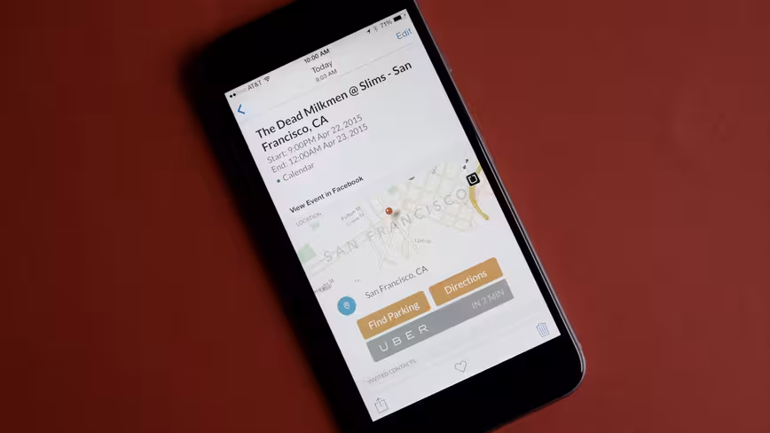
That’s all in addition to features like integrated map and an Uber button to help you get to where you’re going and single-tap dial into conference calls from within the app.
➤ Tempo [iOS]
Get the TNW newsletter
Get the most important tech news in your inbox each week.