Social aggregation and sharing service Rebelmouse has revamped its platform to introduce a more mobile-friendly design and new features, like the ability to automatically populate posts with images and other content.
Keeping true to its core mission of providing users with a platform for grouping and sharing the most interesting content they stumble across on the Web all in one place, the changes are designed to increase the visual appeal of content shared on your page but without adding unnecessary clutter.
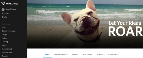
For example, the refresh brings in full-width header images to drive higher engagement and a new navigation bar on the left-hand side of the screen, which the company says balances accessibility with keeping the page distraction-free.
As well as automatically adding images or GIFs to your post (just type a headline and it’ll find something appropriate, in theory), the update also adds support for in-line dynamic content. So, the next time you want to embed a tweet, Facebook post, YouTube video etc. all you need to do is paste the link in your post.
Rounding off the list of notable changes is the addition of a live preview as you’re composing a post, and some new social sharing options.
The company said that the new design was also conceived with mobile visitors in mind, so the page will resize dynamically according to the device it’s being being viewed on, though there are still native iOS and Android apps – both of which have been updated to include the new options and design.
The features have actually been gradually rolling out over the course of the last two weeks, but Rebelmouse wanted to ease into the new version before announcing it to ensure any remaining bugs had been worked out.
➤ Rebelmouse | App Store | Google Play
Featured Image Credit – Shutterstock
Get the TNW newsletter
Get the most important tech news in your inbox each week.


