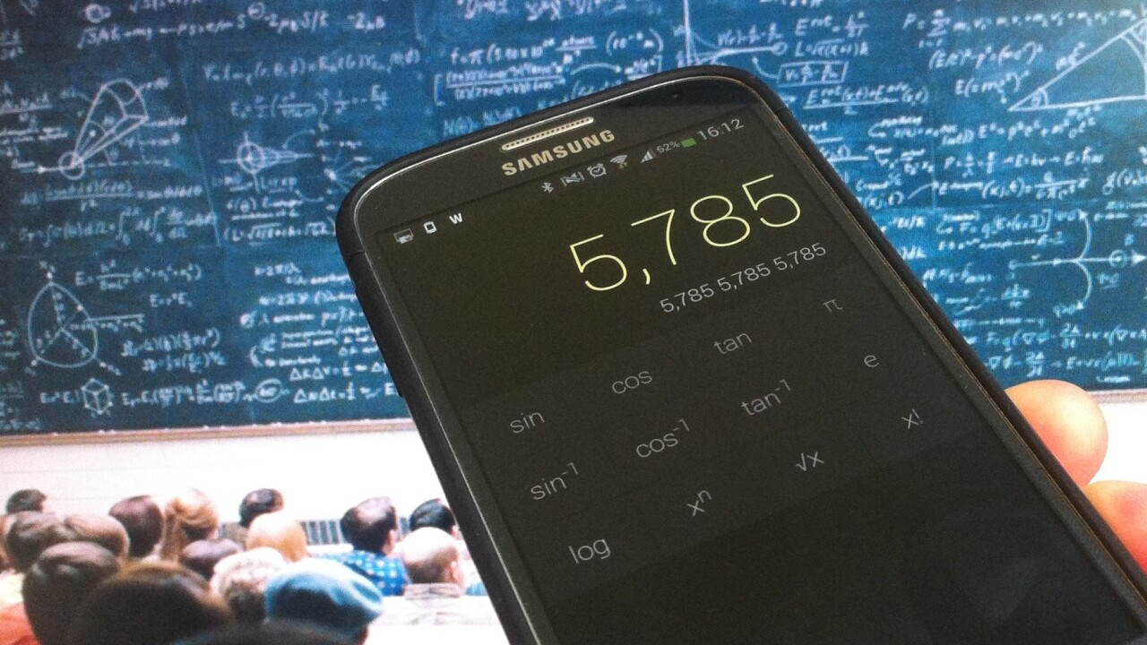
Android often gets a bad rap for the aesthetic quality of its apps, but there are plenty of beautiful ones out there. And while the prospect of a new calculator app might not set your saliva glands into overdrive, it’s worth our while giving CALCU a quick shout out for its attention to design detail.
How it looks
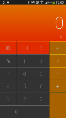
Launching initially with a default dark skin, CALCU lets you select from twelve themes.
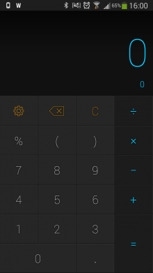
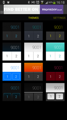
Some may be a little garish, but they’re all smooth and underpinned by the same slick navigability and UX. The main part of the calculator is pretty standard, with the result of your sum appearing at the top, and keypad at the bottom.
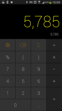
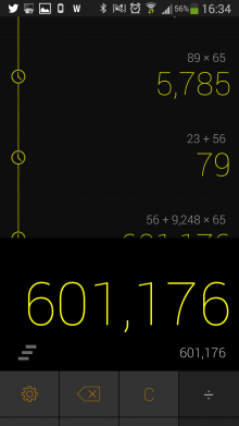
By swiping down, you can view the calculation history tape, while swiping up on the keyboard reveals additional keys, including the scientific functions.
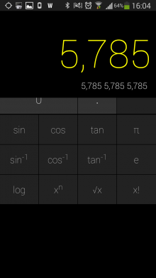
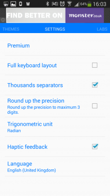
You can also enable further features that are classed as still in the ‘Lab’ – basically you can swipe down on the keyboard to carry out the calculation, or swipe up to clear the screen. And within settings, you can fine-tune things by enabling a full keyboard layout, haptic feedback, and more.

If you’re looking for a simple but good-looking, nice-to-use calculator app for Android, CALCU is worth your time.
Though it is free, you can pay $1.99 to remove the ads within CALCU, as well as “supporting more features”. In other words, even if you like the app and don’t mind the ads, it would be awfully nice if you can donate to the cause anyway.
Meanwhile, if you also own an iOS device, you may wish to check out Tydlig, while Rechner is decent too.
Get the TNW newsletter
Get the most important tech news in your inbox each week.


