
Foursquare released a new version of its iOS app today sporting an all-new look for iOS 7 and a few new location-based features, including the proactive recommendations that were announced back in August.
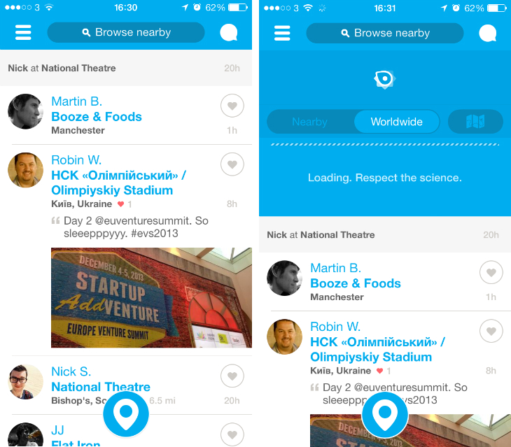
The most obvious and radical change to the app is on the home screen. The feed of check-ins, split into ‘Worldwide’ and ‘Nearby’, now takes up the entirety of the screen, stripping away the map and trending events or check-ins that used to reside in the upper third of the app.
Users can now expect the odd push notification to pop-up on their lock screen with a tip or recommendation based on your current location, your check-in history and the activity of your friends on Foursquare.
The idea is that it will serve up information only when you need it most, prompting you with (hopefully) accurate recommendations – even if you’ve completely forgotten that the app is sitting somewhere on your device. Furthermore, once you’ve checked-in somewhere Foursquare promises to give you tailored advice, such as the best dishes on the menu, a special offer or an important tip left behind by a regular.
These ‘smart’ recommendations could be a huge part of Foursquare’s growth and have the potential to change both user engagement and the way that people use and perceive the service as a whole.

Back on the home screen, a quick tug down on your feed will show a small space for tips and trending locations, as well as shortcut for viewing a map of nearby friends. The check-in icon at the bottom looks the same, but even the pop-up window for selecting your current location has been tweaked and refined for version 7.0.
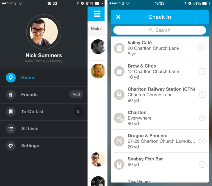
The side-bar also looks radically different, giving your display picture, name and profile a far greater degree of prominence than before. All of Foursquare’s functionality is still there – the search filters in particular remain unchanged – but this is a lighter, more social experience than before. The design is slick and profile pages in particular are fantastic to peruse.
➤ Foursquare | iOS
Image Credit: Justin Sullivan/Getty Images
Get the TNW newsletter
Get the most important tech news in your inbox each week.