The concept of the Android ‘launcher’ only really reached a wide audience outside hardcore mobile geeks with the launch of Facebook Home earlier this year. While that product ended up making little impact, Aviate may well have a better chance of success. Launching in beta today, this a fresh take on what a mobile homescreen should be.
Coming from a Silicon Valley-based team that includes two ex-Googlers, Aviate shuns the familiar rows of app icons that we’ve grown accustomed to in order to make a big bet – it can know what apps and information you need before you do. If Google Now knows you, Aviate wants to do the same for your phone.
Let’s take a look at a couple of screenshots of what Aviate looks like when I’m at home.
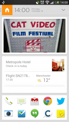
Above on the left, you can see that Aviate knows I’m at home (see the icon in the top-left). Below that, we have the standard Aviate homescreen. I’ve customized it with a picture (of a poster for an Internet Cat Video Film Festival that I saw in Brooklyn) and the standard Google Now widget. Below that, I’ve added shortcuts to apps that I use regularly.
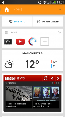
It’s on the right screenshot above that we start to see Aviate’s magic, though. With a swipe down on the homescreen, we get to see apps that are useful when I’m at home. Aviate will suggest some, but I can customize the list. I can also add widgets that are useful to me at home. For example, a TV guide widget isn’t much use if I’m out and about, but at home, having it just a swipe away is very useful. It’s this ‘what you need, when you want it’ approach that is central to how Aviate works.
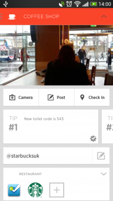
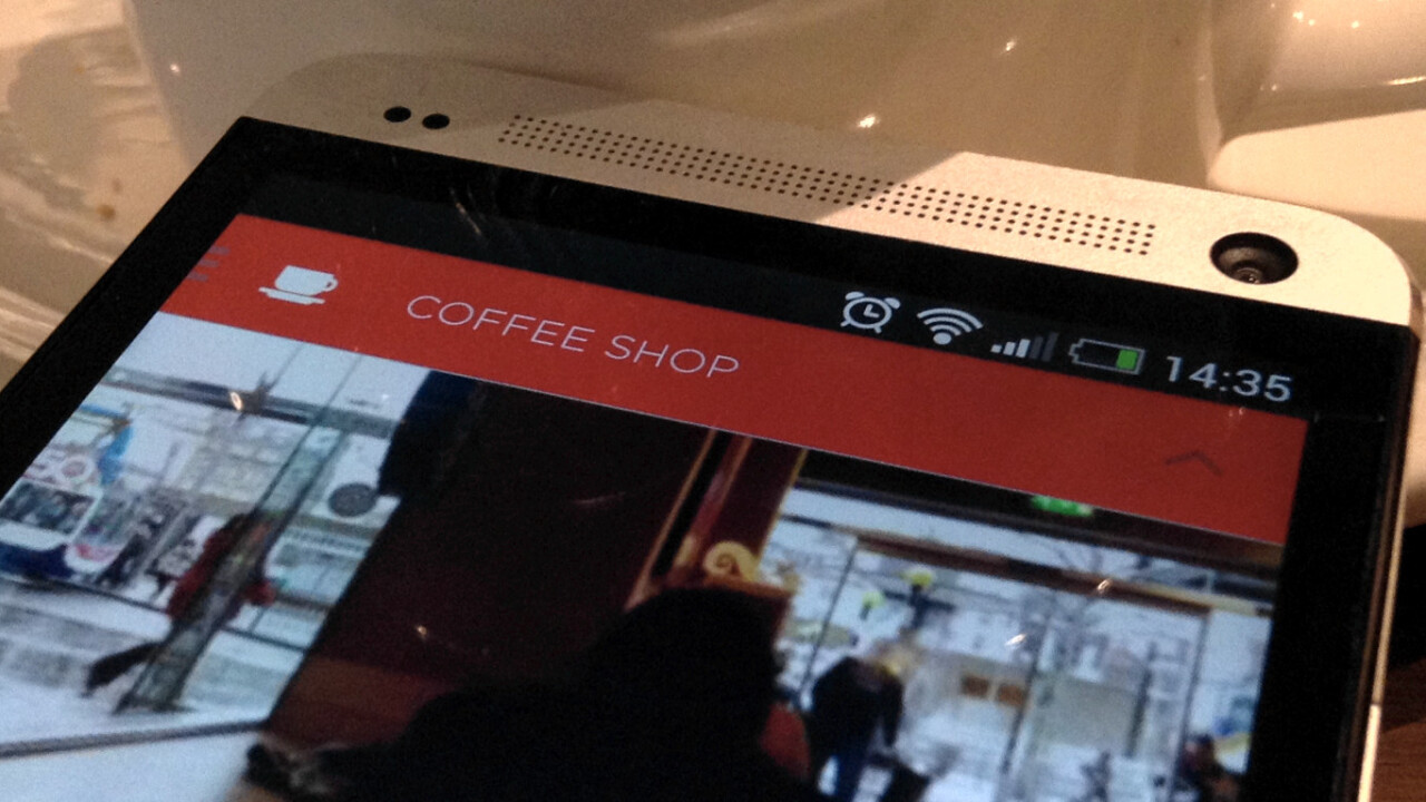
Aviate creates one of these ‘spaces’ for each location that you visit, and when you’re away from home it’s even more useful. For example, I’m sitting in Starbucks as I write this and Aviate is showing me a ‘Check-in’ button that opens Foursquare (other location-based apps will be supported in the future), a shortcut to send a tweet to the @starbucksuk Twitter account, a photo of the shop, access to the Starbucks Android app so I can pay straight from my phone, and more.
All of this is set up automatically based on Foursquare data, but can be tweaked as you see fit.
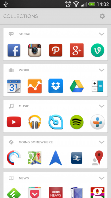
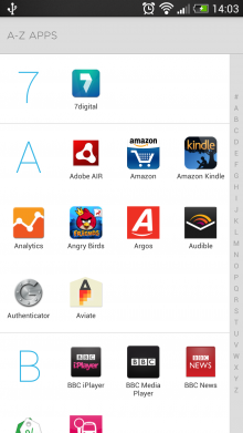
Of course, you’ll probably still want to access your other apps. A swipe to the right reveals automatically categorized collections of apps, so your ‘social’, ‘music’, ‘work’ apps are all together. Aviate does a good job of organizing them, but you can tweak them as well. A further swipe right moves you to an alphabetically sorted list of all the apps on your phone.
By way of an additional overview, here’s Aviate’s own promo video, which shows the launcher in action.
With $1.8 million in funding from Highland Capital Partners, Freestyle, Andreessen Horowitz and Draper Associates, Aviate has some smart money behind it, and it’s exciting to think about where the team might go with the product.
At present, the different spaces are triggered by location, time of day (there are ‘morning’ and ‘nighttime’ profiles) and movement (a ‘going somewhere’ profile). However, the Aviate team says that there are plenty of other triggers they could use. For example, maybe in the future it will load a ‘listening’ profile when you plug in your headphones, with quick access to music and audio apps.
I started using Aviate about a month ago, and despite being a bit of a floozy when it comes to my homescreen, I’ve stuck with it, delighted with its contextual approach. It certainly requires a bit of customizing to get it exactly as you want it but it’s well worth spending the time getting it just right for you.
It’s worth remembering that Aviate is in beta, which you’ll notice when it doesn’t quite detect locations well enough at times. Features like a ‘do not disturb’ mode for your notifications aren’t available in every location, which can leave you feeling a little disorientated when the feature you need isn’t there. In all, though, it’s a stable, useful addition to your phone that should do a good job of working out what you want, and when.
We’ll be watching closely to see how Aviate develops, and you can too. You currently need an invite to use the app and we have 500 to give away to The Next Web readers. Just download the app from the Google Play Store and sign up with the code NEXTWEB but be quick before they run out! Aviate beta supports Android phones (it’s not tablet-optimized) running 2.3 Gingerbread and above.
➤ Aviate / Google Play Store (invite code: NEXTWEB)
Get the TNW newsletter
Get the most important tech news in your inbox each week.
