 Smartphones, our incredibly powerful personal computers, are celebrated for their ability to handle email, music, social media, navigation and more. Yet they also make calls, just like any regular mobile phone. Remember that? I know, it’s easy to forget sometimes.
Decent, innovative dialer apps are rather scarce on the App Store, which is perplexing given the amount of time we all spend scrolling for a specific contact or punching in long-winded numbers.
Enter Callism, a new iPhone app from the team behind Reach Network, that wants to give users a smarter, more visual alternative.
How it works
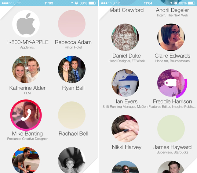
On the home screen, you’ll see a simple grid with numerous circular icons representing the contacts in your address book. They’re rearranged automatically based on your calling behavior, so although only six are shown at once – far less than the list format found in the default iOS dialer app – the ones that you need most frequently should always reside at the top of the screen.
On a personal note, I only call a handful of people on a regular basis these days. So rather than scroll through a long, alphabetized list, I prefer to have my most-used contacts at the top.
It’s clearly a trade-off, but a good one in my opinion.
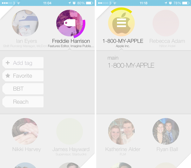
Select any contact’s circle and a red phone icon will appear, then tap again to trigger a regular phone call. Similar to Mailbox and other productivity apps, each circle can also be dragged left and right to trigger secondary tasks. Depending on how far you slide the icon, different actions are unlocked. These include call reminders, detailed contact information and tags.
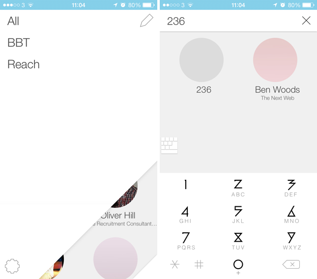
Pressing the small, triangular area in the top left-hand corner also reveals a tag list, which, despite being an age-old concept for address book apps, still proves useful for grouping close friends, family and colleagues together.
Conversely, tapping the bottom right-hand corner brings up your standard T9 dialer. Here you can quickly rattle off a specific number, or also search for contacts using the letters denoted by each key. Given that the search results and keyboard share the same screen, the numbered keys feel a little cramped and personally, I’m just not a fan of the app’s typeface.
Wrap up
Callism is fast and intuitive to use. The lack of an A-Z index bar on the right-hand side can be jarring at first, but it’s nice to see an app with an entirely different approach to sorting and navigation. The only sticking point is the iOS 7-inspired design and the swathe of soft, easily palatable colors. It won’t be to everyone’s tastes, though it fits Apple’s new aesthetic just fine.
Disclosure: This article contains an affiliate link. While we only ever write about products we think deserve to be on the pages of our site, The Next Web may earn a small commission if you click through and buy the product in question.
Image Credit: Joe Raedle/Getty Images
Get the TNW newsletter
Get the most important tech news in your inbox each week.

