
Social media seems to get a bad reputation nowadays, what with recurring talks of privacy concerns and freedom of speech restrictions. It’s understandable, of course; platforms like Facebook and Twitter are for many the primary means of communicating with large groups of people and have collected a huge amount of information about us. These details can reveal a lot about our daily lives and personal convictions, so what’s done with that data is important.
However, it doesn’t all have to be about selling you suspicious dating advertisements or letting the government spy on your cat-video viewing habits. The following list compiles 20 apps and resources that do cool things with your information, from nifty visualizations to clever organization.
Wolfram Alpha Facebook Analytics
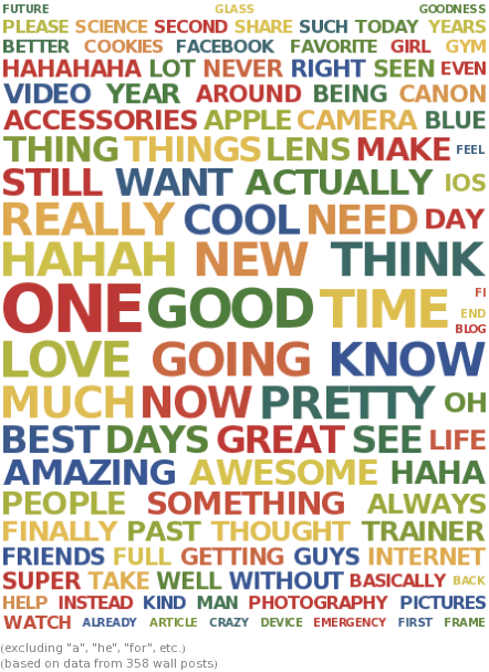
Wolfram Alpha’s powerful computational engine is mostly known for its mathematical prowess, but it’s recently gained the ability to perform a thorough analysis of your Facebook account too. This provides an immense amount of information—much of it presented in nice little graphs and other visualizations—such as the number of statuses you’ve posted, the age distribution of your friends, and your most popular photos.
Our favorite is the ‘Word Cloud’ which neatly organizes your most commonly written words by scaling them according to usage frequency.
Facebook Graph Search
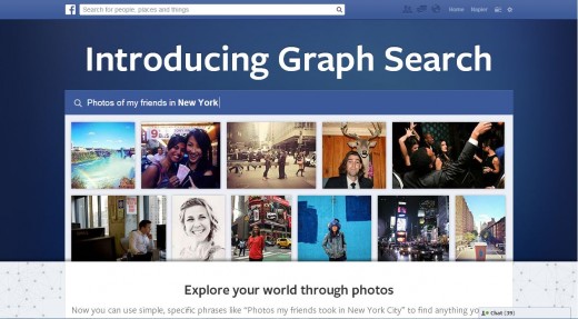
Although not a standalone app, Graph Search is Facebook’s attempt to make useful sense of all the pictures and information it’s collected about you and your friends. Granted, the tool has come under fire for making it easier for Facebook stalkers to do their stalking, but it’s hard to deny the cleverness of some its features.
You can type in a huge variety of queries, ranging from “restaurants my friends like,” through “photos I’m tagged in,” to “people who like The Next Web and chocolate”.
Friendwheel
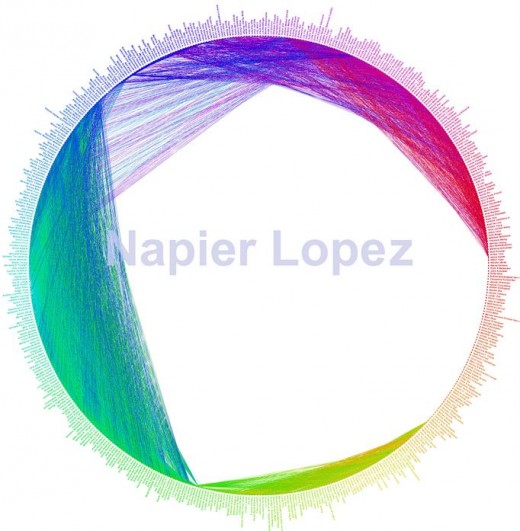
Another data visualization, Friendwheel aims to give you an overall picture of who knows who within your Facebook friend base. Each contact represents a point on a circle, so watch as the app literally connects the dots with overlapping colored lines. Because we tend to be a part of various distinct social circles, you’ll likely see different network groups emerge from the patterns of lines.
Mentos Fresh News

Ever wanted to feel like a celebrity and see yourself on the news? Well, Mentos Fresh News aims to help you do just that… sort of. This web tool prompts you to link your Facebook account and basically create a short news reel where fake anchors read out updates about your social life and biography based on information you’ve shared through your Facebook Timeline. The “reports” range from the ridiculous to the raunchy, cleverly integrating things such as your photos and the places you’ve visited into their commentary.
Mentionmapp
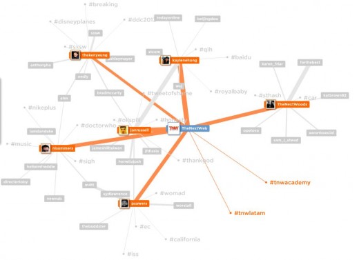
Mentionmapp gives you a graphic representation of your influence on Twitter, connecting users based on recent mentions of people and hashtags. Sign in with your Twitter account and use it to quickly gauge your network connections in a tree you can push, pull, and move around.
Twtrland
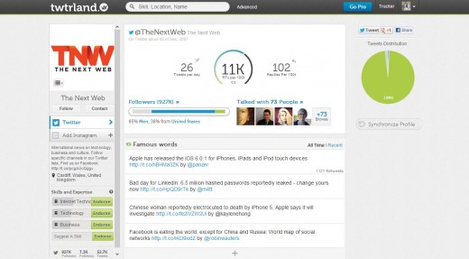
Able to analyze both Twitter and Instagram accounts, Twtrland is an analytics Web app that presents you with a thorough exploration of your posting habits and the followers you interact with.
The app provides a plethora of data, such as your average number of retweets, your most commonly used words, and your favorite Instagram filters. Most intriguing is its smart search, allowing you to filter followers based on characteristics such as age, location, and even whether or not they are celebrities.
➤ Twtrland
TweetBookz
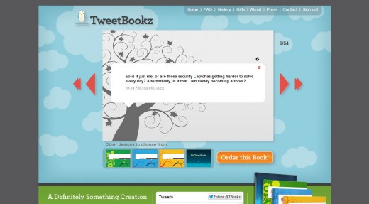
We all know that person who just has to share every detail of his or her life story on Twitter. Or maybe you are that person–we won’t judge. In any case, Tweetbookz.com is a colorful website that allows you to create a “TweetBook” of your posts; log in with your Twitter information and choose from a few different designs to order a book of your online musings in either softcover or hardcover varieties.
You can also order gift certificates for your friends to create their own. Even if your tweets might not make for a bestseller, it’s a novel way of physically documenting your personal story in the digital age (pun intended).
Twitter Character Infographic by Visual.ly
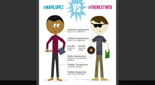
Visual.ly is known for its infographic services (be sure to check out some of their other stuff), and this one for analyzing your Twitter account is on the quirky side.
Link your Twitter account and create a character whose expression and attire change depending on stats such as your tweet to retweet ratio and the general topics of conversation you engage in. Point to a second Twitter account to see how your stats and avatars’ characteristics compare. You can also add some finishing touches like glasses or hairstyles to truly personalize your character.
➤ Twitter Character Infographic
Tweeted Trips
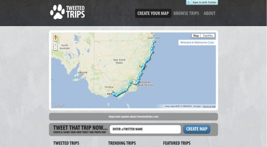
Do you travel a lot and tweet along the way? Tweeted Trips lets you showcase your travels based on the location metadata of geotagged tweets (you can add location info manually if a tweet isn’t geotagged), plotting a route of your voyage onto a map. You can also input another Twitter handle if you’d like to get a sense of the travels of other users, or view trending and featured “trips”.
➤ Tweeted Trips
Statigram

Statigram combines both viewer and analytics abilities to create a powerful Instagram web app. It does everything you would expect from an Instagram viewer, giving you a feed of recent images and allowing you to sort through followers and followings. However, the heart of the app lies in its statistics.
It not only provides you with an abundance of details about your engagement and reach, but also gives you advice on how to increase your Instagram popularity, such as suggesting the best times to post pictures. In addition, it can create infographics and collages to share on various networks.
Worldcam
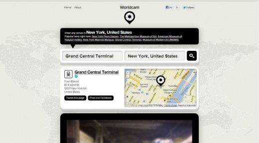
A simple mapping app, Worldcam gives you a glimpse at what sorts of Instagram photos are being shared throughout the world. Just enter a city or venue and you’ll be presented with a feed of recent photos shared near that location.
➤ Worldcam
Google+ Ripples
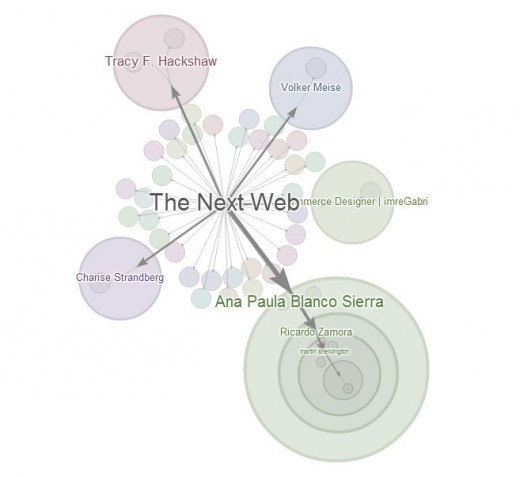
Google+ may not have the popularity of Facebook or Twitter, but it remains an essential platform for many communities. Ripples is integrated directly within the service and visualizes the spread of posts on the network, allowing you to identify major influencers, social connections, and even track popularity over time.
To access it, simply click on the arrow on the top-right of a post and select ‘View Ripples’ from the drop-down menu.
➤ Ripples
Simply Measured Vine Analytics
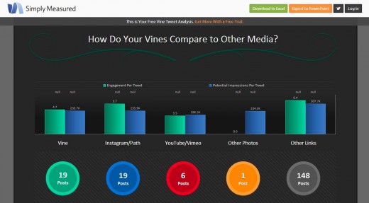
Simply Measured, an analytics company, offers up a free statistics web app to measure your reach on Vine. Link your account and see who’s sharing your videos and driving interaction, and get some general numbers about your posting customs. It’s all presented using colorful graphs and charts too. It’s worth mentioning that Simply Measured also offers a variety of other analytics services as well.
Numblr
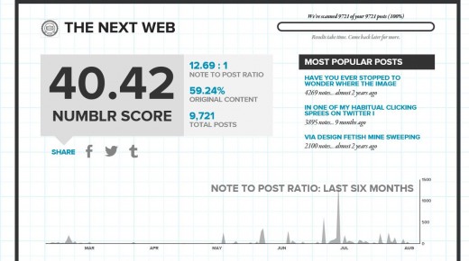
Numblr is a simple but quaint analytics website for Tumblr, presenting quick stats on your blogging popularity, such as your most read posts, your note to post ratio, and your distribution of post types. There’s a mysterious “Numblr Score” for which we assume bigger means better. Just enter any blog’s URL and watch as the app wittily complains about the effort it’s making to load the data.
➤ Numblr
Foursquare Time Machine
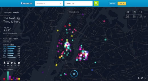
A joint effort by Foursquare and Samsung, Time Machine visualizes all your check-ins with the service on a colorful animated map. That’s cool enough on its own, but it even predicts where you should go next to fully do justice to its name. You can also create an infographic with details about your check-in habits for you to share and show off to your friends.
4sqmap
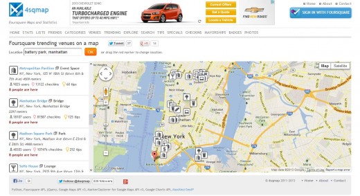
4smap delivers a vast array of statistics and resources to complement your Foursquare experience. You can check trending venues around a given area, explore locations by category, or see recommended places.
The app’s power really becomes apparent once you sign in with your Foursquare account. Use it to see your friends, check-ins, tips, badges, mayorships, and more plotted on their own maps. Like Time Machine, 4sqmap can generate a shareable infographic with a variety of activity stats neatly detailed.
➤ 4sqmap
LinkedIn InMaps
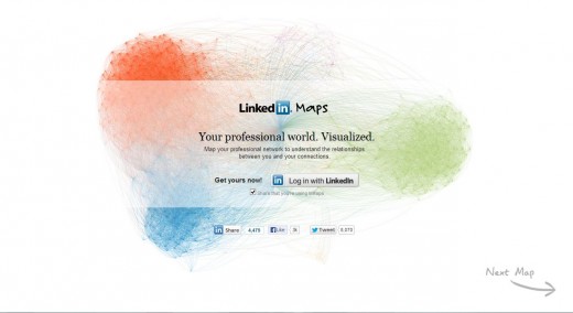
Being able to visualize your connections perhaps is most useful for LinkedIn, a network which at its very core encourages creating professional connections between various groups of people.
What’s different about InMaps as a visualization tool is that not only does it color-code your various network groups, it also allows you label the various colors that emerge with whatever group they belong to.This gives you a practical purpose for the visualization, making it easy for you to see which networks need to be expanded upon to better represent your real-life interactions.
➤ InMaps
Kinzaa
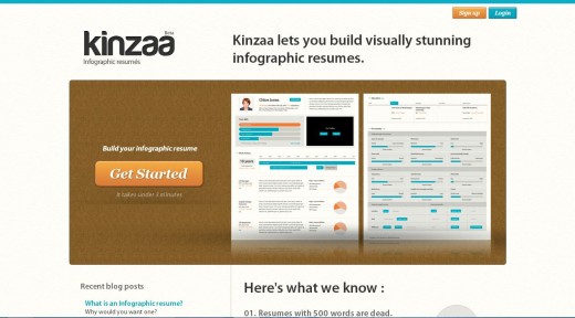
Generally speaking, making a resume is an unpleasant necessity. For employers, having to read hundreds of them isn’t much better. Kinzaa aims to make resumes more interesting by importing your LinkedIn data to create an “infographic resume” which details your work, education, and experience history graphically (you can also create one without importing anything).
Instead of just seeing words on paper, potential employers get charts and diagrams that stand out from the myriad of other applications and give a greater overview of your candidacy.
➤ Kinzaa
Vizify
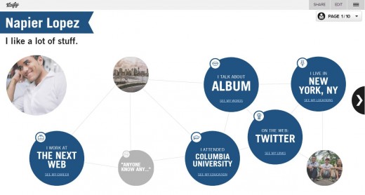
One of the most thorough visualization apps on this list, Vizify creates “graphical biographies” of your presence in the online world. You can connect it to services like Facebook, Twitter, Foursquare, LinkedIn, Instagram, and personal websites to get a graphical breakdown of your activity on each of those sites, pulling out information like your most frequent discussion topics and your career history.
It also has cool animations such as videos demonstrating how often you’ve changed location and a statistical overview of your Twitter account. What truly makes Vizify unique though is its aim to not only be a source of information for your own eyes, but also to be something you can share and provide as a quick reference point for your online presence.
You can even change your page’s color or add things like quotes and infographics to adequately personalize your account.
➤ Vizify
Immersion by MIT Media Labs
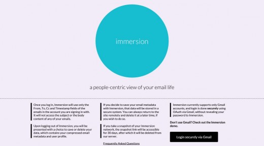
Email is not a social network per se, but our emailing habits can certainly be revealing about our personal interactions (just ask the NSA!). That’s what Immersion by MIT Media Labs sets out to prove: provide it with your Gmail account information and it collects the times, senders, and recipients of messages to graphically establish connections between contacts.
Don’t worry; you can delete all your information from their servers if you’re concerned about privacy.
Wrap-up
Social platforms collect a lot of information about our lives, and while that can sometimes be disconcerting, it’s also great to have apps that do something useful with that data to allow us to see the patterns that emerge from our activity on these networks. They give us a small overview of our own personal stories, and often makes for cool graphics too.
Think we missed any other interesting resources? Let us know in the comments below!
Header image credit: KAREN BLEIER/AFP/Getty Images
Get the TNW newsletter
Get the most important tech news in your inbox each week.


