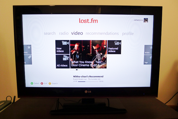
The Last.fm app on the Xbox 360 has been given a pretty drastic redesign this week, with a Metro-inspired grid layout, full-screen artist photos and motion control via Microsoft’s Kinect peripheral.
Prior to the launch of Xbox Music, Last.fm was one of the only music streaming services available on the system. Despite updating its Scrobbler apps for Windows, Mac and Linux earlier this year, it’s hard to shake the feeling that the Internet radio service is on a downward spiral.
Pandora continues to grow in the United States and on-demand streaming services such as Rdio and Spotify are seen as the future of the music industry. Last.fm has been wise to connect with both of these services, but as a result it’s also faded into near-obscurity.
Can its dedicated app on the Xbox 360 make the service relevant again?
A new homescreen, a new interface

The redesigned interface and menus will feel very familiar to Xbox 360 users who have been using the new dashboard even before the launch of Windows 8.
The new radio tab is split into seven panels for accessing different playback modes. My library radio will fling the user into a custom playlist based on everything that has been previously scrobbled. That could include any tracks saved to a local library such as iTunes, but also any connected on-demand music streaming services.
My Recommended Radio, meanwhile, will generate a personalized playlist based on music that is similar to the user’s current tastes. Last.fm has always offered a very simple and intelligent music discovery system and it’s no different here in the new Xbox 360 app.
Elsewhere on the radio tab is a scrolling panel for promoted stations, as well as options to create a new playlist based on a specific artist or tag.

Moving around with the Xbox 360 controller can be a little unresponsive though. Just pushing the analog stick left or right can cause the app to stutter or skip a panel entirely. It never felt broken, but the team most needs to give this a serious comb over for bugs.
Last.fm has been producing its own video content for some time now, but it’s been hidden and largely unappreciated on its browser-based service. The team has given these interviews and acoustic sessions a dedicated home in the revamped app, made easily acceptable from the ‘video’ tab on the homescreen.
There’s not much to see here, but the scrolling panel at the center does appear to be tailored towards user’s existing listening habits.
The listening experience
Creating a unique and functional music player for a video game console can be difficult, as there’s just so much more space to work with on a TV screen.

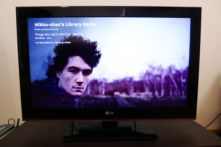
Last.fm has decided to focus on its library of high-quality artist photos by using them as full-screen background images while the music plays. They rotate about every two seconds, and are often stunning to look at.
The app will show what the station is, the name of the artist, track and album, and the release date in the top left-hand corner. It all feels very stripped back and visual, making it perfect for parties or casual listening.
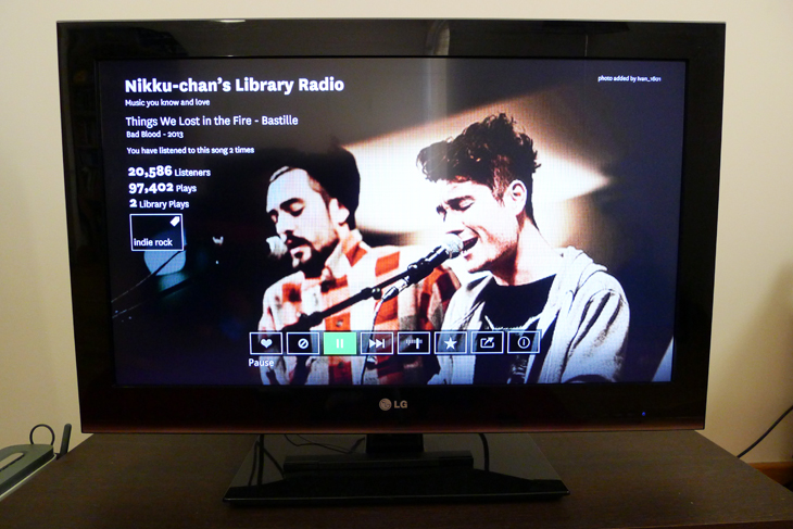
Pushing the analog stick in any direction will bring up the advanced controls. Here the user can stop, skip and share the song that they’re listening to through Facebook.
Genre tags for each song and the playback information, including total number of listeners, sits below the track information at the top of the screen, giving music junkies some additional date to chew over.
Those tags are particularly useful, in fact, as they allow users to “jump down the rabbit hole” and launch related radio stations without leaving the music player.

A “fine tune” option at the bottom of the screen is also a nice touch for filtering specific music genres as the playlist progresses.
The bottom line
The new Last.fm app is a clean, refined experience on the Xbox 360. It’s not an on-demand music streaming service – and perhaps that’ll be its downfall in the end – but it’s still a great way to discover new music.
Similarly, if you like the ambiguity that comes with radio-inspired Internet services such as Pandora, there’s a lot to like here. It’s incredibly simple to set up a playlist and refining it once you’ve started is hassle-free.
There are some nasty bugs that need fixing, but it’s not enough to detract from an otherwise stellar experience.
Get the TNW newsletter
Get the most important tech news in your inbox each week.


