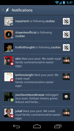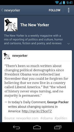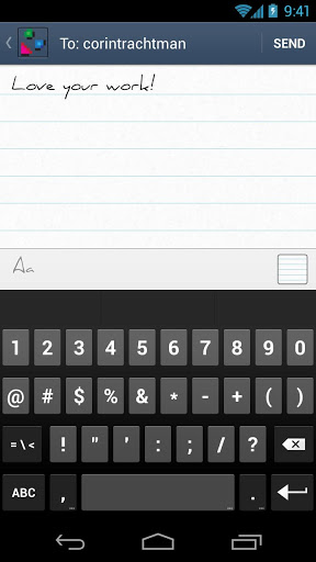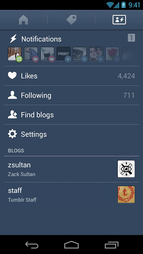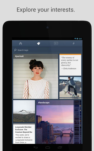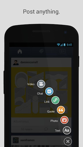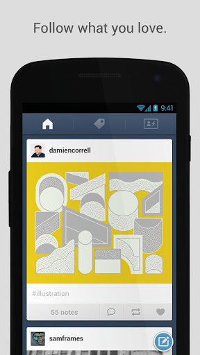
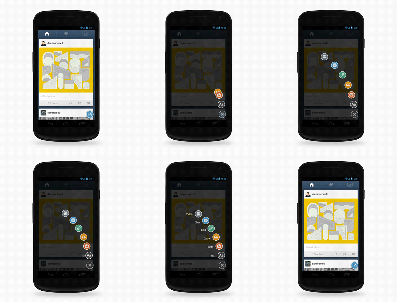
Tumblr has updated its Android app with a completely new look, featuring a redesigned interface which more closely follows Holo design conventions — Google’s theme guidelines for Ice Cream Sandwich. The update also includes other aesthetic-focused changes, including new post animations.
In the past, Tumblr had neglected its mobile presence, but over the last 6 months the company has turned things around. Just this past November, Tumblr released major updates to its iOS app, and now this update follows that trend.
You can see the animated new post interface via the Gif below:
Here’s more of the new design, including the notifications and commenting pages:
The update, which Tumblr calls a “total facelift,” is live now in Google Play. You can check it out via the link below.
Featured image: joshwept
Get the TNW newsletter
Get the most important tech news in your inbox each week.

