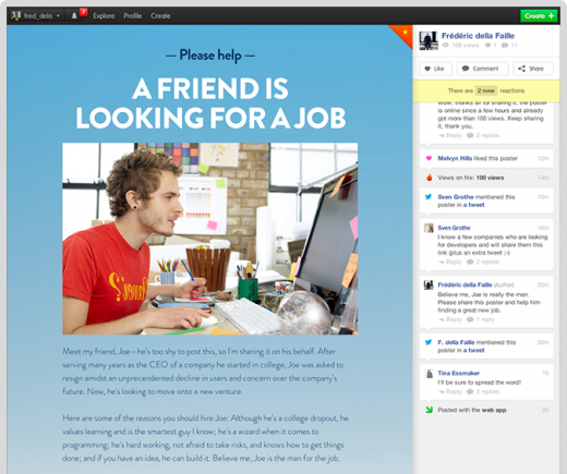
After debuting in beta and raising $910,000, micro-publishing startup Checkthis has launched a new look and “Social Posters,” a fresh take on its experiments with commitment-free, quick, single page publishing.
As we’ve said, sometimes you don’t need an entire website; you just need something that looks great and is easily shareable. This is the void Checkthis fills, and its Social Posters are like single page blog posts or about.me sites, created just for an announcement, blog post, product listing or even a gif.
Checkthis founder and designer Frédéric della Faille calls its new Social Posters “the natural evolution of self-expression on the Web,” and while that’s a bold (and vague) statement, the simplicity of these posters make them surprisingly easy to build, and the tool itself succeeds where many WYSIWYG site and blog design interfaces fail.


The social aspect of Checkthis’ Social Poster lies in its right sidebar, which lets users like, comment and share. These actions are shown in a timeline feed, which makes the posters feel more alive. Admittedly, the posters also look a bit more crowded with busy social sidebars, but that sacrifice turns a static page into something more interactive.
Checkthis’ weakness lies in the fact that many people have their own blogs already, and services like Tumblr have so far been able to satisfy users with quick content creation and sharing. Still, the service is operating in an interesting space, and as it evolves, it seems to have the potential for that viral growth which every startup searches for.
Image credit: EVA HAMBACH / Getty Images
Get the TNW newsletter
Get the most important tech news in your inbox each week.


