Today, the social media aggregation service Storify launches a new version of its site that focuses on fronting user-created media and content, as well as a more prominent search function. The site’s design is dramatically different and, I feel, more closely reflects the way that people use the service.
If you’re unfamiliar, Storify is a tool that lets you build a story out of social media posts on Twitter, Instagram, Facebook and other social networks. We’re big fans of the tool here at The Next Web and have used it to Storify events like the death of Apple founder Steve Jobs.
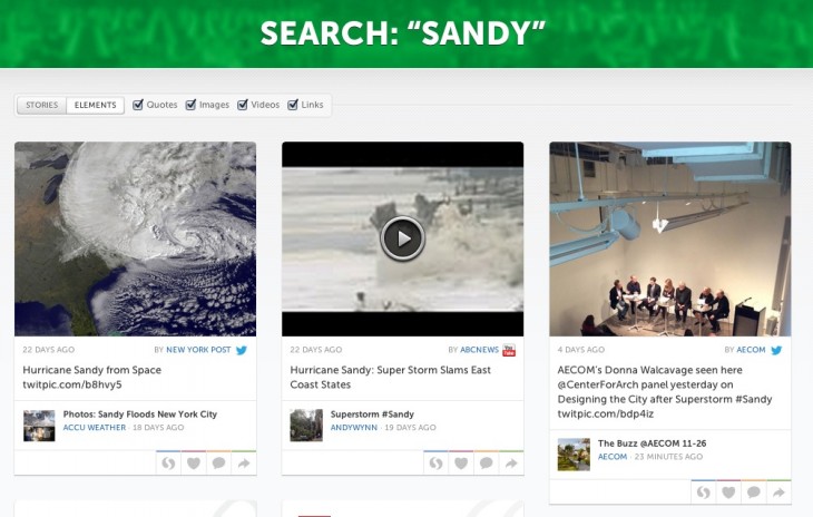
The new design is almost entirely given over to cards that feature user content like status messages and tweets, especially those that have been shared with pieces of media like Instagram photos or articles. This prominently places the kinds of media that people are sharing, rather than the static section-based design of the old site.
The new design emphasizes the fact that users are contributing to and creating the stories with their individual posts.
I spoke with Storify co-founder Burt Herman about the new tile designs. and asked him why the main page featured individual components of what could be a Storify story, rather than the stories themselves.
“It’s so users can more easily see the best of what has been Storified and from there collect media into their own stories. We see this also as a teaser or the table of contents of a magazine,” says Herman, “where you see a photo or a compelling quote and it encourages you to look deeper to read the whole story.”
Clicking on the arrow in the corner of any of the cards will flip it, letting you see the Storify stories that it has been added to, as well as comments on the media itself. These ‘teasers’ should be a good way for site browsers to see how a collection is created from a piece of content.
The new site also prominently features a search bar right at the top. This in-your-face fronting of the search feature, along with the suggested topics right above it, place an emphasis on Storify as a cross-network topic engine. Instead of visiting each of the sites that you’re on individually, plug in a search topic on Storify and get collections in one place. It greatly emphasizes the agnostic nature of Storify’s service.
When I asked him why the search feature was placed so prominently, Herman told me that “We found that it took too many clicks to dig down into stories and see the content there, and wanted to expose more of the great media being collected on the site.” The search function was added in March, but had a far less prominent place on the old version of the site.
The new search function also has a refined algorithm that is ‘based on the resonance each media item has’ on Storify.
The trends across the top above the bar are just suggested searches for now, but Herman says that they will become trending tags from shared stories. These replace the old static sections from the previous version of Storify’s site.
“We found that not many people were putting stories into sections, so instead we plan to automatically determine tags for stories based on social media elements being used and allow them to be edited,” Herman says.
The new site also has user profile pages that can be set up with an image. These collect all of the Storify stories and media elements collected by the user.
Overall, the new site looks to be a far better representation of what Storify does. It allows people to collect media within an incredibly quick and easy framework. Those stories represent not just stories that are being told through postings, but also the trends at work across networks. A social aggregation service that makes even more sense now as information is spread across a variety of networks.
The new Storify should be available soon.
Image Credit: Sheila Rooney/Getty Images
Get the TNW newsletter
Get the most important tech news in your inbox each week.


