When I visited Detroit for a couple of days during late 2011 I wrote the story about how AutoWeek, a 53-year old magazine, was bootstrapping a car-buying startup in shopautoweek.com. The team has been doing a great job gathering information and helping people to make informed buying decisions, and now adds a beautiful iPad app to its tools for car-buying research.
I’ve been playing with the shopautoweek.com iPad app for about a month, watching the team implement changes and generally provide a more polished experience. I can now safely say that it’s the single best experience I’ve used, and I think you’ll enjoy it too.
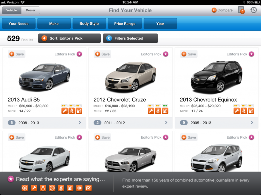
Let’s start with the overall design. It’s cars first, through and through. Loading up the app you’re immediately taken to an overwhelming selection of vehicles. But narrowing those down by your preferences is intuitive and done quite easily.

If you’ve used the shopautoweek.com site then the sorting features are already going to be familiar to you. But if you haven’t, the idea is that you can quickly and easily tell the app “Your Needs”, which are broken down by things that actually make sense. You’ll see selections for fuel economy, family-friendly, sporty, hauling and more. As you select each point that’s important to you, your selections narrow.
But once you’ve narrowed those selections, things start to get really fun with the app. The Notebook feature from the shopautoweek.com site also carries over to the iPad app. This allows you to add vehicles of your choosing, keep notes about them, and compare them to one another at will. Though you can only compare two at a time, it’s still a great feature to have at your fingertips.
Inside the listing page for each vehicle you’ll find a wealth of information. Of course there are photos, but there are also editorial reviews, a full features listing, beautiful gallery photos and even suggested reading that surrounds the hot-button points of your car. For instance, if you’ve looked into a “green” vehicle, your suggested reading will include things like lineups of the hottest gas-savers for the year, sourced from AutoWeek and shopautoweek.com

Retina-ready graphics are in heavy use through the app, but their increased size doesn’t seem to affect the load times. When browsing over WiFi every page load was snappy, and the general feel of the app is on par with the great choices we’ve come to know from the best developers.
But no matter how you slice it, the real beauty of the app is the fact that’s it’s simply car buying research done the way that makes the most sense. AutoWeek (and thereby shopautoweek.com) has been a trusted name in the automotive review business for decades. That knowledge, coupled with a brilliant sense of design and UX, rockets the shopautoweek.com iPad app right to my top choice for applications in its class.
Get the TNW newsletter
Get the most important tech news in your inbox each week.


