Flickr promised us some big changes when it started cutting some of its not-so-popular features last month.
At the time, Yahoo!’s photo sharing service said:
This year is going to be big at Flickr! In the coming weeks and months you will see significant updates to Flickr’s user experience, new features and offerings across devices. Our goal is to build a gorgeous, intuitive, and truly beautiful experience for you, your friends and your photos.
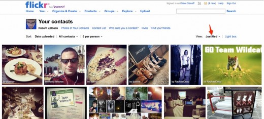
Flickr has started rolling out a new design to reflect its initiative to create a better user experience. In a blog post today, the product announced a new view for photos called “Justified”. Here’s what the company had to say about the release:
Today, we’re excited to introduce a new look for the Photos from your Contacts page, called the Justified layout. We created this new view to make it easier to see the stories your friends are telling with their photos. While the previous layout choices are still available, the new design optimizes for seamlessly displaying more images at larger sizes, so you can see more of the activity from contacts, friends and family at once.
As Flickr notes, the new view is only available on your contacts page, but promises that it will start rolling it out for all pages on the site. The redesign sports infinite scrolling and a lightbox view when you click on a photo.
Here’s what the new view looks like, which is strikingly similar to the popular sharing site Pinterest:
The new Justified View is the default option for your contacts page and you can decide how large the photos are displayed. If you leave it as-is, there’s no doubt that this is a more enjoyable way to surf through photos on Flickr, which hasn’t updated its look in quite a few years. In fact, I can’t remember the last time that Flickr had a facelift.
Companies like Snapjoy have been urging Flickr users to jump ship and move their photos away from the service, suggesting that it might die a slow death. The new focus on how users interact with the site shows us that the light is still on and people are still working on the site, at the very least.
This new view is what Flickr calls “the first of many changes” it’s working on, so we’ll be paying attention to what it has up its sleeve next.
Is a redesign enough to keep you on Flickr, or have you already moved on? Let us know in the comments.
Get the TNW newsletter
Get the most important tech news in your inbox each week.


