It would be easy to say that QR codes kind of suck and leave it at that. People have been talking about these square symbols with embedded information like URLs for years, claiming that they’re the future of advertising and information distribution. But they never seem to live up to their promise.
Now, Scan.me feels it has the QR code problem solved and, after seeing what the company is up to with the latest release of its app for iOS and Android and the enhancements to its web service, we’re inclined to agree. By building a great experience on both sides of the equation, with a ‘gold standard’ scanning app and a simple, beautiful landing page for every QR code generated, the company is looking to craft a benchmark code scanning system.
Scan.me isn’t coming into this fresh to the code scanning business. It’s current app has over 10 million downloads and its used the data from their experience with this as well as with partners on the other end of the equation, businesses and content providers, to work improving its service. Its also received $1.7M in funding from a host of partners including Google Ventures.
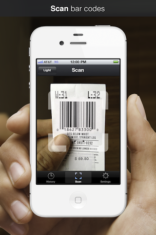
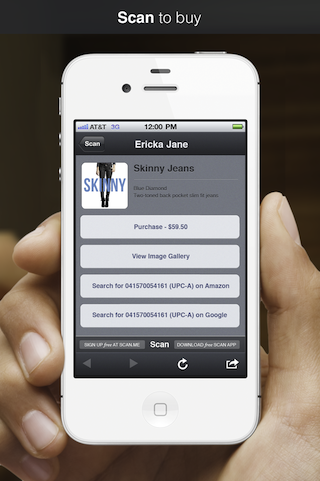
Now, the scanning app has hit version 1.9 with a slick new interface and the web interface for creating codes to scan has gotten a major overhaul as well. The app now also scans regular barcodes as well with plans to add more formats, with a zap of a barcode taking a user to an Amazon, Google or direct product page.
The app is designed to be fast and focused, allowing a user to scan a code and get results, without much more fluff. But, as the Scan.me guys have figured out, this is only part of the experience, and not even the most important bit.
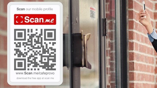
You’ve probably seen QR codes around, on packaging, in magazines, on a placard at a department store advertising discounts or an email catalog. But they’re typically poorly displayed and designed, making for a lame first impression.
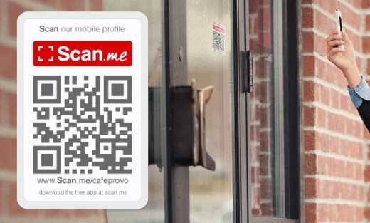
Scan.me’s codes are presented with a ‘call to action’ like ‘Scan this to Like us on Facebook!’. They’re designed beautifully, with a standard URL for non-scanners and a crisp look that presents well. Businesses or individuals can build one of these codes with the QR code generator on the Scan.me site, which has templates for profiles, social networking actions and websites.
But getting someone to scan a code isn’t the hard part either. It’s getting the user to a virtual location that looks and feels inviting and enabling a business to start a conversation with them.
“We think that having social actions on the scan pages invites conversation between the person and the business,” says Scan.me’s Garret Gee, talking to me about the new site and app. The biggest issue, it turns out, isn’t getting a user to scan a code, it’s getting them to do something after that.
Typically codes will drop a user onto a page that hasn’t been optimized for mobile, or isn’t specifically designed for that purpose. This is where the company’s beautiful mobile-centric scan pages come in. They’re gorgeous splash pages that can be designed right along with the QR code on the Scan.me site. They offer simple calls to action like following the company on Twitter, Liking them on Facebook or asking them a question by email.
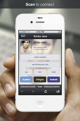
The pages can also, of course, be a mobile website designed by the business or person building the code. But if you don’t have the resources, Scan.me’s pages provide a great alternative.
And the process works, too. Gee told me that they recently partnered with music video site Vevo to add a code to the end of a video by electronic artist Kaskade. They convinced Vevo to try out one of their templates as a landing page and ended up with a 40-50% conversion rate on users taking action. To give you a comparison, the industry standard rate is somewhere around 1%.
“We want it to be the gold standard app for scanning,” says Gee, emphasizing that it wants to make sure that the entire experience, from start to finish, feels like a conversation between the user scanning the code and the business or person offering it. There have been a lot of people working to solve the QR code dilemma and Scan.me comes the closest we’ve seen to enabling this tech to reach its potential.
You can check out the code builder at the Scan.me site and you can grab the app from the app stores here.
Get the TNW newsletter
Get the most important tech news in your inbox each week.
