Apparently acquisition rumours haven’t slowed down the TweetDeck team, as today it released a completely rebuilt iOS app, TweetDeck 2.0 is slick, more responsive and has added better navigation and customization features that keep it in the running as one of the premier Twitter clients for iOS devices.
Admittedly, I had abandoned TweetDeck 1.0 some time ago, in favour of other clients such as HootSuite and, more recently, TweetBot. TweetDeck’s utilization of AIR was what had initially turned me off of the application as a whole, and it took the iOS app with it. But since TweetDeck has offered a browser-based platform, I’ve been getting back into it. And the improvements to TweetDeck’s iOS app are pretty remarkable.
TweetDeck 2.0 takes better advantage of the touch screen, where you can pinch to navigate, edit, delete and move columns. The implementation is slick and fluid, which is becoming more important than ever in an iOS app: it can be the difference between ongoing usage of an app or outright deletion.
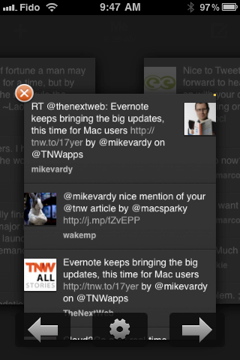
While the developers may not have taken a long look at TweetBot’s design when putting TweetDeck 2.0 together, I’m certain that users will see these two apps as the best option for them in terms of overall look and feel.
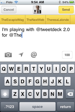
Composing tweets was simple, as it should be. Users can add photos, location data and other usual suspects to their tweets. When mentioning or messaging a recipient, as names are entered into the device, they pop up in a very noticeable (yet not intrusive) bar above the tweet. Users can select the name from the bar or continue to type away if they choose.
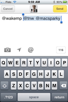
Swiping to the right in a column allows users to move to the next column, and so on. Selecting a tweet brings up the message in its own column, where users can then reply, retweet, email or view it at Twitter’s own website if they want. If there is more than one Twitter handle in the tweet, when attempting to reply the user is given the opportunity to delete the additional recipients right away from your upcoming tweet. They appear highlighted (a la Copy and Paste) and by hitting the delete key n the devices virtual keyboard they can be removed.
To look at a user’s profile, simply touch their handle within a tweet, or they can be accessed by swiping to the right from a tweet that they sent. A new screen shows all of the user’s information and a slider allows following and “unfollowing” to occur quickly and easily. Users can direct message, block, report spam and view the profile in question on the Twitter website from this screen as well.

TweetDeck 2.0 also has customization options that allow users to really personalize their experience, from only displaying their mentions from certain accounts they have in their TweetDeck profile to limiting the number of Twitter lists they can actively monitor. Each of them can be put into their own columns or integrated columns that combine several lists into one.
The improvements made in this overhauled TweetDeck app really take it to the next level, which keeps it among the top Twitter iOS apps available. The competition in the Twitter client market is fierce, and TweetDeck 2.0 is among the best of the bunch. If you’re looking for a great-looking, great-feeling Twitter client for iOS, you can’t go wrong with this new version of TweetDeck.
TweetDeck 2.0 is available for free in The App Store now.
Get the TNW newsletter
Get the most important tech news in your inbox each week.

