Ever since Gmail got a re-design for better display on the iPad, people have touted its usability and the HTML5 interface. However, Google also put the question out as to how it could improve the experience.
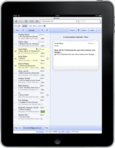
In answer to that, according to the Google Mobile Blog, Gmail is rolling out a new “stacked cards” interface so that it’s easier to get a look at multiple conversations:
Google had this to say about the interface:
In the past, performing actions on selected conversations was awkward. There were two similar toolbars on the screen: one on the bottom left and the other on the top right. The former affected the selected conversations, while the latter affected the currently open conversation. Since the toolbars’ buttons looked similar, it was easy to mistakenly use the wrong toolbar. Sound confusing? It was.
The hope, with the new design, is that the open right panel will leave more work space. This new, open design should make it clear what you’re working with in Gmail.
With this morning’s rumor about the forthcoming Google Chrome tablet in the US, it’s entirely possible that this is yet another piece in the Google tablet puzzle.
Get the TNW newsletter
Get the most important tech news in your inbox each week.
