 YouTube’s new video page look is officially live. It has been accessible via a small hack for some time but now it’s public and available to all.
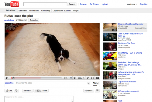
It’s a far cleaner look with much greater focus on the actual content and dare I say it, less advertising? Full details after the jump or read YouTube’s blog post about the change here or check out a sample video page (yes, that’s my dog).
Overall look and functionality
– It’s cleaner, simpler and easier to use.
– Information about a video is now grouped together in one place and there’s a consistent way to get more detail when you need it. This way, unless something’s truly useful to you, it doesn’t clutter up your page.
– Actions bar cleaned; you’ll see a streamlined presentation for sharing, flagging, and embedding controls.
Discovery
– The right-hand side of the page is devoted to the next video to watch.
– The channel name and subscribe button are now both on top of the video.
Playlists
– There’s a new playlist interface, with the next video in the list appearing consistently in the top right. You can easily expand that list or skip ahead using a new next button in the player controls.
– Saving to playlists is easier and Favorites the default option.
Ratings
– Five-star ratings system replaced with a simpler “likes / dislikes” model and introduced a new “Videos I Liked” list.
Comments
– Comments have a new highlights view which summarizes the best discussions and celebrates when creators communicate with their audiences.
Get the TNW newsletter
Get the most important tech news in your inbox each week.
