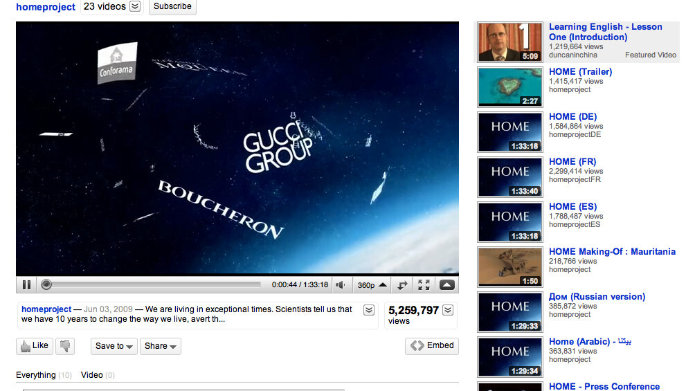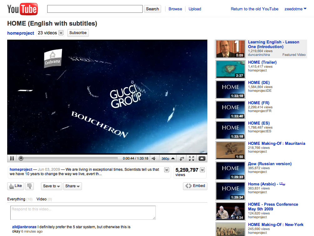
Over the last week, YouTube has gradually rolled out its new ‘Video Page’ design to a select number of beta testers.
The new look comes complete with a greater emphasis on the video, “like” and “dislike” buttons (as opposed to the 5 star rating system), information about the video is slotted underneath the video rather than to the right of it, and the entire page is equipped with expand and contract options that help ensure minimal clutter.
It’s unquestionably a step in the right direction and if you’re keen to try it out simply click on this link. If you’re wanting to switch back, you’ll see a “return to the old YouTube” in the top right corner. Enjoy.

Get the TNW newsletter
Get the most important tech news in your inbox each week.


