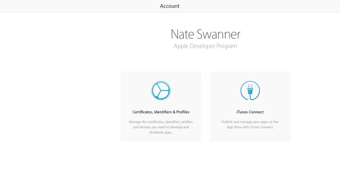
If you login to your Apple developer account today, it may look a little different. It seems Apple has refreshed the page, though it’s not clear if the change affects everyone immediately.
The main portion of the screen has an iTunes Connect button as well as a direct link to manage Certificates, Identifies and Profiles standard. A new side panel gives you quick access to those features as well as CloudKit.
The panel also links to documentation, news, forums and the bug reporter. There’s also a more direct way to manage your membership.
Unfortunately, the aesthetic bump doesn’t carry over into Apple’s other developer pages. The developer libraries, for instance, are still dated. Let’s hope the front page is just the beginning of Apple’s developer portal overhaul.
Get the TNW newsletter
Get the most important tech news in your inbox each week.


