Apple’s newest version of OS X is just around the corner, with many placing bets that it will be released to consumers next week at the company’s October 22 media event.
All signs point to it: OS X Mavericks was upgraded to Gold Master status earlier this month and released to developers, which means that the company has officially finalized it for consumer release.
Apple has touted Mavericks, which it unveiled in June this year, as its most powerful operating system and the most power efficient. The operating system gives laptops and supported devices Finder Tabs, multiple display menus, on-screen notifications, and even iBooks support.
Before OS X Mavericks gets rolled out to consumers though, here’s a look at 10 awesome OS X design concepts — many of them which have been inspired by Apple’s new iOS 7 look.
iOS 7 has been a complete overhaul for Apple, design-wise. From the fonts, to the icons, to the transition effects and beyond — everything looks different in iOS 7 — and it is no wonder why people are keen to see what Apple will change for its OS X look. Here’s a peek at 10 awesome design concepts that have been circulating on the Internet. Be sure to click on the image and/or title of each to view more images from the collection.
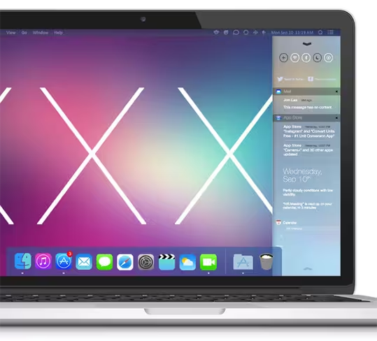
1. The Next Mac OS by Edgar Rios →
Rios has incorporated the sleek Apple look and iOS 7-style icons into what he thinks OS X Mavericks could have looked like — and it’s a flatter but cleaner version of the current style Macbooks have.
He has also incorporated the gaussian blur applied to overlaid menus in iOS 7 to a notification center that sits in the background on the side, which is a pretty cool addition to keep users updated of all their notifications at a glance.
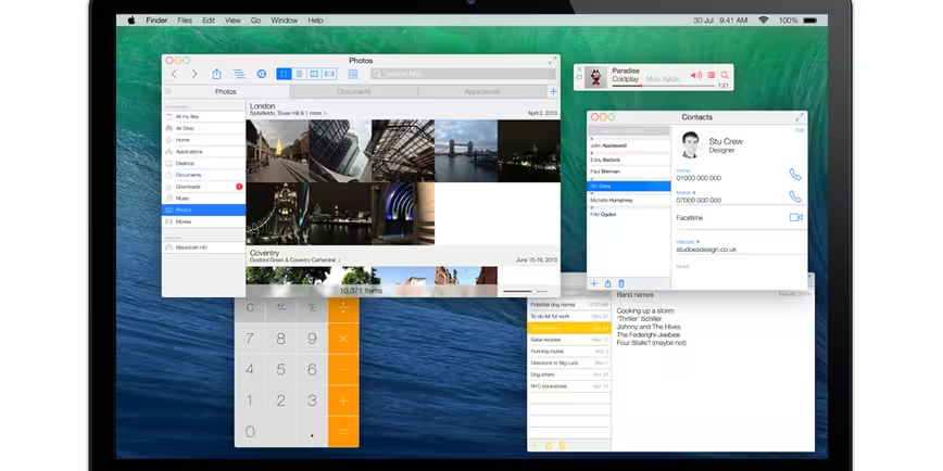
2. OS X Ivericks by Stu Crew →
Flat windows, icons without borders and a translucent menu bar are what this designer has visualized for a future Apple OS. Crew has also created a ‘Photo Stream’ style of viewing images in the Finder, and unlike the previous mock-up, Crew has designed his notification center to take up the whole screen.
What’s more, Crew has also included the possibility of Siri one day arriving on a Macbook. “Will Siri ever make his (or her) way onto the Mac? Who knows. If it does it will probably take it’s design from the iPad and cover the whole screen,” he says.
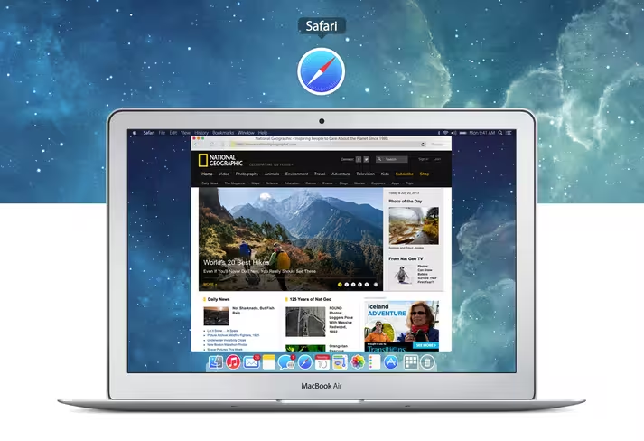
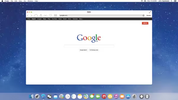
3. OS X 11 – Inspired by iOS 7 (Safari) by Saif Aslam →
The designer here has focused on reimagining Safari for a future Apple OS — and it’s an interesting twist. Besides having white borders, the icons have been flattened and are laid out side-by-side right beside the address bar.
He has also incorporated flatter and simplified iOS 7-style icons, and interestingly enough — stretched the dock so that it extends to the end of the Mac screen.
➤ OS X 11 – Inspired by iOS 7 (Safari)
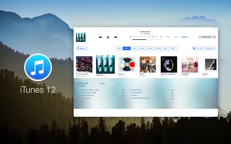
4. iTunes 12 concept by Anton Kovalev →
Kovalev has focused on redesigning iTunes, and it’s a really pretty look at what the music player could probably look like by incorporating iOS 7 design elements.
First of all, the designer has gotten rid of the grey borders and made them white. The iTunes application now looks a lot more colorful, with songs in each album currently playing listed in a blue-gray box below the album art itself — which adopts the blurry effect that iOS 7 is now synonymous with.
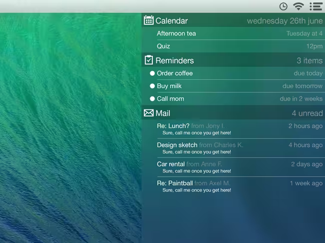
5. Mavericks Notification Center Concept by Gustav Kjellin →
Apple is touting interactive pop-up notifications for OS X Mavericks,which will let you reply to a message, respond to a FaceTime video call or delete an email straight from a notification.
However, Kjellin has a notification center in mind, with notifications from your calendar, mailbox and reminders all gathered within a sidebar to be seen all at one glance. It’s a design concept that would be a very convenient (and elegant) addition to the Mac desktop.
➤ Mavericks Notification Center Concept
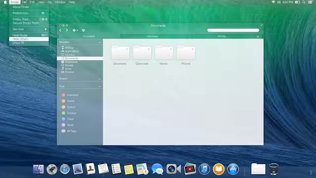
6. OS X 10.9 Mavericks – Concept Art by Franco Creations →
The dock is reimagined by this designer, becoming a translucent one that seems to blend in with the color of your desktop wallpaper. It also sports a much flatter look as the icons are revamped in line with iOS 7.
The Finder also gets a new frosted translucent look instead of the dull gray that is now a trademark of Apple’s design.
➤ OS X 10.9 Mavericks – Concept Art
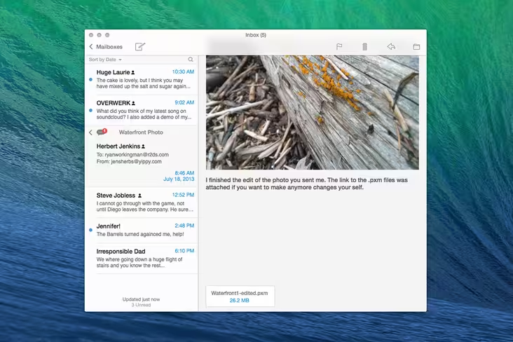
7. OS X Mail Redesign by r2ds →
The Macbook’s Mail app gets a new look — it’s much sleeker, cleaner and brighter, kind of like your ‘Messages’ inbox on your iPhone, but with an extension of content on the right.
The action icons also sport new flatter looks that are located on the top right-hand side of each and every email message, making it more convenient to flag or delete an email, among other options.
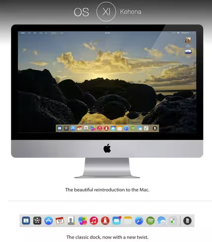
8. OS XI Kehena Concept by Ohsneezeme →
A vision of what OS X Mavericks will look like based on iOS 7, is what this designer describes self-named “OS XI Kehena” as. The reimagined dock changes itself to fit the color scheme of your desktop, while folders within the new Finder show you a preview of what can be found inside each one.
The status bar has also been overhauled to become much simpler, and melts into the desktop wallpaper so you don’t see it unless you want to.
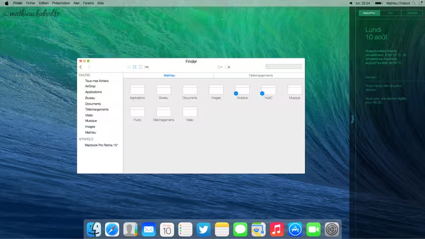
9. OS X Concept by Mathieu Chabod →
Clear and simple are the design themes that Chabod is going by for his vision of OS X Mavericks, and he has tried to delete all the unnecessary elements of the interface. To maintain consistency between OS X and iOS 7, he adopted the ‘previous’ and ‘next’ buttons of Safari in the mobile OS.
Icons-wise, he re-designed them into the style of iOS 7 and they thus sport a flatter and simpler look.
10. New Mac OS X Family by Vitali Zakharoff →
The iOS 7 icons are used in this designer’s rendition of OS X Mavericks, while a notification center (also reminiscent of iOS 7) makes its way onto the desktop.
The blurry effect that iOS 7 is known for has also been transplanted onto the desktop wallpaper.
➤ New Mac OS X Family (via The Zinx)
As OS X Mavericks will soon be released to consumers, these mock-ups will stay just concepts, considering that Apple has already mostly revealed what its latest OS will look like. However, it seems like bringing the translucent, blurry effect of iOS 7 looks great on desktops — simply by looking at these design concepts — and we’d love to see Apple incorporate them into its next desktop OS after Mavericks.
Headline image via Justin Sullivan/Getty Images
Get the TNW newsletter
Get the most important tech news in your inbox each week.

