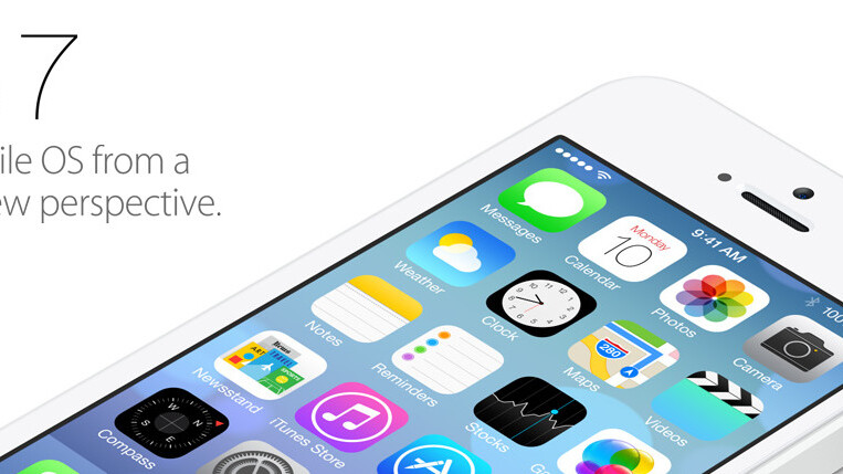
I have been trying to like iOS 7. Really. I watched the videos, played with it on several iPhones, and last night I even installed it on my iPad (which was released yesterday). But I just can’t do it. It has to be said; iOS 7 is just not an improvement over iOS 6.
That’s a bold claim, but give me a few minutes to explain. (And yes, I am aware that iOS 7 is still in beta and not for public release right now.)
It isn’t the first time that Apple has launched something I didn’t immediately like. When I first saw the iPad I thought the spacing of the home screen icons was off and I also remember not liking the black bezels on the MacBook Pro when they were first shown. Of course, once I played around with an iPad or MacBook Pro I pretty soon realized that they just worked, or I simply got used to it.
Unfortunately, iOS 7 is not something you will just get used to.
Inconsistent
So is it really ugly? Yes, it is.
But besides ugly it is also inconsistent. And just not as intuitive as you would expect. It is flatter, yes, and that isn’t a good thing. Flatter design is the hip thing right now, but Apple has always looked beyond hype and ignored what is hip or hot, instead opting for what is useful and intuitive.
So why is it so bad that the new interface is flatter?
There is a simple trick for remembering stuff. Lets assume you have to memorize six names. Lets use Harry, Sally, Boris, Tessa, Sophie and Patrick. The trick is to picture the layout of a house, and then park each person in a different room. You put Harry in the hallway, Sally in the bathroom, Boris in the kitchen, Sophie in the bedroom and Patrick in the basement.
Now, when you need to recollect someone’s name, you walk through your imaginary house and you’ll easily find the names in each room. It is an old trick to remember things and a nice example to explain why iOS sucks.
See, a 3D interface isn’t just a pretty gimmick. It is just easier to navigate through as a user. You remember things by name, color, position, elevation, and association. By flatting the interface you lose some of these attributes. And because of that, it becomes more difficult to navigate.
Design over usability
 When Steve Jobs announced the first version of Mac OS X, he described the new ‘aqua’ interface in an interview with Fortune magazine as follows:
“We made the buttons on the screen look so good you’ll want to lick them.”
With the first version of iOS it was obvious the interface was so intuitive and they made the buttons so slick that you just wanted to touch them.
Everything was optimized for your fingers. Nothing never felt too small or too wide, everything just worked. Enabling ‘Airplane Mode’ was cool just to see the switch go from on to off, and back again. But beyond the coolness factor of a button that looked so real you just had to touch it, it also made the button friendly, recognizable and easy to use.
There’s an advantage to using forms that people are accustomed to.
When Steve Jobs was working on the original Macintosh he tried to persuade Bill Atkinson to use rounded rectangles for floating windows. At first Atkinson refused as he thought it would be too hard to do from a technical stand point. But Steve insisted:
Steve suddenly got more intense. “Rectangles with rounded corners are everywhere! Just look around this room!”. And sure enough, there were lots of them, like the whiteboard and some of the desks and tables. Then he pointed out the window. “And look outside, there’s even more, practically everywhere you look!”. He even persuaded Bill to take a quick walk around the block with him, pointing out every rectangle with rounded corners that he could find.
When Steve and Bill passed a no-parking sign with rounded corners, it did the trick. “OK, I give up”, Bill pleaded. “I’ll see if it’s as hard as I thought.” He went back home to work on it.
![]() At some point the art imitating life got a bit overboard. iCal, the notes app and the Game Center app are some examples of design going too far with imitating reality.
At some point the art imitating life got a bit overboard. iCal, the notes app and the Game Center app are some examples of design going too far with imitating reality.
I totally understand that Apple wanted to get away from the photo realistic interfaces, fake paper and ‘faux’ leather. But going all flat isn’t the solution. It’s a knee-jerk reaction to skeuomorphism that leaves us with a solution that’s worse than the problem.
iOS 7 is flat, and although it is described as an interface where all the unnecessary design elements are gone, what we are left with is an interface that is less intuitive and doesn’t invite the user to touch and play around. It feels more like a well designed magazine that you’ll be afraid to touch because you might smudge the pages.
The menu is indiscernible from the app, it isn’t clear where the titles end and the body text starts. ‘Is that a button, just a text, and if it is a button, how wide is it?’ — I often felt like I was looking at a web interface with a missing CSS style sheet while I was browsing around on my iPad.
Overly focused on design
Steve Jobs once said “Design is not just what it looks like and feels like. Design is how it works.”
iOS 7 is well designed, but it is overly focused on how it looks, and less on how it works. It almost seems like more effort went into making sure it didn’t look like anything we had before, than making it look natural and intuitive to the user. In an effort to get as far away from the over-realistic designs of previous version Apple has sacrificed elements that actually helped us users find our way around.
With iOS, design is no longer just how it works, and that’s too bad.
Get the TNW newsletter
Get the most important tech news in your inbox each week.


