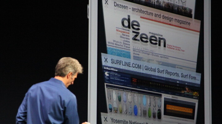
Apple is in the midst of shifting its design language from one of illustration to one of animation. In order to do this, it’s emphasizing the use of a new dynamics engine that will give developers more tools than ever to create interesting tactile experiences.
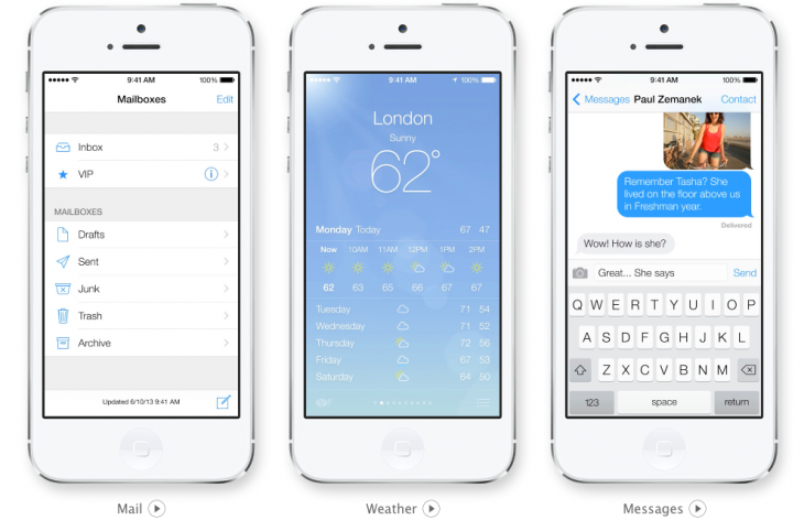
Unfortunately, those experiences don’t always translate well to still screenshots. If developers are aggressive in adopting Apple’s new language, and I think that they will be if the conversations I’ve had at WWDC are any indication, then we’re going to end up with a lot of apps that end up looking very similar in ‘pictures’.
In order to show off the way that the apps use animation to differentiate themselves from other apps, there needs to be a way to display motion content right alongside still content in the screenshot section of the app’s App Store description.
These videos should not be very long. Look at Apple’s new iOS 7 preview site, which is packed with short video examples of many new features that are revealed through animation. They’re not embedded here but you can click on the image to watch them, or click here.
It’s probably a coincidence that many of these interactions or sequences are about as long as a Vine video, but it’s a darn interesting one for sure. There seems to be a sweet spot of attention span and illustrative value in the ‘six second’ video that the Vine folks spent a lot of time divining.
Note that the videos also fill the entire screen, which allows the user to see it as if the app is already installed on their device and running as it will when they buy it. This transformation gives a much better feel for how it will be to actually use the app than a cropped screenshot.
Just after the WWDC keynote, I tweeted that iOS 7 must be seen to be understood, and much of that has to do with the shift away from pixel art as a primary means of communication. There’s a very definite reason why Apple decided to show off iOS 7 with a bunch of video previews.
The new aesthetic of iOS 7 is simply not suited to still images. Animation and interaction is how the next generation of apps will signal, instruct and delight their users, and developers deserve a way to show that off.
Get the TNW newsletter
Get the most important tech news in your inbox each week.


