![A stunning concept of what Apple’s iOS 7 could (and perhaps should) be like [Video]](https://img-cdn.tnwcdn.com/image?fit=1280%2C720&url=https%3A%2F%2Fcdn0.tnwcdn.com%2Fwp-content%2Fblogs.dir%2F1%2Ffiles%2F2013%2F05%2F146170267.jpg&signature=be5ba20362c2ea6105830223d70ae45f)
The folks over at digital agency Simply Zesty have been thinking about what iOS 7, the upcoming new version of Apple’s mobile operating system, will – or should – look like based on the typical rumours and speculation that precede every major Apple event.
With Apple’s WWDC 2013 conference just around the corner, many have started postulating what the future has in store for both iOS and Mac OS X, but it’s always just a bit more tangible when it gets conceptualized in visual form – especially when it’s done by a professional designer.
Enter Simply Zesty’s Art Director, Philip Joyce, who has come up with a way to present what he thinks the next version of iOS should be like. As you may have heard, iOS 7 is expected to be a huge revamp on many levels, including a fresh UI with a very ‘flat’ design.
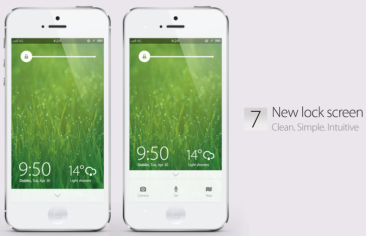
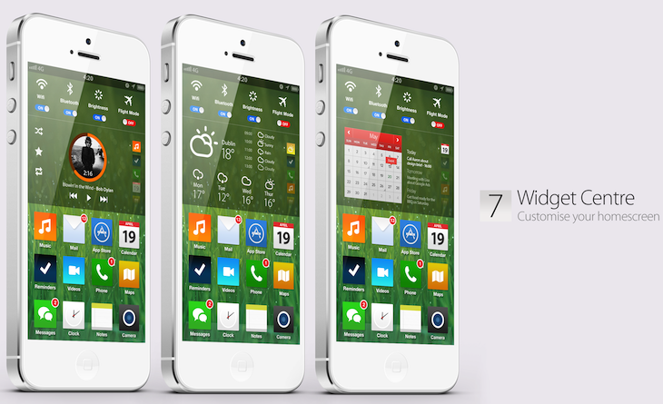
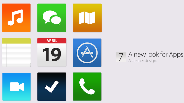
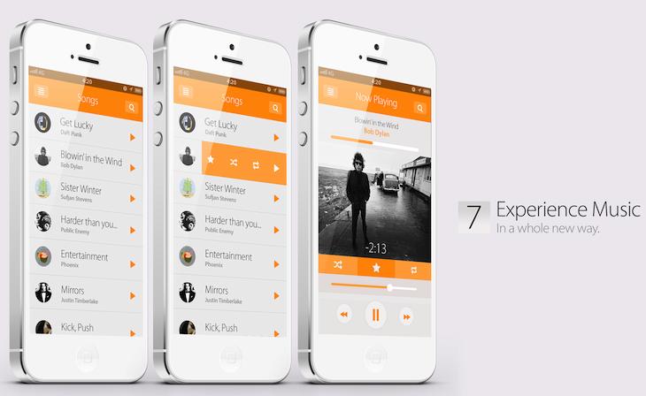
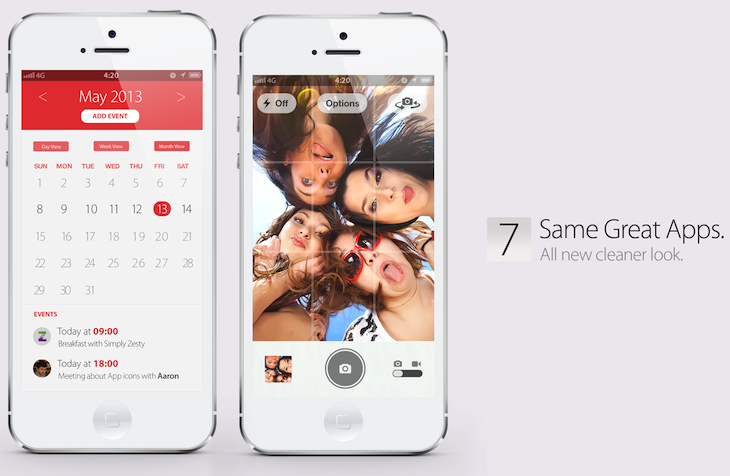
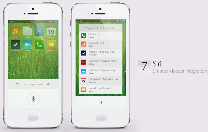
Bearing that in mind, here’s Simply Zesty’s pretty impressive conceptual take on the forthcoming iOS 7 (screenshots below):
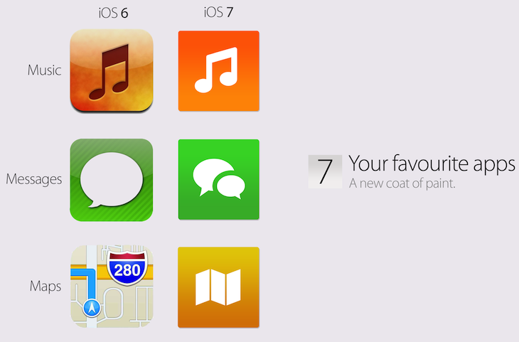
As you can see, it features completely redesigned app icons, a brand new lock and a customizable, widget-rich home screen, and a fresh look for oft-used apps like Calendar, Music, Camera, Siri and Facebook.
I, for one, very much like the concept designs, particularly that of the Music application (see visuals and SlideShare presentation below).
What’s your opinion?
Top image credit: Justin Sullivan / Getty Images
Get the TNW newsletter
Get the most important tech news in your inbox each week.

