The legal scuffle between Apple and Samsung will continue on Monday as both parties return to court for further witness questioning and cross-examination. The testimony will center around design, both industrial and software, as Apple tries to drive home that even though the design of the iPhone and iPad feel obvious now, they weren’t inevitable.
Apple is set to call several more witnesses like industrial designer Peter Bressler and Macintosh iconographer Susan Kare to the stand to testify that Samsung could have gone a variety of other ways with their designs, rather than to duplicate Apple’s.
And, of course, Samsung will cross examine and has already filed a number of objections to the declared statements that Apple’s experts have submitted to the court.
Apple: Just because the iPhone is obvious now, it doesn’t mean that it always was
First up on Monday, after the continuing testimony of Samsung’s Justin Denison, should be Peter Bressler, the former President of the Industrial Designers Society of America. Bressler is being brought in by Apple to talk about Apple’s design patents and how they are clearly not a result of pure function.
Bressler is here to say that Apple created something that feels obvious now, but that wasn’t just an inevitable point in the evolution of cell phones and tablets. They were something new and different that only seem obvious now because they were so well designed.
Bressler is also there to make the point that the Samsung designs for both phones and tablets have become very close to Apple’s, and that this trend began with the introduction of the iPhone in 2007 and the iPad in 2010. In order to do this, he references patent D618,677 for the iPhone and patent D504,889 for the iPad. These design patents are what Apple is using to say that Samsung’s devices look too much like theirs for them not to be copies.
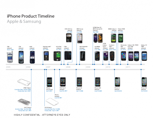
In order to illustrate this, Bressler has created and submitted two timelines, one for Samsung phones and one for tablets, ostensibly demonstrating that Samsung’s industrial design changed significantly around the time that Apple introduced each product, growing to mimic it.
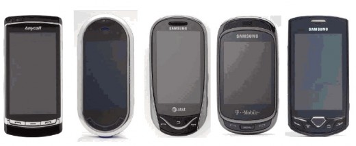
In what is sure to be a point of contention for Samsung, Bressler points to several Samsung designs that were apparently planned to be introduced, but scrapped in favor of more ‘Apple-like’ products after the release of the iPhone. He then uses several released Samsung models to point to the fact that the bezel and general design of the phone does not have to be perfectly rectangular with rounded corners, as Apple’s is:
But, after the iPhone was released, he says, the designs all grew to look very much like it, so closely resembling it that it could be difficult to tell them apart.
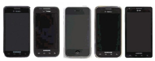
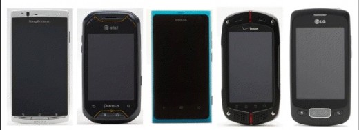
The bezel sizes and shapes of the devices that Bressler references are all very similar in size and color to the iPhone. This, he says, wasn’t something that had to be that way, and he points to the Nokia Lumia 800, Casio G’zOne, Sony Xperia Arc S and other devices that are shown to have a significantly different design from the iPhone, yet function just fine. This, he says, is proof that Apple’s design decisions are just that…design, and not completely dictated by function.
Samsung’s argument is that the iPhone has to be the size, shape and relative design that it is because that is the way that all cell phone designs were going even before it arrived. Bressler says no, that many other designs still work just fine so the iPhone’s design is not the only way to skin the smartphone cat.
The Lumia 800, by the way, is brought up a lot in Bressler’s statements. It’s pointed at quite a bit as an example of a well-designed phone that doesn’t have the same bezel size, color and shape, that doesn’t use rounded corners and that still functions just fine.
Things get even more nitpicky at that point, as Bressler goes into the ‘lozenge-shaped’ speaker hole that Apple’s iPhone uses. The hole, he says, doesn’t have to be that shape, it’s that way because Apple wanted it to be. He points to a bunch of different Samsung phones that had a variety of funky-shaped speaker holes before the iPhone, and points out that now they’re all the same exact shape as Apple’s iPhone. Because the holes obviously could have been any shape, that both indicates that it’s a design choice, not an inevitable function, and that Samsung copied that from Apple.
Samsung, of course, has raised a series of objections related to Bressler’s testimony, so it’s not clear exactly what parts of the originally submitted testimony that the jury will get to hear. Apple has already filed objections to those objections, fighting back on a number of points in order to include many points from Bressler’s testimony on the D’677 and D’899 patents.
Apple’s grid-of-icons interface
The next witness in Apple’s rolling list is Susan Kare, the iconographer who designed many of the interface elements found in the original Macintosh. She’ll be there to talk about the D604,305 and D617,334 patents, which relate to the visual design of the user interface of the iPhone. Specifically, the sticking points are the round-rect icons displayed in a grid and the status bar at the top of the screen.
Kare has been in a back and forth rebuttal battle with Samsung expert Samuel Lucente over whether Samsung’s grid-of-icons is too similar to Apple’s, and whether the status bar is a purely functional design. As with the industrial design patents, Samsung’s object is to convince the jury that this is ‘just how these things have to look in order to work properly’.
If Samsung does its job right, the jury will see the grid of icons and the status bar as something inevitable. A result of the industry as a whole working these problems out and presenting them to the user in the only way possible, rather than a solution that Apple came up with and everyone else adopted.
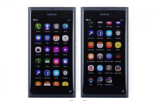
Kare’s testimony points to several examples of other devices like the Nokia N9, the BlackBerry Storm 2 and the Meizu M8 as having a similar grid of icons, but that differentiate themselves from the iPhone significantly in design. The N9, she says, exhibits a layout that features more heavily rounded icons and actually manages to squeeze more apps on the screen.
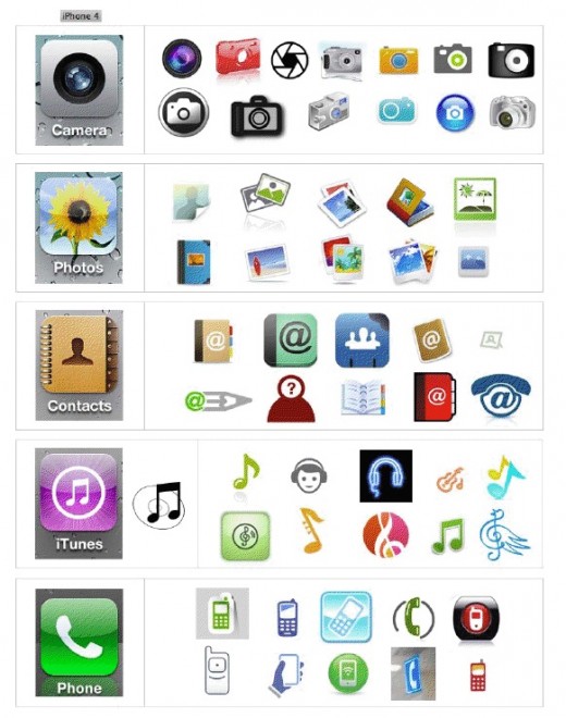
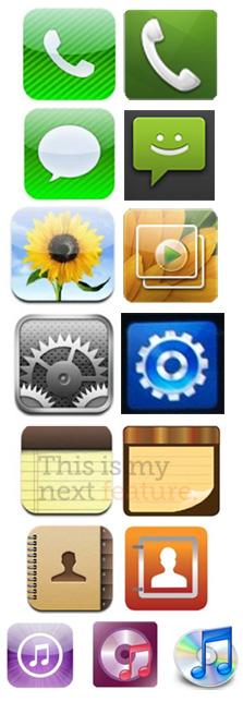
Kare will point to designs of Apple icons that have been duplicated, in many cases almost directly, on Samsung devices. These include the ‘Photos.app’ icon, which displays a yellow sunflower. Almost any icon of a photograph could have been used, says Kare, but Samsung chose to use the same exact breed of flower in its own icon.
For a graphic representation of what Apple is so pissed about with regards to Samsung’s icons, Nilay Patel at The Verge had an excellent comp back in April, shown above. Why did Samsung choose those icons? Once again, it will try to state that the gear, flower, text bubble, phone, CD and more are all inevitable and Apple will argue that they are actually arbitrary decisions that Samsung made to copy flagrantly from their designs.
Obvious vs. Inevitable
Essentially, day 3 of the trial is going to come down to a simple argument, regardless of how complex the testimony gets. Samsung will be trying to convince the jury that the design of the iPhone and its user interface aren’t anything special, that this is just the inevitable result of smartphones and that earlier designs like the LG Prada and others point to a future where every phone had a rectangular rounded-corner shape with a grid of icons displayed on a large screen.
Apple, on the other hand, will be trying to make the point that just because the iPhone looks and feels obvious now, it certainly wasn’t inevitable and that it forever changed the course of smartphone design. But, it will also have to balance that by trying to convince the jury that there are, in fact, other ways to make smartphones that can compete with the iPhone and that still work well.
It’s going to be a tricky tightrope to walk, and we’re still not sure how much of this testimony the jurors will see, as the objections are still being tossed back and forth hot and heavy over the weekend. Any critical ones will have to be addressed before the jury enters the courtroom Monday.
For more coverage, you can see our roundup of day 2 here and our previous summary of the leadup and first day here.
Get the TNW newsletter
Get the most important tech news in your inbox each week.
