This article is an excerpt from TNW’s full review of OS X 10.8 Mountain Lion.
Safari: The best version yet
Along with Mail and other core apps, Safari 6.0 is more of a polish release than anything else. Many of the major improvements have already been seen in developer versions of Safari 5.2, which is now in its 4th beta release. But though 6.0 is essentially taking 5.2’s place in Mountain Lion, it’s been tweaked a bit and has gotten some nice visual and functional tweaks, both in the interface and preferences pane.
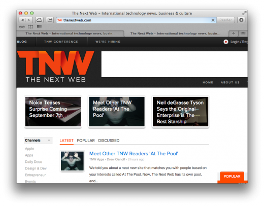
One of the biggest visual changes is that multiple tabs will now stretch to fill the entire width of the window, no matter how few are open. This means that even just two tabs will split the window in width, stretching out to take up the space. It makes it a bit harder to reference the names of the tabs quickly, but it does make them easier to click on as the target area is much larger in general.
But for most people, Safari 6.0 will not be an upgrade to Safari 5.2, but the latest shipping version, 5.1.7. In which case they’re in for some pleasant additions that bring Safari more in line with the most modern versions of its competitor Chrome.
One stop search and browse
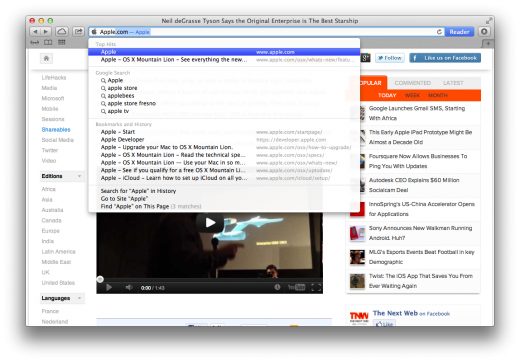
Chief among these is the switch to an ‘smart search field’ in the place of the split URL and search fields along the top of the browser. This kind of unified, ‘type anything here’ interface has been around in Google Chrome for a long time and has been a popular addition for many through the use of plugins. It only makes sense that you would be able to search any term or enter any URL in the same box, two fields just makes it harder for some inexperienced web users to decide. Google and plugin authors call it an ‘omnibar’, but Apple calls it the smart search field and it works fairly well. If you slam a term that it can’t resolve a URL out of into the field, it will automatically perform a search using your default search engine.
This makes the smart search field a one-stop shop for browsing, but Apple has also added a nice set of contextual options that drop down as you begin typing out your term.
These fall into 4 sections: Top Hits, Google Search (or your default search engine), Bookmarks and History and a utility section that allows you to directly visit a site or find your term on the current page. Top Hits will give you your most likely candidates based on your browsing history and a search of major domains.
Google Search delivers you common search items based on your term and Bookmarks and History mines those sections to surface pages you’ve visited in the past. This effectively makes the smart search field a general search tool for your favorite sites, granting you access to them without having to individually dig through your internet history or Bookmark menu. Think of it as Spotlight, but for browser stuff only.
The smart search field also gets a nice visual bump over earlier version of Safari. When you hit enter on a term or URL, there is now a nice lighter blue progress bar with a more subtle gradient. As the search or navigation completes, a soft animation fades the blue out to the right, leaving behind a white bar. It’s a small bit of animation, but makes for a nice touch. The older versions of safari simply loaded the bar and then disappeared it as son as it was complete.
Once a URL has been loaded, it will dispense with the ‘http://’ prefix and begin directly with the domain name. This cleans up the display and mimics what other browsers like Chrome have been doing for a while. Safari also fades the page path after, emphasizing the domain name itself.
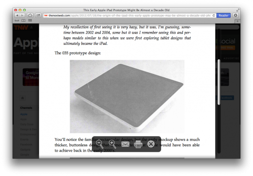
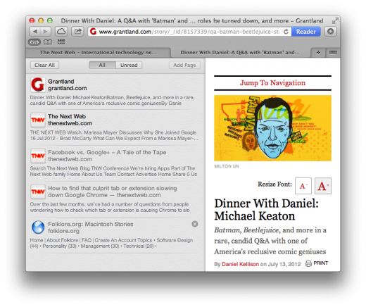
The right side of the smart search field is now dominated by a large blue Reader button on sites that Safari can parse. On those pages, mashing the button will scan the page and render it as crisp, readable text with cleanly embedded images. This is very similar to the mobilizer functions found in Instapaper and the Readability bookmarklet. The more readable version of the page pops up as a lightbox-style overlay that allows you to scroll, magnify, email and print the document as it appears on the page. To exit the Reader mode, you can click on the button, tap the ‘x’ in the control pane at the bottom of the page or click anywhere outside the Reader box.
All of this is relatively unchanged from Safari 5.1.7, but the experience has been streamlined a bit and the Reader button now has a more prominent dedicated location at the end of the smart search field. Making it part of the chrome of the browser, rather than a button that hovers inside the field itself.
Sharing pages and links from Safari
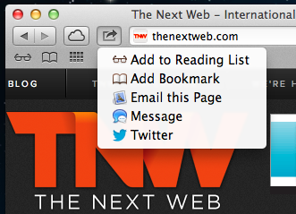
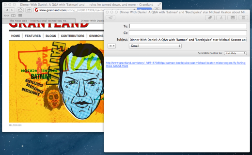
Two new buttons are introduced to the title bar in Safari 6. These include the Share and iCloud tabs features, both of which are included by default. The share button is the same as is found throughout Mountain Lion, but has some contextual options that are unique to Safari.
The button features a list of options that can vary depending on whether you have enabled Twitter and Facebook social accounts in system preferences. But they’re basically the following:
- Add to Reading List
- Add Bookmark
- Email this Page
- Message
The Add to Reading List option will tuck the current away into your reading list, which is accessed via the small eyeglass icon above the tab bar. When you click on the add button, you’ll see the page shrink into a grey Safari icon that zips over to the icon, similar to the way that downloads are initiated. The button will then be animated with a blue progress bar as the page is saved for later reading on or offline.
![]()
The Add Bookmark button does just that, launching the stock bookmark drop down that you can use to organize your references.
The email button opens up Mail 6.0 for you automatically and will begin sharing it according to the settings that you’ve chosen. Mail can share your page as a full embedded webpage, as a link or as a PDF. You can read more about how Mail handles this and how you can change those settings in the section of this review on Mail.
Message will launch a new message dialog right within Safari that lets you specify a recipient and send a message without actually having to switch to the Messages app itself. Just type in the field and a list of your contacts will pop up, letting you send it via iMessage, AIM, Gtalk or whatever protocol you have set.
Twitter and Facebook, if set up, will let you do the same, but out to those social networks. Any use of the @ symbol in a Tweet will bring up auto fill options from your contacts, but not from Twitter itself. When using the social options, the message gets a thumbnail of the page attached with a paper clip in a nice visual way. For some reason, Messages does not do this. In the Twitter pane, you can an option to tweet from any account that you have set up on the system.
On both share sheets for social networks, you’ll have the option to include a location. The Facebook pane allows you to choose a privacy level from Friends only on up.
Note: Facebook integration will not be arriving in Mountain Lion until the fall, likely with the release of Apple’s iOS 6 software.
Reading List
Reading List remains very similar to its appearance in Safari 5, but the background has been changed from the stock ‘light linen’ to a grey texture. Reading List items can now be read both online and off. If you have no internet connection and tap on an item in the list, it will be loaded complete from a local cache.
Note that clicking any links on the page will obviously not work. In a nice touch, the Reader option still does though, which means that its doing its magic by parsing the local cache, not by reaching out and downloading assets.
Any items that you added to your Reading List before Safari 6.0 will not appear offline, as they had to have been added after the feature was present.
iCloud tabs
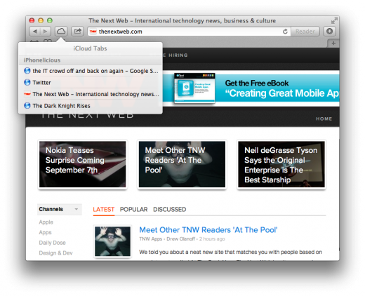
The other major addition to Safari this time around is the ability to pull tabs over from other Mountain Lion computers and, in the future, iOS 6 devices. Any other computer that you would like to share tabs with must also be signed into iCloud for the feature to work.
To activate it, click on the iCloud button and you’ll be presented with a list of tabs that are currently open on other devices. Each section will feature the name of the other Mac or device in the header and a list of the open Safari tabs below it.
In my tests, the tabs sync fairly quickly, within perhaps 30 seconds or less in most cases. The behavior seemed to depend on when OS X decided to poll the other devices via iCloud, but it definitely wasn’t a live update. In order to retrieve the latest tabs, you will need to close the sheet and re-open it. Still, it’s an incredible improvement and insanely useful from the moment you have it. If you work from one machine primarily, you’re probably not going to be all that impressed by it, but if you have more than one Mac, or in the future, a Mac and an iOS device running iOS 6, it’s going to become indispensable.
Yes, this kind of tab syncing has been around via plugins for a while and is a standard feature of Google’s Chrome, but having native support for it on the Mac is welcome and when it’s integrated into iOS devices, it will make it that much more useful.
Pinch to navigate tabs
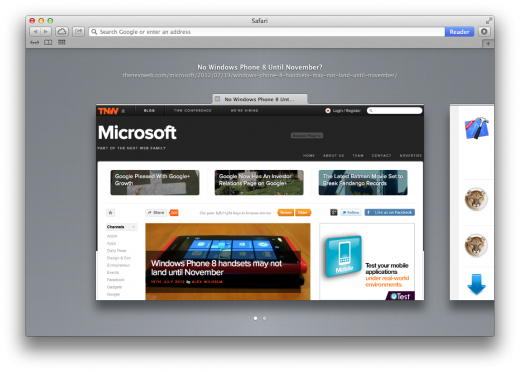
Safari 6 has gotten one additional gesture combination that can prove useful for navigating tabs. If you’re using a computer with a trackpad or a Magic Mouse attached, you can use the two finger ‘pinch’ gesture anywhere inside the main Safari window to bring up a side-scrolling tab browser.
The tabs are represented here visually, with full previews of the windows available. You can scroll through them with a two finger swipe sideways or by clicking on the navigation dots at the bottom. The background is coated in the standard ‘medium grey’ linen. Out of all of our testing, however, this was the one feature that was able to consistently crash Safari 6, so it’s likely got some bugs that need working out. It is a nice way to visually scoot through your open pages though, instead of clicking on random tabs until you find the one you want.
Password, preferences, omissions and tidbits
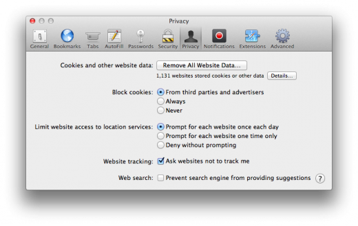
The preferences pane of Safari hides some nice new enhancements. First, Safari now supports the Do Not Track standard, which allows you to tick a box that blocks any participating service or site from using cookies to track your activity on it and other sites. Nearly any site that you visit with ads in place has a tracking cookie of some sort in play.
Enabling do not track in the security pane will notify sites that comply with the standard that you do not wish a tracking cookie to be used. As of now, this is still very much a voluntary thing, so it’s not some sort of magic invisibility pill. Any site that works with the service has to voluntarily support it. Some sites like Twitter have come out in vocal support, while many others that rely on cookies are studiously ignoring it. Still, it’s nice that Safari now complies with the standard.
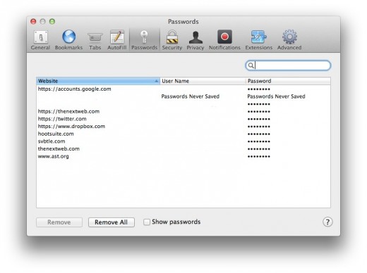
Safari will now autofill your passwords securely for you, in addition to filling in your name, address and other information. You may have seen Safari automatically enter passwords for you before, but those were stored in the system keychain, Safari now has its own password autofill system. In order to manage all of these passwords, there is also now a new pane under preferences. The Passwords pane lists the websites, usernames and passwords that have been saved through the ‘would you like to remember this password’ dialog that pops up when logging in to sites.
The pane allows you to remove specific entries or clear the list completely, as well as search for a specific site or username. The passwords, by default, are blocked out with asterisks, but can be revealed by clicking the toggle at the bottom. This requires that you enter your account password. The password field will reflect the fact that you chose to not remember the password of a site as well.
If you’re a big bookmarks bar user, like I am, you’ll be happy to find that you can now rename those bookmarks right in the bar by clicking and holding on their names.
If you visit the Advanced tab, you’ll notice that the option to set a default font and size has been ditched. This is likely to reflect that most sites specify their own using CSS, but some tweakers will probably be disappointed. The Universal Access options have been renamed to Accessibility to reflect the system-wide terminology change.
One thing that you won’t see anywhere in Safari is support for RSS. You’ll notice that the RSS button is gone from the right side of the URL bar and that there is no longer any options for RSS in the menus. Apple has stripped out support completely for one reason or another. This follows the theme set with Mail 6.0, where RSS has also been removed completely. Perhaps Apple is making a statement about how important it believes RSS to be in the future, or maybe it was just bloating the code. Either way, you’re going to have to use a third party app of some sort to keep track of your RSS feeds now.
Performance
Safari 6.0 uses the latest version of webkit, build 8536.25. It’s faster than ever, easily beating out the current Safari 5.1.7. Substantially improved Javascript performance turns in marks of 220ms or so, which compares well to the latest Chrome builds on the Mac, at around 280ms. General performance is good, as ever, though the current version of Safari is no slouch, so it’s hard to see a huge difference.
Crashes during testing of the latest build were fairly minimal, but included some general use crashes as well as some that could be directly attributed to the new visual tab browser mode. All in all, it’s easily the best version of Safari yet.
Sandboxing
Apple lists Safari as one of the apps that is sandboxed under Mountain Lion, but the story isn’t that simple. Safari’s main process, including the UI and basic application framework, is not actually sandboxed. Only the tabs that display web content are, each one existing in its own slice of system memory, with limited access to resources. This is completely fine on a technical level for the end user, because it provides them with the same kind of protection from system-affecting code running in those tabs as if the whole app was sandboxed.
For developers, though, this is an interesting tidbit, because it means that Apple is still playing with its own rules a bit when it comes to its system apps. Though other apps Apple lists like Mail, Notes, Game Center and Reminders, are completely in their own sandbox, the way that Safari is implemented is a bit of a cheat. Why this is a sticking point for developers going forward is discussed further in the ‘Security, Gatekeeper and the myth of Mac invulnerability’ section.
Notifications
Safari has also added support for HTML 5 notifications. We covered this addition in the Notification Center section of this review, so we suggest you check that out for more information. Here’s the basic premise though:
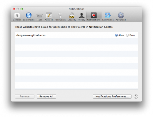
Safari can send either Banner or Alert style notification and it’s not just system notifications. Safari 6.0 actually adopts the HTML 5 standard for web notifications and sends those to the system. This means that web developers who adopt the standard can then ask a user permission to send alerts to OS X from a webpage. Once granted, they can shoot the alerts out to the notification system and they will then be displayed in whatever style you have set up in Notifications Preferences for Safari.
The pane allows you to see which sites have asked for your permission to send notifications out to Notification Center in OS X Mountain Lion. You can allow or deny them from here, or remove the sites permission entries completely.
For more on OS X Mountain Lion, read TNW’s full review here.
Image Credit: Adrian
Get the TNW newsletter
Get the most important tech news in your inbox each week.

