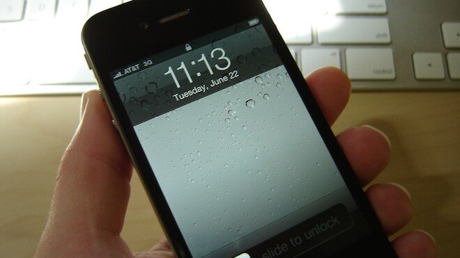
The release of iOS 5 saw Apple address two of the biggest shortcomings of the operating system: dependence on a computer and notifications. It also took tentative steps towards improving its multitasking capabilities by adding four- and five-finger multitasking gestures to the iPad 2 that make it a breeze to get to the Home screen and switch between apps on the device.
I’ve been using multitasking gestures on my first-generation iPad since Apple first introduced them as a developer beta in iOS 4.3 and even went so far as to stay away from iOS 5 when it first shipped with the feature disabled on the original iPad. Apple brought it back—and this time as a fully supported, publicly available feature—in the first update to iOS 5, and I updated my iPad in a hurry.
On the iPad’s large screen, it makes sense to pinch with four or five fingers to get to the Home screen, swipe up with four fingers to bring up the multitasking bar and sideways to switch between apps. But on the iPhone, that’s an impractical solution, and would be more trouble than it’s worth. It would also render one-handed use of the gestures impossible.
UI designer Max Rudberg has come up with a solution for this conundrum that utilises an edge-based gesture. As you can see in the video below, he proposes an implementation where the user swipes up from the bottom edge of the display with a single finger to bring up the multitasking bar. It is simple and makes complete sense, and now that we have seen it, we cannot imagine why Apple would not want to add it to the OS.
Taking it a step further, we think it would be a terrific addition if you can swipe in from the left or right edge of the display to move from one application to another, just like you do with the four-finger horizontal swipe gesture on the iPad. It’ll make switching between your email client and your browser, or your text editor and your notes app, require much less effort than it does now.
If implemented, this will not be the first time that Apple has retooled existing gestures to make them functional using fewer fingers on smaller surfaces. After Apple added four-finger multitasking gestures to its notebook and desktop trackpads, the company later reduced them to one- and two-finger gestures to make them work with the Magic Mouse.
Like the multitasking gestures on the iPad, these new gestures will be in conflict with several third-party apps, which already use edge-based gestures for some of their features. However, the overall benefit to the system as a whole would be significant enough that, in our opinion, it would be a small price to pay to have to use other ways to access those same features on affected apps.
On the iPad, where multitasking gestures have usurped almost all of the Home button’s features, I find myself not using it at all. There is the occasional time where I will double-press the Home button to bring up the media controls when the device is locked, but it mostly just sits there, looking pretty and not doing much at all.
As Rudberg also points out, the Home button on iOS devices is overloaded with functions and becomes less responsive over time due to the wear and tear of constant use. These gestures would dramatically reduce—though by no means eliminate—your use of that button and, in the case of the horizontal swipe feature we suggested, would even make switching between apps faster.
Rudberg also suggests that the features could be optional, with a preference to turn them on in the Settings app, like the current multitasking gestures on the iPad. He’s filed the feature request as a bug report with Apple (radar #10524715), and we hope to see it added as an option in future versions of iOS.
Get the TNW newsletter
Get the most important tech news in your inbox each week.


