Updating the Uber app on your phone may bring a new icon — and you may not like it.
It seems that Uber has ditched the familiar ‘U’ for what appears to be a map with your location at the center. Uber describes the center square-ish piece as a “bit,” and now has separate icons for riders and partners.
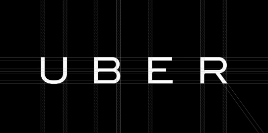
Uber also has a new logotype, which the company says “reflects a more substantial look as we too have matured as a company.” It’s a bit stronger, and more masculine; Uber says it was redesigned so users could identify it from afar.
Another initiative, which the company is calling “Atom,” will bring a unique look and feel to each city in the Uber app. Rather than keep everything static, Uber is trying to afford each city a unique look and feel.


The <3 of EU tech
The latest rumblings from the EU tech scene, a story from our wise ol' founder Boris, and some questionable AI art. It's free, every week, in your inbox. Sign up now!
Again, this all comes via an update, and is a rebranding effort; nothing about your Uber experience has changed, which may be the biggest oversight.
Get the TNW newsletter
Get the most important tech news in your inbox each week.