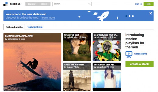
Following its acquisition by YouTube founders Chad Hurley and Steve Chen at the end of April, popular link-sharing website Delicious has relaunched, keeping many of the features that helped draw users to the service but now offers more social features to help organize the best websites around topics that users know about.
Hurley and Chen, now operating under a new business called AVOS, transitioned into the leadership roles for Delicious and were forced to take Delicious back to the drawing board, rebuilding the eight-year-old site from the ground up. As they note in a blog post on the AVOS blog, “the result is a new homepage, interface and back-end architecture designed to make Delicious easier to use”.
The website is in a “back to beta” state, but has launched as a work in progress. The idea is to retain Delicious’ core functionality but improve the way users discover new links and websites, including the new “Stack” feature that helps collate a user’s favourite links into an easy to share collection, effectively becoming “playlists for the web”.
Put simply, Stacks consist of a group of related links that can be personalised with featured images, titles, descriptions and comments for each link. The Stack is then published publicly, allowing over users to track the collection, viewing any new links that are added over time. The same can be done by other users, allowing you to follow a specially curated collection of links that may be relevant to your interests.
Hurley, speaking with AllThingsD in an interview, explains what he hopes Delicious can provide over automated sharing algorithms like Facebook:
At Facebook, they want as many signals in as possible, and that’s great, but right now it’s really noise. We’re really looking for the signal. It’s great to have passive links to share information, and I’m a fan of what they’re doing. I think peole get burned out of actively participating. That’s what we did at YouTube in a way, a really open viewing and sharing experience, where we never asked users to sign in. At Delicious, we’re trying to do that again here — people can get value without signing in.
Delicious still retains the same branding and the overall concept is still the same – users are still able to use a bookmarklet to save links – but the idea is to incrementally expand the website’s functionality, with “[lots] more features waiting in the wings”. Much of the time spent between July and September was to rewrite the website code, rebuild the infrastructure and migrate the site over.
AVOS wants Delicious’ navigation to be simpler, renaming bookmarks to links and has made sure to support the old APIs and feeds from the previous interation of the link-sharing website. The company has also made sure to introduce multi-word tagging and users can upload profile pictures, with “more social features to come”.
The website has more of a social feel to it now, instead of just a wall of text. Delicious now thrusts visual snippets of curated content at you the minute you visit the website, gesturing for you to seek out and view new content. It’s a long way from where it was.
Whether users will want to come back to the website is another matter, before Yahoo sold the company it was floundering and user data had to be migrated to rival services in order to retain curated lists of links in case they went dark. Hurley and Chen are confident they can entice users to the service, whether that happens remains to be seen.
Get the TNW newsletter
Get the most important tech news in your inbox each week.


