Sixty years ago the Brookhaven National Laboratory in Upton, NY held an open house. Visitors who toured the lab were treated to an interactive exhibit, a game titled Tennis for Two. The setup was simple—a 5-inch analog display and two controllers, each with one knob and one button. The world’s first video game was born, but after two years, the exhibit was closed.
Twelve years passed, and an eerily similar arcade game showed up in a bar called Andy Capp’s Tavern. The name of the game? Pong. Its maker? Atari. Seemingly overnight, the burgeoning world of video games was transformed. Novelty became industry.
Since Pong, the complexity of video game graphics has evolved exponentially. We’ve encountered alien insects, elven adventures, and soldiers from every army imaginable. We’ve braved mushroom kingdoms, boxing rings, and an expanding universe of hostile landscapes. While it’s fun to reminisce about the kooky characters and impossible plot lines, it’s also worth discussing the design elements that make video games worth playing—the UI components.
[Read: Playstation 5: All the games announced at Sony’s big event]
Like websites or mobile apps, video games have common UI components that help players navigate, find information, and accomplish goals. From start screens to coin counters, video game UI components are a crucial aspect of playability (a player’s experience of enjoyment and entertainment). To understand how these components impact the gaming experience, we must quickly address two concepts that are vital to video game design: Narrative and The Fourth Wall.
Narrative
Narrative is the story that a video game tells.
The fourth wall
The Fourth Wall is an imaginary barrier between the game player and the space in which the game takes place.
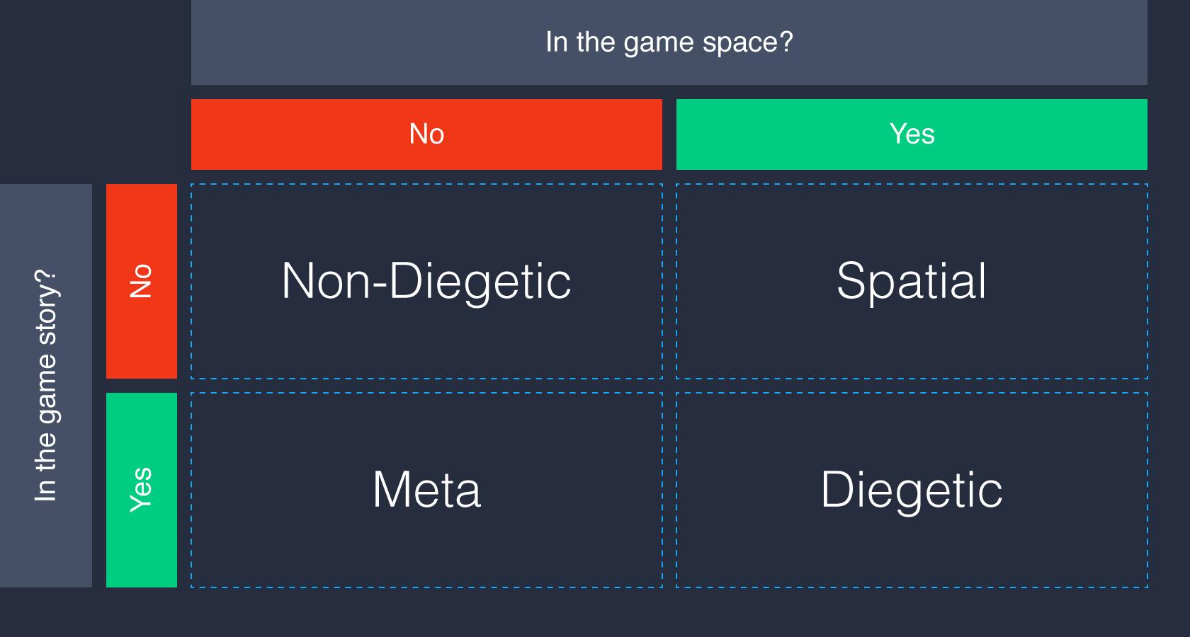
Narrative and The Fourth Wall provide two questions that must be asked of every UI component incorporated into a game:
- Does the component exist in the game story?
- Does the component exist in the game space?
From these two questions, four classes of video game UI components emerge: Non-diegetic; Diegetic; Spatial; and Meta.

Non-Diegetic
- Does the component exist in the game story? No
- Does the component exist in the game space? No
Non-diegetic UI components reside outside of a game’s story and space. None of the characters in the game, including a player’s avatar, are aware that the components exist. The design, placement, and context of non-diegetic components are paramount.
In fast-paced games, non-diegetic components may interrupt a player’s sense of immersion. But in strategy-heavy games, they can provide players with a more nuanced assessment of resources and actions.
Non-Diegetic components commonly appear in video games as stat meters. They keep track of points, time, damage, and various resources that players amass and expend during gameplay.

Diegetic
- Does the component exist in the game story? Yes
- Does the component exist in the game space? Yes
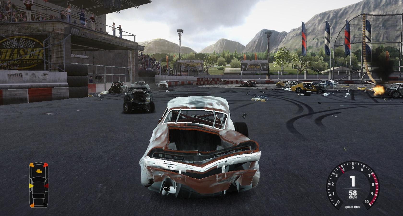
Diegetic UI components inhabit both a game’s story and space, and characters within the game are aware of the components. Even though they exist within the game story and space, poorly considered diegetic components are still capable of distracting or frustrating players.
Scale makes diegetic components tricky. For instance, an in-game speedometer that resides on a vehicle’s dashboard will likely be too small for players to see clearly. In some games, handheld diegetic components (like maps) can be toggled to a 2-D, full-screen view, making them non-diegetic.

Spatial
- Does the component exist in the game story? No
- Does the component exist in the game space? Yes
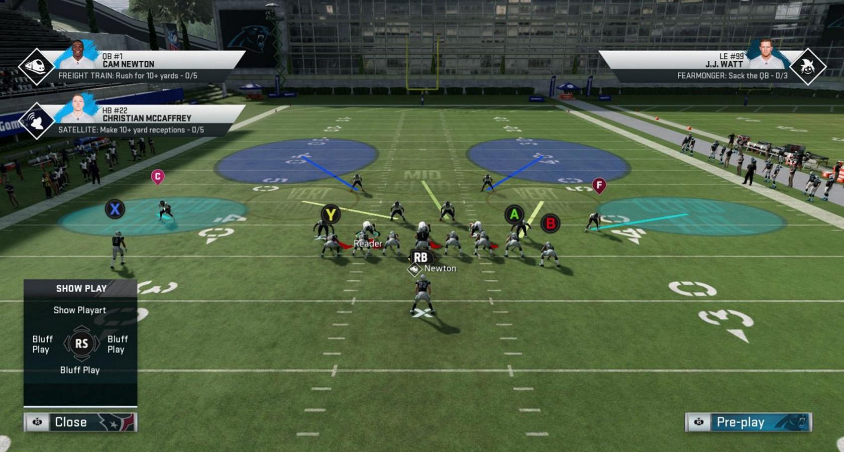
Spatial UI components are found in a game’s space, but characters within the game don’t see them. Spatial components often work as visual aids, helping players select objects, or pointing out important landmarks.
Text labels are a classic example of spatial UI components. In fantasy and adventure games, players may encounter important objects that are unfamiliar in appearance. Text labels quickly remove ambiguity and keep players immersed in the gaming experience.

Meta
- Does the component exist in the game story? Yes
- Does the component exist in the game space? No
Meta UI components exist in a game’s story, but they don’t reside in the game’s space. A player’s avatar may or may not be aware of meta components. Traditionally, meta components have been used to signify damage to a player’s avatar.
Meta components can be quite subtle—like a slowly accumulating layer of dirt on the game’s 2D plane, but they can also feature prominently in the gaming experience. In action and adventure games, the entire field of view is sometimes shaken, blurred, or discolored to show that a player has taken on damage.

Classifying video game UI components isn’t always cut and dry. A life meter may be diegetic in one game but non-diegetic in another. Depending on a game’s narrative and its players’ relationship to the fourth wall, components may blur the line between classes. Likewise, an infinite range of visual styles and configurations can be applied to components according to a game’s art direction.

The Toptal Design Blog is a hub for advanced design studies by professional designers in the Toptal network on all facets of digital design, ranging from detailed design tutorials to in-depth coverage of new design trends, tools, and techniques. You can read the original piece written by Micah Bowers here. Follow the Toptal Design Blog on Twitter, Dribbble, Behance, LinkedIn, Facebook, and Instagram.
Get the TNW newsletter
Get the most important tech news in your inbox each week.


