
Some people think Twitter is all about short messages back and forth but we know better. It’s all about generating all sorts of data which can then be sliced and diced into interesting visualisations. Although there are a number of well known services providing user statistics (TwitterCounter, Tweet Stats, etc.), we wanted to delve a bit deeper than that. Here are some of our favourites.
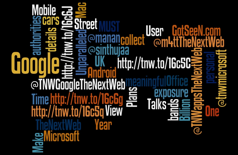
Wordle
We’ll start by looking at interesting visualisations of your own timeline. Wordles are word clouds of any given data source. By providing the RSS feed of your twitter stream, you can create a Wordle of your Twitter stream. The Wordle creator lets you adjust all sorts of visual options allowing you to set colours, fonts and layout to your heart’s content.
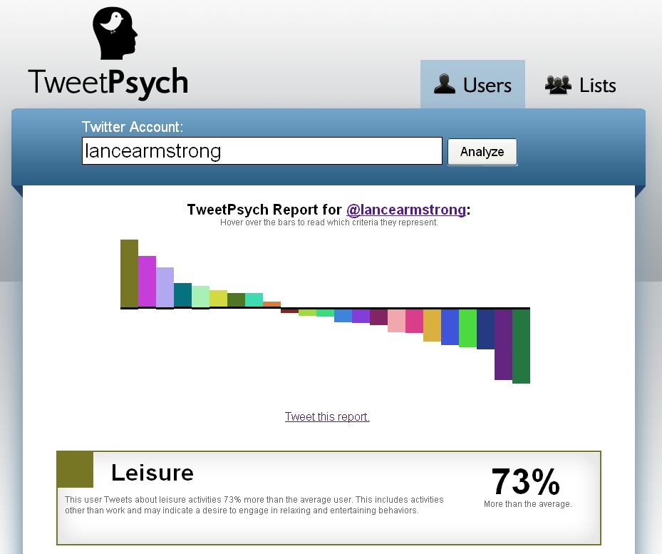
Tweetpsych
Tweetpsych takes an an entirely different approach to assessing your timeline, this time looking for evidence of psychological dimensions.

The 💜 of EU tech
The latest rumblings from the EU tech scene, a story from our wise ol' founder Boris, and some questionable AI art. It's free, every week, in your inbox. Sign up now!
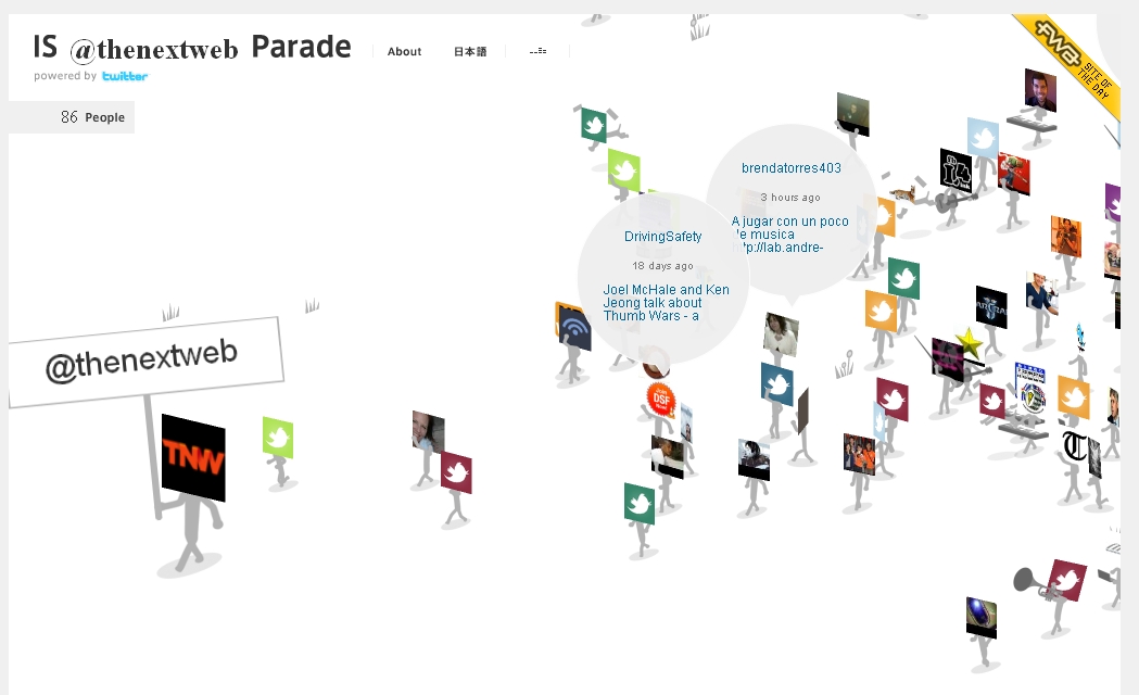
Parades
Once you’ve had a look at your own timeline, it’s interesting to see who is following you. Everyone loves a parade, especially when the parade is in your honour. IS Parade creates a parade showing your followers marching to the drums behind your avatar. Parades can also be created following keywords rather than user names.
TweepsKey
TweepsKey is another way of visualising followers. This one visualizes the importance of your followers by reflecting your followers as a series of dots where the size of the dot is a reflection of an influence measure of the follower.
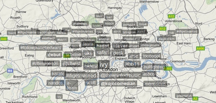
Trendsmap
Of course, Twitter is bigger than your timeline and followers. One of the real powers of Twitter is its ability to aggregate conversations into trends allowing us to instantly tap into the topics of interests to large groups of people. Trendsmap takes this to the logical next step by mapping conversations onto, well, a map. The web app has a rich feature set allowing you to look for specific trends or specific locations.
The Health Tweeder
The Health Tweeder is similar to Trendsmap in that it looks across all Twitter chatter, only this time for specific conversations rather than to identify trends. The service provides a thematic view of health related conversations.
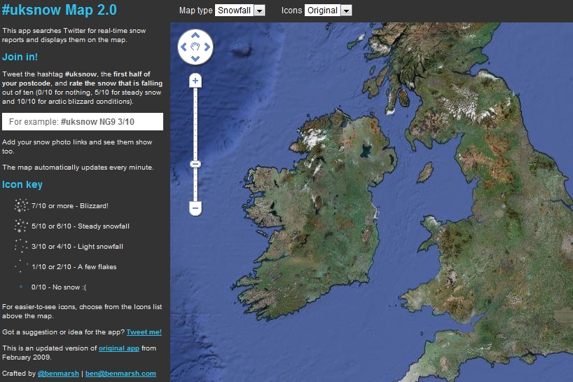
UKSnow
UKSnow works on a similar principle to The Health Tweeder, only looking for weather info rather than health info. The service, a throwback to Britain’s snowy 2009/2010 winter, maps snow related tweets onto a map to generate an overall picture of snow in the UK. With this being the middle of summer, it’s not that useful at the moment but the service is another example of the power of aggregating related tweets to build a consolidated picture.
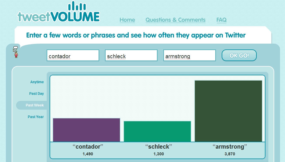
TweetVolume
Looking at trend data means you’re prisoner to whatever most people are talking about. Another interesting dimension is a simple comparison of how many times one word is mentioned versus another. TweetVolume is a service that does just that. It’s plain and simple but it does the job well.
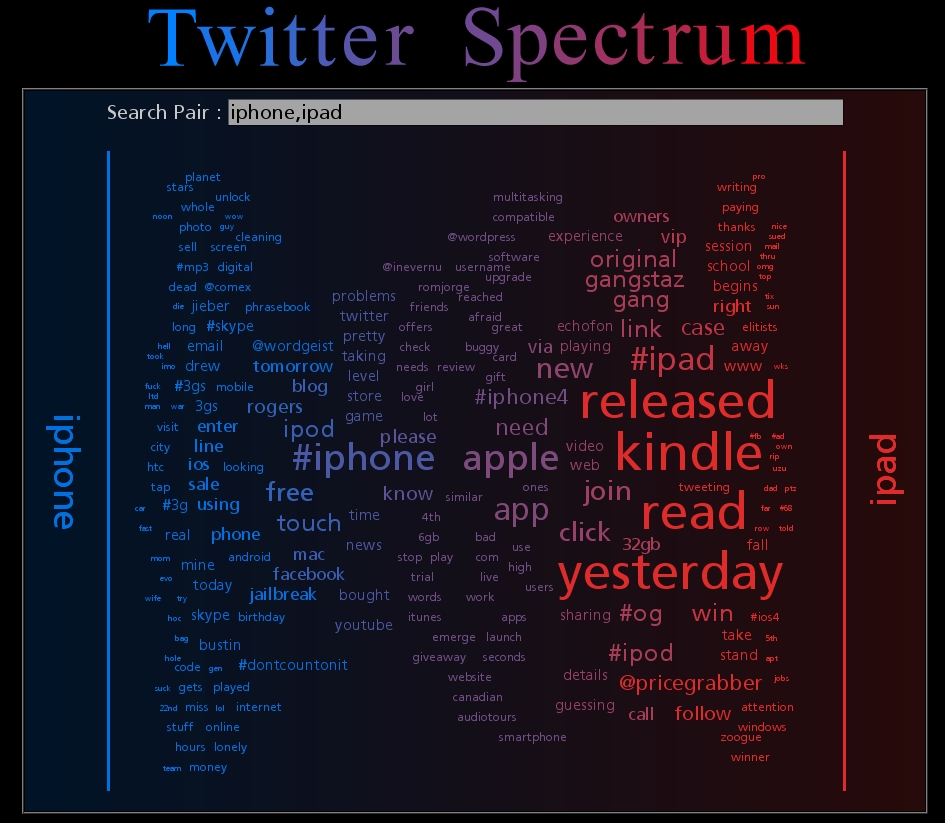
Twitter Spectrum
Twitter Spectrum, one of a series of visualisations by Jeff Clark, is another take on comparing how often selected terms appear. Instead of an absolute numeric analysis, this service then displays other words used in the tweets alongside the search terms.
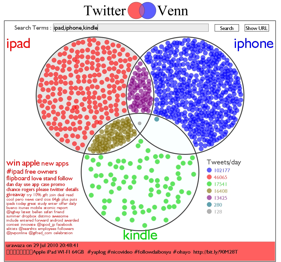
Twitter Venn
Another Jeff Clark visualisation, Twitter Venn does pretty much what the name implies – generates a Venn diagram showing the overlap of tweets mentioning search terms provided.
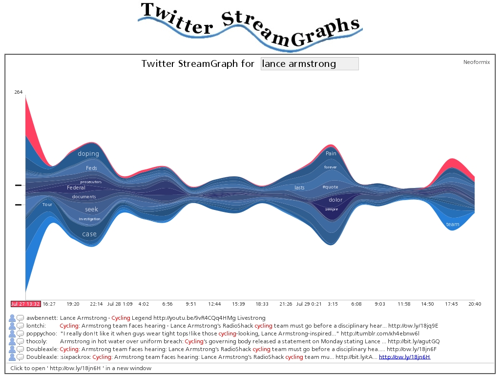
Stream graphs
Another Jeff Clark tool, this one shows the usage over time for the words most highly associated with the search word you enter. The results are spectacularly elegant and give insight into both times of tweets and volumes of specific words.
Visible tweets
Our final option brings it all back down to individual tweets. Rather than use a data aggregation to infer meaning, Visible tweets is a visualisation of individual tweets in a format suitable for large public displays. You can input either an individual username or a search term and the page animates transitions between individual tweets.
If you have a favourite that we’ve missed, please suggest them in the comments section.
Get the TNW newsletter
Get the most important tech news in your inbox each week.