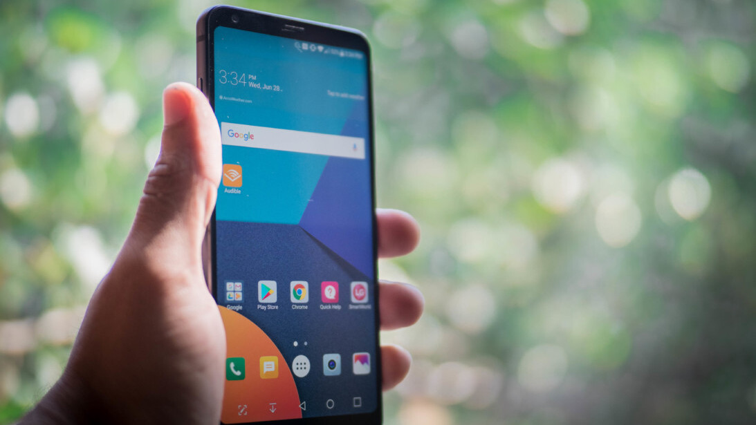
You can’t talk about the G6 without comparing it to the S8. Be warned, I’ll be doing that a lot in this review.
Even as the G6 was first announced and impressed everyone with its minimal bezels, gorgeous display, and refined design, we knew the S8 was right around the corner with, even smaller bezels, an even prettier display, and a sleeker design.
All this means the G6 inevitably feels like it’s playing second fiddle to the S8. But after spending a couple of months with both devices, that may not be such a bad thing.
Specs
- 5.7-inch QHD+ display
- 18:9 aspect ratio. Also known as 2:1. You know, ratios.
- Dolby Vision and HDR10 support
- IP68 water and dust-proofing
- MIL-STD-810G drop resistance
- Dual 13-MP cameras. F2.4 ultra-wide angle and F1.8 standard
- Snapdragon 821
- 4 GB RAM
- 32 GB storage (microSD expandable)
- 3,300 mAh battery
- Wireless charging (US only)
- Android 7.0 Nougat
- Google Assistant support
- Black, Ice Platinum, Optical Marine Blue and Optical Terra Gold colors
Note: LG recently announced a slightly more powerful LG G6+, which goes up to 128GB of storage and adds a Hi-Fi 32-bit Quad DAC. We only reviewed the older model, but you can read up more on the G6+ here.
Design and Hardware
Once you get past the initial prettiness of the S8, there’s something appealing about the relatively tame design of the G6. The phone is attractive enough, with its glass back and metal frame, but it still plays it safe with some of that utilitarian ‘LG’ vibe.
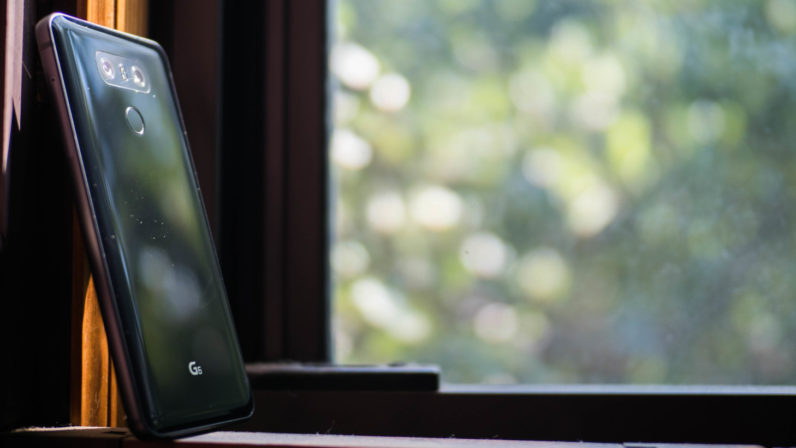
That isn’t necessarily a downside. For those of us that don’t use cases, it’s at least nice that I don’t feel a need to baby the G6 the way I do the S8. And if you do use a case, all you’re going to notice is that beautiful display anyway. Regardless, it’s probably the most premium-feeling phone LG has made (I’d argue the original LG V10 felt just as premium, but I digress).
Mind you, I’ve lost some confidence in the G6’s claimed military-standard drop resistance; I’ve seen too many YouTube drop tests with unsavory results. At the end of the day, it’s still a phone with a glass screen and a glass back. Still, it feels a bit more sturdy, and the flatter sides help it feel more secure in hand. That counts for something.
That Display
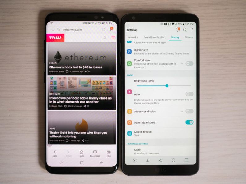
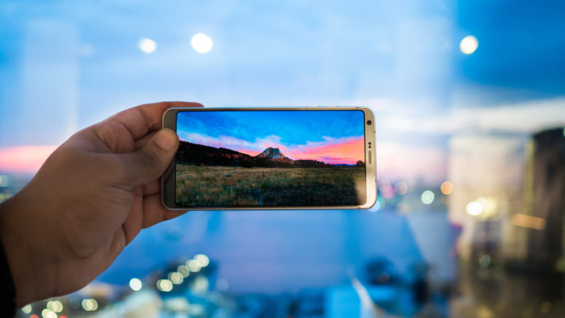
As mentioned before, the screen is a pleasure to behold. That tall aspect ratio and minimal bezels help the display melt away in your hands. It’s arguably most impressive display I’ve seen – right up there with the Galaxy S8.
Being of the LCD variety, it’s not quite as eye-popping as the S8, but the colors feel a little more accurate by default, and LG has finally nailed the white balance. And as much as I prefer the pitch-blacks of OLED displays, I also appreciate how LCDs aren’t prone to distracting color tints at off-center viewing angles – it’s almost like looking at paper.
The screen is rated for HDR10 and Dolby Vision HDR – which work beautifully when watching Netflix – so it’s able to get quite bright and is easily visible outdoors. The rounded corners are icing on the cake.
Unfortunately, the tall aspect ratio means that some apps either dont use up the full display or have elements cut out, and LG isn’t as good about resizing video to fill the screen as Samsung. It also means that while the phone is comfortably narrow, it’s harder to reach items near the top of the screen.
These are issues every phone with a tall display will suffer from. But for some reason I can’t wrap my head around, LG decided to omit a one-handed mode in the software. This was an absolute life-saver on the V20, and ultimately makes that phone easier to use than the G6, despite being much larger overall.
It’s one of those things where if you’ve never used it before, you may not care. I, however, use the one-handed mode multiple times per day, and its omission here repeatedly irked me. Another point for the S8.
Conversely, LG’s fingerprint reader is in a much more comfortable location to access with with one hand, so there’s that.
Performance and Battery Life
The software hasn’t changed much between generations. The headline addition was Google Assistant support, which made the G6 the first non-Google device with the technology – although that isn’t much of a selling point now that it’s spread to other devices.
The UI still features a rather bland white-on-black look, but there are at least some themeing options through LG’s store. More importantly, LG’s skin doesn’t really slow down the phone very much. I just wish LG stuck to a stock Android look, given its custom UI isn’t adding very much in the way of extra features. Samsung has an equally heavy skin, but it looks better and provides more useful additions.
Performance-wise, the G6 and S8 feel similarly zippy for most tasks. The G6 will be slower to load some games and larger apps, sure, but it feels smooth to scroll around and navigate the UI on the whole.
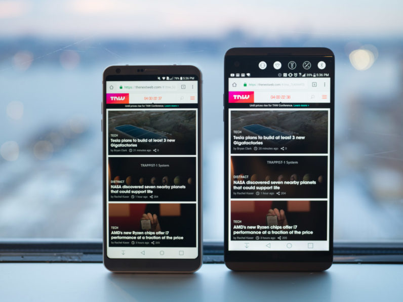
That said, after using the device for several months and populating it with ever more apps, there’s been a little bit of slowdown, but nothing too bad. It’s worth mentioning I’ve noticed slowdown less on the S8 though. As you’d imagine, given the newer processor, it’s probably the better choice if you’re concerned about long-term performance. On the whole though, I find the performance differences between the two phones largely negligible.
The Snapdragon 835’s newer technology is more palpable when it comes to battery life. Though the G6 has a fairly hefty 3,200 mAh battery, its big, bright screen and last generation processor meant that I consistently got worse battery life from it than Samsung’s S8.
I generally found myself getting about 4 or 4.5 hours of screen on time with my typical heavy use. It’s not bad, but the smaller S8 normally netted me about 5.5 hours, and the larger S8+ about 6.5. I wish LG had gone all out and packed in a larger battery to compensate, given it’s already chunkier than Samsung’s devices.
Wide-angle versatility
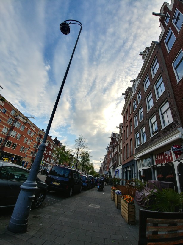
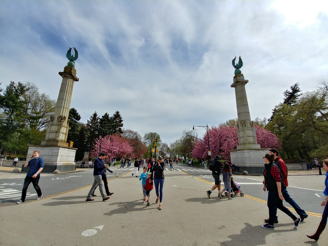
Practically speaking, the camera is the biggest differentiator between the two devices, and it’s a category I think LG handily wins.
Frankly, I think picture quality among any of the flagship phones is a toss-up, though perhaps the S8 gets slightly better results on average. Still, that pales in comparison to the versatility afforded by the wide angle camera.
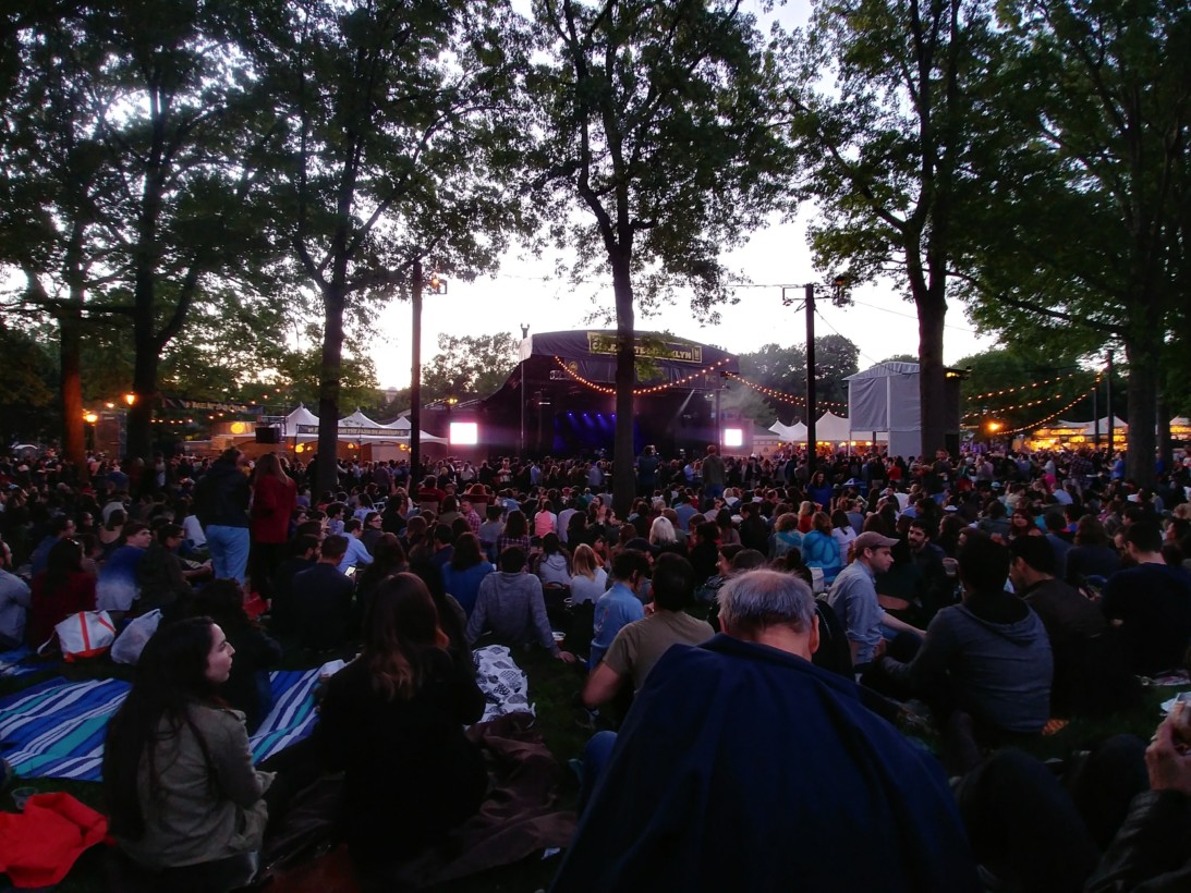
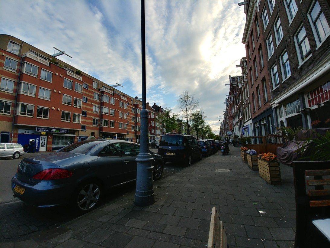
I’ve been using the LG V20 since it launched last year, which also has a second wide-angle camera, and it’s a godsend for crowded spaces and city architecture. Basically, it comes in handy whenever you often don’t have the room to step back far enough to fit everything in your frame.
Of course, you could always do a panorama, but those are slow and prone to stitching errors.
Unlike on the V20(and G5), this time LG is using the same exact sensor for both cameras, making the wide-angle not just a secondary option for perfect lighting – it’s just as capable in low light and high-contrast situations as well.
It would take a dramatic leap in image quality to make me prefer a single lens to a dual-camera setup. LG remains the only manufacturer to pair a normal camera lens with a wide-angle one, and it’s the most practical combination in the business (though I’d love to see a third telephoto lens someday).
Second fiddle isn’t so bad
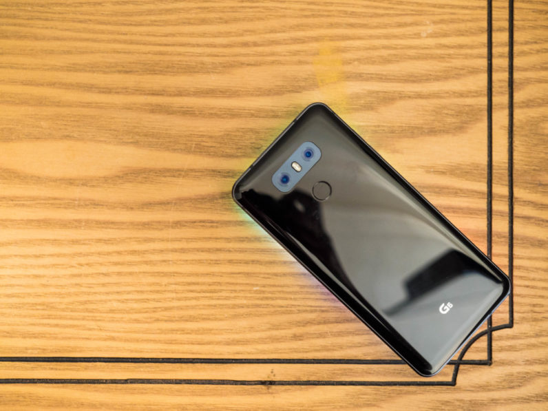
I can’t help but feel LG shot itself a bit in the foot by opting to go with a Snapdragon 821 instead of the newer 835. It kills a bit of the flagship vibe for the spec fiends, and it seems to have a real-world disadvantage regarding battery life.
As such, the Galaxy S8 remains the Android phone I’d recommend to most people, but it’s certainly not the one I’d recommend to all, especially if you’re into mobile photography. That is can be found unlocked for quite a bit cheaper is a nice bonus too.
For all the comparisons, it’s worth acknowledging the G6 is a great phone in its own right. The screen is absolutely fantastic, the build quality and design are quite good, and the camera experience is one of the best around. I just hope LG pushes the bar a little higher next time around.
Get the TNW newsletter
Get the most important tech news in your inbox each week.

