Last week, I put together a piece about the rising size of iPhone screens. It was, in summary, a graph showing them getting bigger. Surprise!
But as the week progressed, I thought about it a bit more and had another thought: what about the evolution of iPhone screen-to-body ratios?
If you don’t know what this is — although the name should give you a very big clue — screen-to-body ratio is a number that shows (roughly) what percentage of the front of a phone is screen, compared to, you know, not screen.
[Read: Why your website’s lack of accessibility options is opening you up to lawsuits]
So I decided the time was nigh to whip up a graph and look at the the history of iPhone screen-to-body ratio.
And, I mean, here it is, I guess:
Are you on mobile? If so, you might not be seeing the graph above (apologies). Request the desktop version of the site on your browser and it should work. Just in case though, I’ve copied a non-interactive version of it for you here:
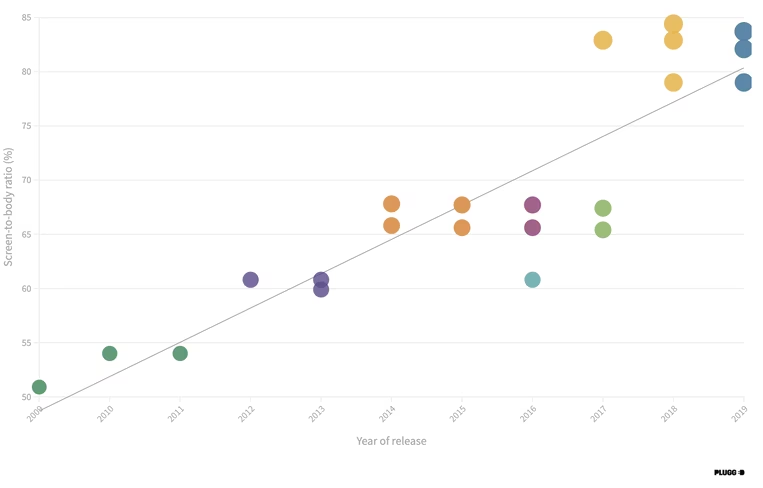
A note though: while this graph gives you an acceptable overview of the iPhone screen-to-body ratio journey, the interactive version above it allows you to actually see which iPhone models are which, as well as the precise percentage ratio. It is just better.
Methodology for the iPhone screen-to-body ratio graph
To get the actual percentage of iPhone screen-to-body ratio, I used data from GSMArena. After that, I just tracked that figure for each iPhone against its year of release.
In regards to the colored dots on the graph, I grouped the iPhones into their respective “ranges,” meaning you can use the filter to narrow the results down.
What can we learn from this graph?
There are a few interesting takeaways.
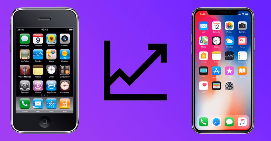
The most obvious is the large evolution in iPhone screen-to-body ratio from 2009 to 2019, with it almost doubling in that time. Still, this isn’t much of a shock when you compare the thick-bezelled 3GS with the iPhone 11 Pro Max, which is basically just one big screen.
How this has evolved is pretty interesting though.
The first four years (between 2009 and 2013) went basically as I’d expected: small jumps in iPhone screen-to-body ratio from device to device. After this, it went in some ways I didn’t expect.
Between 2014 and 2017 (AKA the iPhone 6 to the iPhone 8) there was actually a slight decrease in screen-to-body ratio.
This is because the screen size and overall design stayed the same across the respective models, with the iPhone 6, 7, and 8 Plus devices all having 5.5″ displays. But the actual phones got slightly bigger throughout this period, most likely to accommodate updated parts and batteries.
The biggest leap happened in 2017 though. The screen-to-body ratio rocketed from 65.4% on the iPhone 8 to 82.9% on the iPhone X. This was driven by the removal of TouchID and the old Home button, and the adoption of FaceID, which freed up a whole load of space.
In terms of what’s next for iPhone screen-to-body ratio, there’s still a fair amount of growth possible, due to the current large size of the notch. While other manufacturers have begun using hole-punch displays, which can push the ratio upwards of 90%, Apple has stuck with its ugly little cut-out.
Of course, moving away from the notch is particularly tough for Apple due to the sheer amount of FaceID tech behind it, but the rumor is it’s set to shrink a bit with the iPhone 12, which should give us a couple more percentage points.
Anyway, there you have it: a graph tracking iPhone screen-to-body ratios. Aren’t you lucky.
Get the TNW newsletter
Get the most important tech news in your inbox each week.