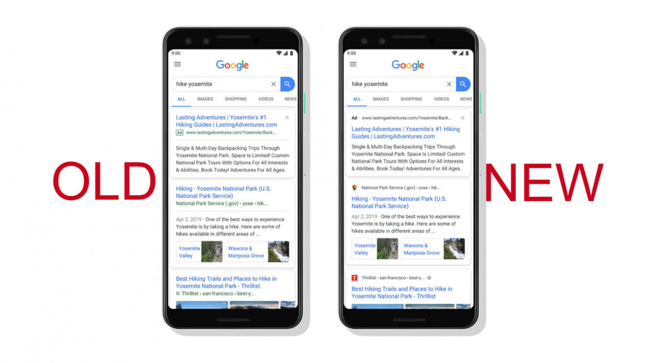
Last year, Google introduced a small but meaningful change to the way it presented search results on mobile – it started to display favicons. This would, in theory, make it easier to visually distinguish trusted sites from shady ones and ads. But when the company started to implement a similar change on its desktop site this year, people were not happy. Now it appears the company is having second thoughts.
Where ads used to be highlighted in green at the top of search results, the change made it so they were only differentiated by a little “Ad” icon. It’s easy to confuse an ad for something else when skimming through search results – which one has to assume was the goal. As noted by Alex Hern of the Guardian, SearchEngineLand has a great synopsis of the changes Google has implemented over years.
A great timeline from https://t.co/MZvT5SOP53 of the slow dismantling of Google's clear advertisement labels, from shaded and coloured backgrounds to a small black "ad" tag pic.twitter.com/FX4RmAgrRH
— hern (@alexhern) January 23, 2020
It’s pretty clear the company has slowly but surely made its ads sneakier, and the gamble appears to be paying off with early improvements in ad traffic. But after the initial backlash, Google says it’s experimenting with a variety of ways to display search results:
Our experimenting will begin today. Over the coming weeks, while we test, some might not see favicons while some might see them in different placements as we look to bring a modern look to desktop….
— Google SearchLiaison (@searchliaison) January 24, 2020
As The Verge points out one of these tests involves removing the favicons altogether, making Google Search results just a plain collection of blue links again. If it ain’t broke…
Get the TNW newsletter
Get the most important tech news in your inbox each week.


