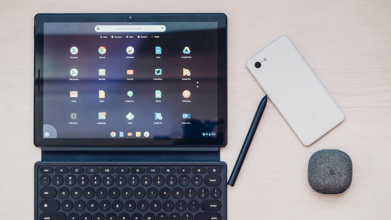
When I first tried the Pixel Slate back at Google’s October event, I left with a mixed first impression of the hardware. It was an undoubtedly gorgeous tablet, but why is it the same size as the Pixelbook? Why is there no headphone jack? Why does the keyboard cost $199 when the tablet starts at $ 599?
After spending a week with a production version of the tablet, those questions have gone unanswered, coalescing with a few new frustrations. The Pixel Slate is a beautiful tablet with a gorgeous screen and a solid keyboard but – to use the oldest of review cliches – I’m just not sure who it’s for.
The Pixel Slate lies somewhere between Microsoft’s Surface and Apple’s iPad in terms of functionality. Chrome OS doesn’t have all the full-fledged desktop apps available on Windows, but it does provide a powerful browsing experience, a real file manager, and a myriad of Android apps available in the Play Store.
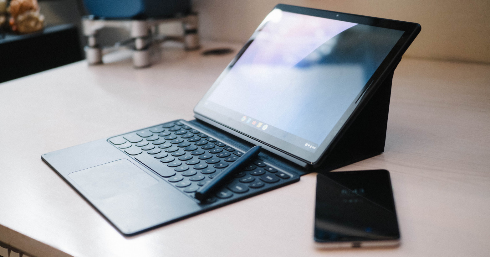
Its design is reflective of this duality, though aesthetically, it’s a bit closer to the iPad Pro. It’s a stunning slab clad in a navy blue anodized aluminum. The buzzwordy ‘Molecular Display’ is bright and super sharp. The colors aren’t quite as vibrant as on the Surface Pro or iPad Pro, but most people won’t notice.
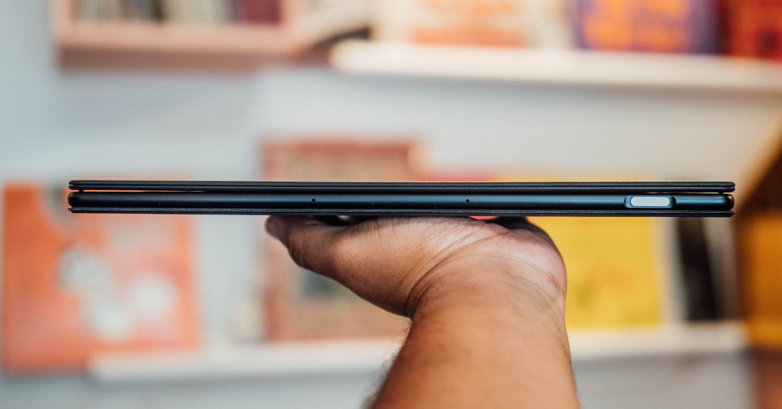
The speakers are nice and loud – better than Microsoft’s with solid stereo separation, but not as good as Apple’s. The lack of a headphone jack is inexplicable on a tablet this size, though unlike the similarly headphone-jack starved iPad Pro, there are two USB-C ports. That at least means you can plug in the included dongle and still have the other port free for charging. You’re definitely going to lose that dongle though.
There’s no kickstand, so the Pixel slate relies on a keyboard cover to stay upright. This cover is so close to being excellent, but major flaws make it a frustrating experience half the time.
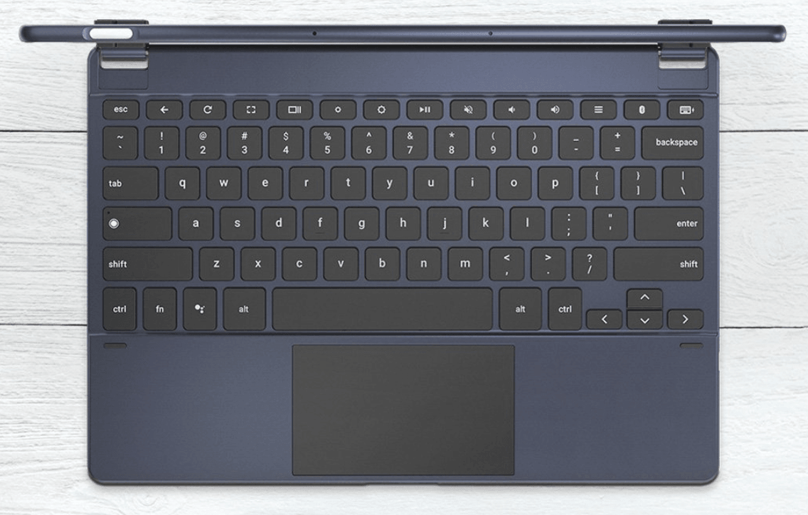
Let’s start with the good. It has a neat soft-touch finish in a matching blue. The keys feel nice, and their circular shape doesn’t bother me at all. The trackpad is large and works smoothly. It has backlighting. A series of magnets makes it surprisingly easy to adjust the display angle – almost as much as a regular laptop. Another set of magnets keep the screen firmly attached to the keyboard and unlikely to topple to the floor if knocked over.
It’s great if you only ever use it on a flat surface.
Because the keyboard doesn’t magnetically latch itself onto the bottom of the screen as with Surface devices, typing on a lap is a wobbly experience. Worse, this flexing causes the trackpad to click itself with any mild pressure applied to the wrist rest area when used on a leg or bed. It happens very often and is supremely annoying.
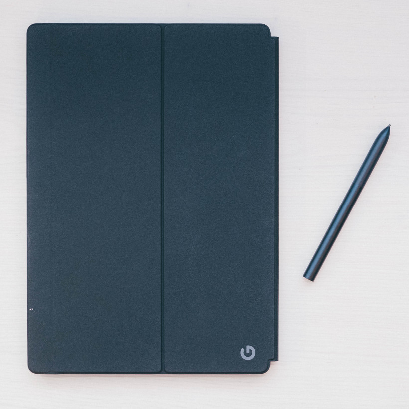
Something less frustrating but still irksome: When the cover is closed, it slips around the display the like a drunken iceskater during an earthquake. It could use a magnet or two to keep things shut. The Surface covers don’t use a magnet, but at least the fabric material creates enough friction for them not to slide around.
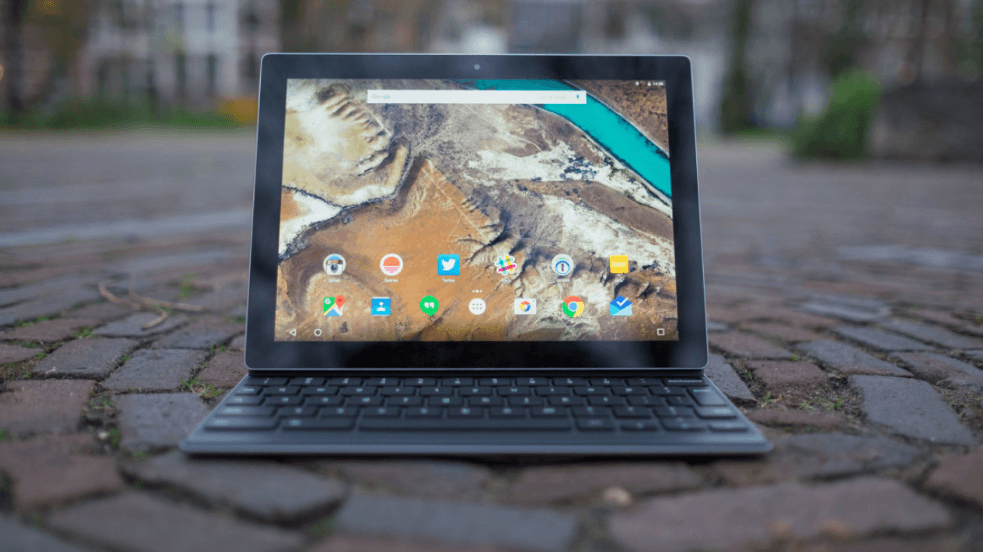
Consider that the tiny Surface Go Type Cover starts at $79 and provides a more satisfying lap experience than Google’s $199 cover. Alternatively, you might as well buy Google’s own Pixelbook, considering it weighs less than the Pixel Slate with the keyboard attached, at 2.7 vs 2.4 lb. Heck, even Google’s first tablet, the Pixel C, provided a better keyboard for portable use, albeit smaller and sans trackpad.
It’s worth noting Google included the $160 Bridge G-Type Keyboard with my review unit. This provides a far more satisfying typing experience, but needs to be connected via Bluetooth, has to be charged separately (although it lasts 3 months on a charge), and weighs half a pound more than Google’s own keyboard. Still, I’d pick this over Google’s solution.
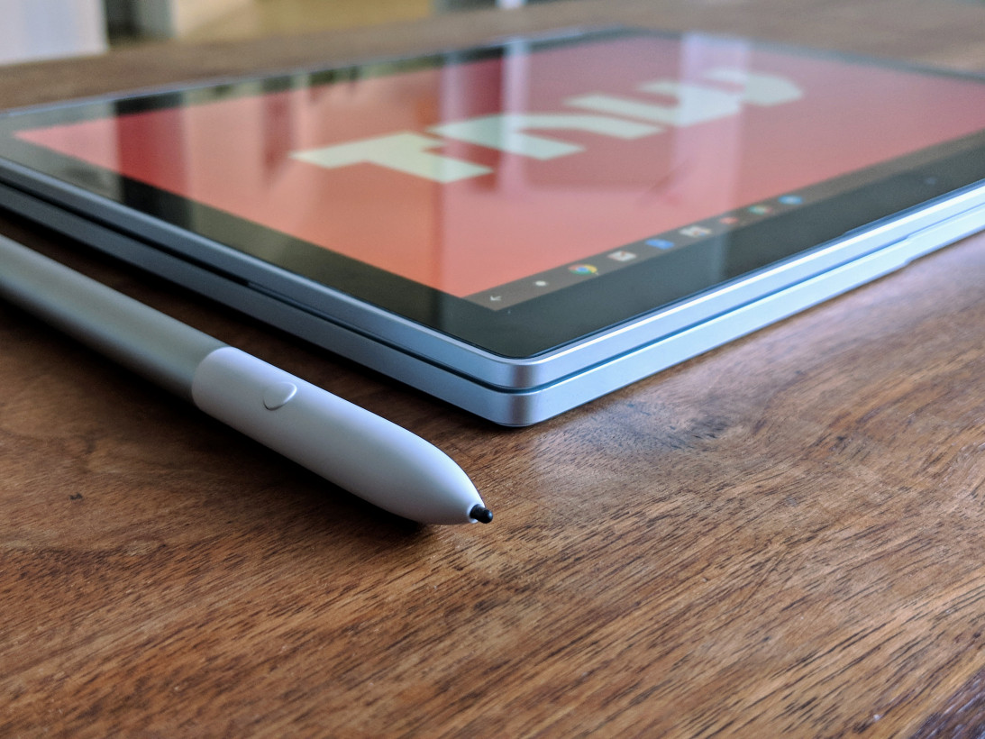
The Pixelbook Pen is okay. It exhibits more latency than the Apple Pencil or Surface Pen, although this depends on the app. You can use it to summon Google Assistant, which is neat, but there’s nowhere to dock the pen when you’re not using it. A magnetic strip a la Surface or iPad Pro would’ve been nice. Even a stick-on pen loop would’ve been appreciated
Chrome OS has seen numerous changes over the years to make it more touch-screen friendly, and Google’s iteration for the Pixel Slate is the best execution of that idea yet, though it still feels like a work in progress in places.
A swipe up from the bottom of the screen lets you access the launcher, a swipe down from the top lets you view recent apps. You can drag apps to the side to enter split screen mode. Simple enough, but it feels less fleshed out than Windows. Some things I noticed:
- You can only use two apps in split screen (Windows does four)
- Chrome OS can be finicky a7bout how small you make each window
- When you resize a split-screen app in laptop mode, the second app doesn’t automatically change with it.
- Some apps were buggy when using split screen, such as not resizing appropriate, or not supporting split screen at all.
I also frequently saw jittery animations when navigating with the touchscreen, the kind that reminded me of where Android was five years ago. My configuration was the $999 model (before keyboard) with an 8th Gen Core i5, 8GB of RAM, and 128GB of Storage. While the Pixel Slate never felt particularly slow, it never felt particularly smooth either. I’ve seen better performance from Chromebooks with worse specs, so it seems to be an optimization problem here. On the plus side, battery life was as solid as I’ve come to expect from Chromebooks, able to get me through a full 8-hour workday at near-full brightness.
Google has spent the past couple of years trying to show Chrome OS can be a full-fledged OS, adding support for Android and Linux apps alike. But with the Pixel Slate, I’m not sure the company has done enough to deserve your hard-earned money. I wouldn’t call the Pixel Slate a failure, but unless you’re a Chrome OS die-hard or money is meaningless to you, there are better options among similarly premium competitors.
If you want a premium Chrome OS device, Google’s own Pixelbook can be found for around $800 new. The base Pixelbook configuration (i5, 8GB RAM, 128GB SSD) will outperform the base Pixel Slate (Celeron, 4GB RAM, 32 GB storage) when you factor in the keyboard’s price. The Pixelbook’s screen isn’t quite as nice, but it still folds into a tablet and the typing experience is far better – while still weighing less than the Pixel Slate + keyboard.
If you’re not tied to Chrome OS, Microsoft’s excellent Surface Go provides similar performance in a much more portable package – with a better keyboard and a tried-and-true desktop OS. At a street price of $500, you get a Pentium Gold processor – good enough, in my experience – 8GB of RAM, and 128GB of expandable storage. Add the $80 or $100 for the Type Cover, depending on your color choice, and you’re still spending less money than the Pixelbook.
If you want something the same size as the Pixel Slate, you can currently buy the new Surface Pro 6 with Type Cover for $800. For that price, you get the same Core i5, 8GB of RAM, and 128 GB of storage as the $1,200 Pixelbook-plus-keyboard configuration I’m testing.
And that’s without even getting into Apple’s iPads or the myriad of other PC and Chrome OS options.
Honestly, I would’ve been just as happy if Google had simply revived the Pixel C with new specs and ditched Android for Chrome OS. Its keyboard suffered from none of the Slate’s wobbliness, and the smaller size made it more useful as a tablet while differentiating it from the Pixelbook. The Pixel C was an excellent piece of hardware without the software to match.
The Pixel Slate gets close on the hardware front, but a steep price and a seriously flawed keyboard cover make Google’s first Chrome OS tablet a disappointing one. If Google wants to be known for its devices as much as its software, it needs to justify the premium price tag. For all but Chrome OS diehards, the Pixel Slate does not.
Get the TNW newsletter
Get the most important tech news in your inbox each week.

