It’s increasingly commonplace for conferences (both tech and otherwise) to offer delegates a mobile app. These promise to help them find talks and make connections, but in practice, often fail to deliver. Nobody is more aware of this right now than the UK’s Conservative Party.
For those not following British politics: The ruling Conservative Party is currently holding its annual party conference in Birmingham, England. It’s a high-security affair, with much of Birmingham’s city center transformed into a heavily-policed ring of steel. If only we could say the same about the conference app, however, which is rife with an array of embarrassing security flaws.
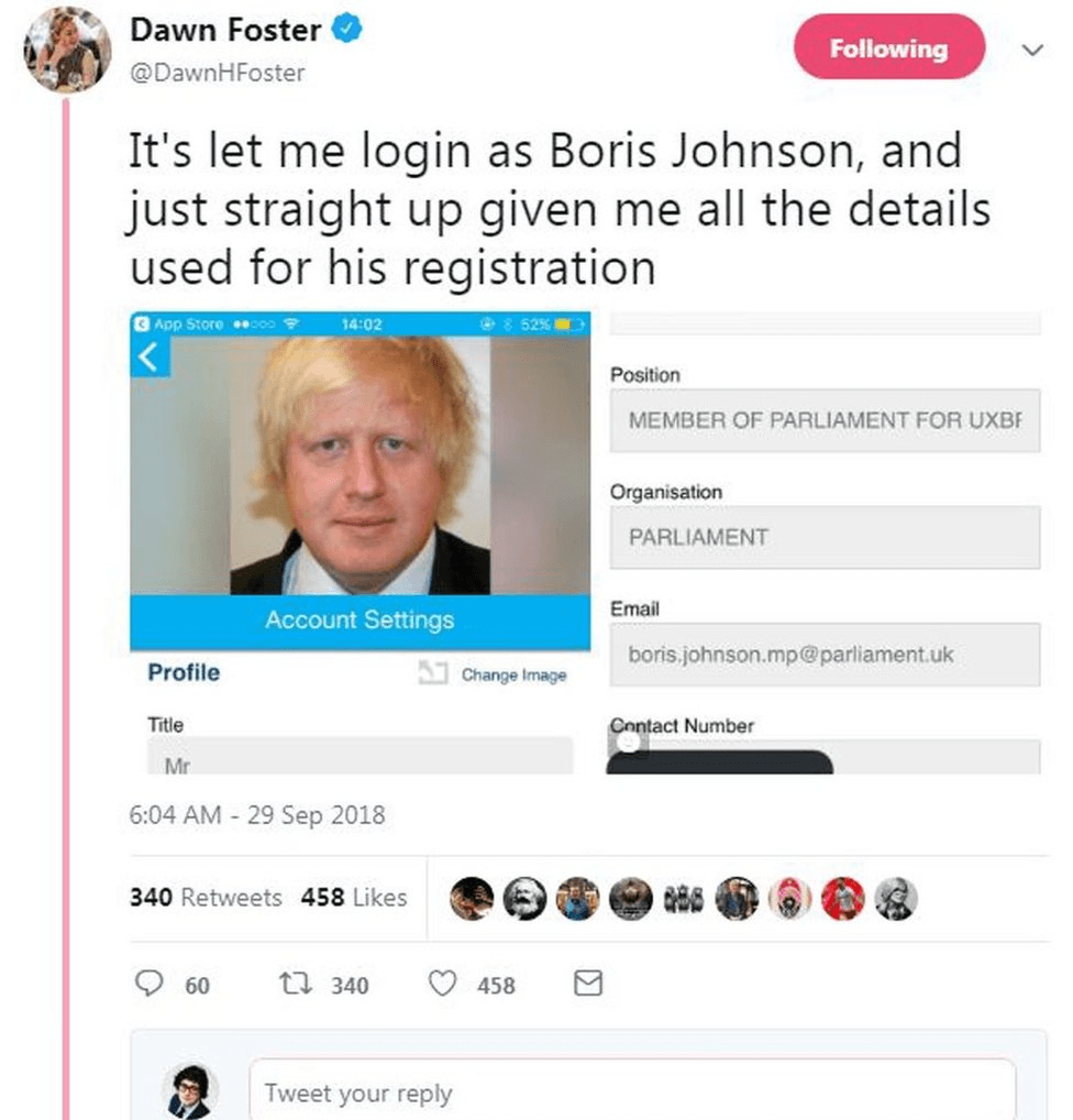
Guardian journalist Dawn Foster was able to log in to the app as former London mayor and foreign secretary Boris Johnson, thereby gaining access to the details he registered with, which includes his private mobile number. According to The Guardian, anyone could access this by merely guessing his email, which, as an MP, is public information.

The app also leaked the details of several other high-profile Tories, including Jeremy Hunt, Philip Hammond, and Gavin Williamson. Some individuals decided to “update” the accounts they accessed. Michael Gove’s profile picture was updated to show Rupert Murdoch, while Johnson’s displayed hardcore pornography.
Most conference apps suck
The Tory party conference app is a notable (and as someone with no love for the Conservatives, hilarious) disaster. But as someone who goes to a lot of technology conferences, what’s interesting is how unsurprising it is.
Conference apps are as close as you’ll get to disposable software. They’re like Pampers diapers; used once, then discarded. As a result, they seldom have the polish you might expect from a commercial piece of code.
I have strong feelings about conference apps. That’s because I’ve had a disproportionate amount of exposure to them. I attend at least one tech conference or event every month (usually more) as part of my job. Until a recent (and long overdue) purge, my phone’s app drawer served as a memorial to tech conferences gone by.
What’s interesting is how the same design and usability mistakes crop up every time. Many, for example, don’t bother caching anything, meaning the user needs to be online to find talk schedules.
That’s not a problem if you’ve got a fast and unlimited mobile data connection, but what if you’re an international visitor paying through the nose for roaming? Or, what if the event takes place somewhere with hardly any mobile reception? And what if the venue ‘s Wi-Fi is overloaded with users and slows to a crawl?
All of those scenarios can render a conference app completely useless. And with events resorting on apps to save on printing costs, you could be left in the dark.
Another disturbing trend I’ve observed is conference apps “reinventing the wheel” by adding social and matchmaking features typically found in other domains, like Twitter and LinkedIn.
Every show: download the conference app
Me: maybe this one won’t suckDownload
Fight with authentication
Realize that it has less utility than website
Delete ?♂️— Stuart Miniman (@stu) September 14, 2018
In theory, this sounds like a good idea. People pay top dollar to attend events, meet people, and create new opportunities. Why not help them along? Sadly, this seldom plays out in practice. In my experience, the social features on most conference apps are half-baked and don’t work particularly well.
That’s not the fault of the developers. I happen to feel sorry for them. For starters, they’re up against a hard, immovable deadline. And then there’s the fact that building a social network from scratch in a few months is a steep task.
And finally — this is as much my personal opinion as anything else — but apps kinda suck, don’t they?
I immensely dislike having to download separate app for every conference. They inevitably suck & clog up phone. s/o build better solution ??
— Carmen Sutter (@c_sutter) January 30, 2017
You’ve got to download them, which is a bit of an effort. Conference apps seldom treat Android and iOS users equally, with one inevitably having an inferior experience. And at the end of the event, you’ve got to remember to delete them.
So, what’s the alternative?
So, before I dive into this bit, I should point out I’m not against apps in all circumstances. They make sense for large-scale events that attract tens (if not hundreds) of thousands of delegates, like Barcelona’s Mobile World Congress, or TNW’s annual event in Amsterdam.
But they are the exception, not the rule. For events with just a few thousand attendees, there are much more sensible options. One option is to have everything written down in a brochure, which participants can recycle after the event. Alternatively, event organizers can publish information about talk schedules and locations online.
I bloody hate conference apps. They meet no real user needs. All anyone wants to know is the agenda.
Conference organisers: stop making shit apps and just put the schedule on the web.
— Sharon O'Dea (@sharonodea) September 29, 2018
Simple is always better than complicated, and in my experience, a website is almost always better than an app.
But if you absolutely must have an app, consider making it a progressive web app. These are standard websites that double as mobile applications, looking and feeling the part. Not only do they support things like push notifications, but they can also work offline.
Problem solved. You’re welcome.
Get the TNW newsletter
Get the most important tech news in your inbox each week.


