I don’t know how this monstrosity was birthed, but YouTube’s new video resolution selector on mobile has got to go.
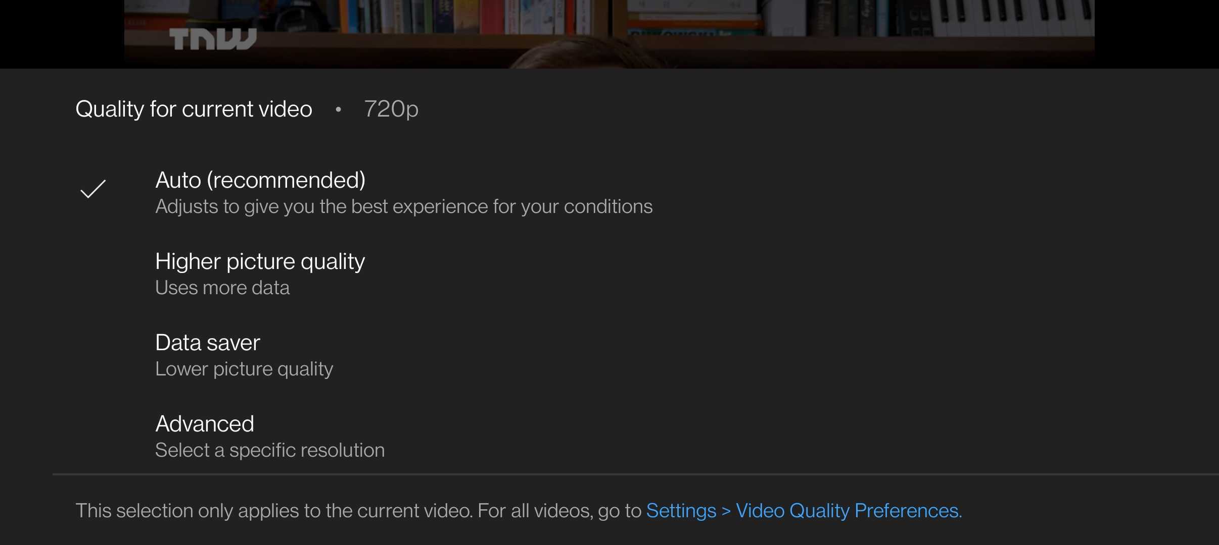
For those of you who haven’t seen it yet, YouTube now has a revamped menu that pops up when you tap the quality button that eschews the standard resolution options of 480p, 720p, 1080p, and so on, for ‘friendlier’ phrasing:

Was this user feedback? Newfangled UX thinking? All I know is it must’ve been unhinged. This isn’t a user experience crime in itself. Perhaps maybe we don’t really need to see what resolution we choose, and it’s best left to the app to decide.
[Read: ]
But here’s the thing: this menu is in the settings for a video that’s currently playing. If I’m popping in here, it’s likely to switch up the video resolution right away, and that point I can probably be trusted to select a resolution on my own.
Plus, if you select ‘Auto’ or ‘Higher,’ it can take a while for YouTube to switch to the best quality stream your connection will support. I frequently watched some 30 seconds of blocky video on a 100Mbps Wi-Fi connection at home like a chump before things cleared up. I imagine this could get sorted out over time, but it’s grating when you have to deal with this every time you fire up a video.
No, it’s not a huge deal. Yes, it might work well for some people. It’s just that this update introduces an annoyance where there was none, and it’s one of those things that a section of users won’t see the benefit of ever. You’re allowed to rant about that sorta thing.
Get the TNW newsletter
Get the most important tech news in your inbox each week.


