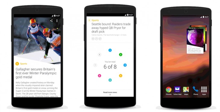
Yesterday, Yahoo announced that its “atomized” news digest was being made available on Android, and in virtually every market in which Yahoo is active.
It’s a bold move for a product that has only been available for less than six months. Behind the ambitious project is Nick D’Aloisio, the 18-year-old who sold his company Summly to Yahoo a little over a year ago for a reported $30 million.
Since then, he’s been working within Yahoo to integrate the technology, and bring his nugget-sized take on news to the masses.
Following the launch of Canadian and International editions of the resulting Yahoo News Digest, TNW caught up with D’Aloisio to talk about the next steps for the service and how the humble newspaper will still inform our news consumption in the future.
It’s been quite a journey already to get this far, can you fill us in on a bit of that journey?
Nick D’Aloisio: For a bit of context, the journey basically began when I joined Yahoo, about this time last year.
Initially, we were taking the Summly technology and the goal was to integrate it in a quick way, so we integrated it into the Yahoo US news app which has been out for about a year now.
That was the initial integration, and for the past 11 months or so, I’ve been working on this new product called Yahoo News Digest and really worked on it from the inception, to the design and now the product.
Working with a great mobile team at Yahoo, we began that journey by announcing at CES on January 7 that it had been released in the US market in English only. The model worked there, so we recursively applied it to the UK market on February 24 by launching it here.
Now we’re launching an international version of the digest and making it available on Android and iOS…. We’re launching in almost every market today.
The Android app itself is inspired a lot by what we did with the iOS design, as the design has been very well received on iOS. We’ve tweaked things to adhere to Google guidelines [and to take advantage of the different feature set, like fonts and home screen widgets]… but the rudimentary user interface, as well as the concept, is very similar to the success we’ve seen on iOS, so we wanted to keep that concept going.
The international digest is really quite interesting because we were inspired by [newspaper’s international editions]. We see this international, English-only edition as our global digest.
So it doesn’t matter what time zone you are in, the notification timing will still be 8am and 6pm local time, you’ll still get a morning and evening digest at your morning and evening timing – and the promise is that when you open up that digest, whatever time it is in the world, those stories will be the most important of the moment.
The agenda is more of a global agenda, editorially we are trying to cover stories that are far more [interesting] to a global audience, rather than the UK or US.
We found it was very important to have a bespoke international edition primarily aimed at people across the world from different time zones that still want to get that sense of completion when it comes to current affairs and world info.
But the international edition still serves up the same content wherever you are in the world? If you’re in Poland, it’s not going to serve you Polish news in English?
Currently the goal of the project is to inform you of global stories, as opposed to the country level or even more granular. But what will happen, because the digest is 24 hour rolling publishing […] when 8am happens in Asia, the stories in that digest will be completely different by the time they get to Germany with the 8am digest there, so in one sense it is bespoke to each country because of the time-zone element.
There’s some responsibility and weight on any service that delivers news to people. How are the stories selected? I’d guess there was some sort of social element, but are the more worthy stories manually curated so people do get to see them still, even if they’re not as popular or ‘clickable’ as other content?
Our main goal is to inform people of everything they should know, as opposed to want to know. As a result, all the [content is] need-to-know news, because of that we don’t have to make many editorial decisions because we’re just covering the things that are very important in the mainstream media anyway in a very different way.
We don’t really tend to think about “which should we include or which shouldn’t we?” it’s more like, if it’s above a certain critical threshold in terms of importance or significance – that we’ve defined – it will be included in the digest, irrespective of whether it leads to click-throughs or whether it’s a good story in terms of sharing.
And how is that critical level of importance decided?
We use an algorithm in editorial [and] there’s an editorial judgement which has always been there since the beginning at Yahoo with what stories get put on the home page. The algorithm takes in social signals, number of articles in a cluster, timing, relevance, things like that. It’s kind of an average of the two.
Presumably you’ve seen some good traction with the launches so far, as you’re now extending the service, are there any figures you can share in terms of users?
The app has been extremely successful on iOS, it has consistently been in the top 20 news on iOS in the UK and US since launch, normally top 10 or so.
Retention we gave on the Q1 earnings call – around 40 percent of all users who download it in a week stick around and use it the following week.
The variables that we see in this product – or KPIs (Key Performance Indicators) – is that we actually want to minimize time spent and maximize use in terms of coming back every day.
Our average session time is only about two minutes thirty seconds, but the goal isn’t necessarily to get people in there for 15 minutes, the goal is to get people to come back twice a day, or at least once a day every day. We’re seeing that reflected in our numbers, that retention.
Obviously the way that you’re curating and delivering the content is a little bit different, but it seems like the underlying outset is different too. You don’t really want people to stick around to read a bunch of stories, which is very different to a lot of other news aggregators or services out there.
We’re very different to other news apps in a number of ways. I’d almost argue we’re the antithesis.
We are definitive where they are personalized. We have a finite stream, where they have infinite streams. We’re twice per day, where they are updating consistently. We’re atomized and summarized whereas they tend to have in-depth article content.
Also, I’d argue that the use-case of [a] digest is to inform the user, whereas the use-case of others could arguably be for wasting time to be honest, if they want people in there for way longer than they should be.
In keeping everything concise and to a minimum, is it actually harder to decide which features you don’t want to include – or perhaps can’t include because it would detract from that core mission?
It’s basically like negative space is more important. The things we don’t include in the content, and UI and design of the product, is just as important as the things we do include.
I’d argue also that we’ve reflected the conceptual element of the product in the user interface. So, the design aesthetic I personally love is very minimalist, clean, it was called international hyper graphic style – it was around in the 1960s. It’s a very highly grid-structured, typographical, super-white space, clean user interface style stuff. It was originally used on posters, but it works very well on a mobile screen real estate because you’re confined to that screen size.
We wanted even the user interface, the elements, the iconography, the accents, to reflect this notion of being super clean and super minimal.
Part of the difference between you and others is your twice-a-day cadence, do you see that changing?
Actually, there have been some competitive apps launched. The New York Times launched New York Times Now which do twice a day briefings, which I would argue is extremely inspired by what we were doing with digest. So we’re definitely excited by the bi-daily model, and I think a lot of other services are going to start using that same paradigm. And to be frank, we didn’t invent that clearly, it came from newspapers.
So, twice a day publishing on digital is almost like an artificial constraint that might work because people behaviourally are so used to it.
It’s interesting that in an industry that’s widely regarded as dying that returning to newspapers is perhaps the future for news.
It is. I think the return to the newspaper medium is incorrect, but the return to the newspaper paradigm is correct.
Newspapers as a concept, although they were constrained by analog mediums, so you had to physically publish it once a day, I think that shaped our behaviour the other way around, but [our relationship with newspapers] became symbiotic where people are so used to it that it’s the best experience now. So totally discarding that, coming up with this bombardment of information, where every second you’re getting new information, I don’t think is the right way to go.
As I’m doing a summary in our digest, I really am trying to distill the information down to its absolute bare essentials. Actually looking at the time element of the stories, temporally when we publish them, is part of that process.
How many people are working away on this? I don’t really have a concept of how many people are curating stories, and working away on the product?
We don’t really give the numbers. It’s in the low order. Under 10, basically, people actually working on the digest.
We’re far more focused on the algorithm. We have a very small team, and the mobile team. We prefer to be nimble when it comes to development anyway, right, because you can move at a quicker rate.
Everything about this is very experimental, this is by no means the finished product, we’ve only been out three or four months and we’re just consistently tweaking, altering and learning.
And is there an ultimate goal or bigger picture that you’re working towards?
When I started Trimit about three years ago now, no one was using words like summarization or atomization. Summarization wasn’t in the eye of the industry. Now it’s really exciting to see other products really evolve and take on this notion of the summary, and distilling the information algorithmically and all that.
Whatever happens, we’re helping the space evolve which is great.
So that’s viewed as healthy competition, as opposed to serious competition?
I don’t think anyone has, at this point, copied the paradigm we have with digest, so it is more competition than copying, but it’ll be good to see in the next few months how other competitors – for example, I mentioned the New York Times Now – there will probably be others that copy that paradigm of briefing in the morning and in the evening and things like that.
Featured Image Credit – Getty Images
Get the TNW newsletter
Get the most important tech news in your inbox each week.


