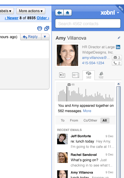
If content is king then context is queen and the castle in which she lives is implementation. Xobni, a contextual plugin for Outlook and Gmail has been hard at work to give its users some much-requested features and the company has been kind enough to give us the heads up on them.
If you’ve been following our coverage lately, you’ll know that we’re big fans of plugins that give more context and function to your email. While Gmail does a pretty good job, there’s a lot of room for improvement. Xobni users have had some pretty specific requests, and the filling of those has brought it back to the forefront of contextual plugins.
So what are people wanting? Here you go:
Minimize: The mini-Xobni will give you more real estate by just clicking on the left of the sidebar.
Faster Composing: Auto-suggest allows you to tab to the next contact in line.
New Colors: Xobni now has a theme to match Gmail’s Bold color theme.
Beyond these three, there have been some slight tweaks to Xobni which will just make it work better:
- Show contextual actions, such as Map this
- New “Add” button next to LinkedIn profile info
- Social updates is now the default tab
- Autosuggest now recognizes recent contacts that you’ve just emailed for the first time
Xobni has also integrated Gmail’s People Widget recently, giving it even more function than the stock Google module. If you’ve not yet given Xobni for Gmail a run, it’s high time that you try. Just head to the site and sign up to get beta access.

Get the TNW newsletter
Get the most important tech news in your inbox each week.


