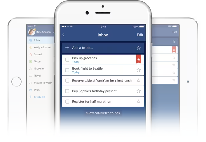
To-do list app Wunderlist has undergone a slick makeover on iOS and added support for 3D Touch.
The new interface is sleek and simple. It puts lists at the forefront, reducing how much space profile pictures take up in the newly designed Home view.
Tapping on lists in the Home view will give you a detailed view of what tasks are within it and allow you to add subtasks, reminders and notes.
Additionally, with support for 3D Touch, you can press on the Wunderlist app icon in your home screen and go direct to adding a task with QuickAdd. 3D Touch also allows you to check what’s on your list for today; by pressing harder on the app’s icon, you’ll see a list of to-dos for that specific day.
Wunderlist is taking advantage of the Peek and Pop functions of 3D Touch. If you press on a to-do, you’ll get a Peek at what it entails. Lifting your finger off the screen at that point will take you back to the list view but if you press a little harder the full detailed view of the task will Pop up. From there you can manage the item, delete it, add to it or just revel at how much you’ve left to do.
Wunderlist’s iOS update was well-overdue as it upgraded the Android app in October, after being acquired by Microsoft in June.
The update rolls out today.
➤ Wunderlist [iOS | Android]
Get the TNW newsletter
Get the most important tech news in your inbox each week.


