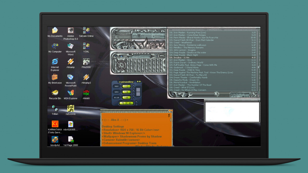
TechCrunch’s recent report about Winamp making a comeback next year nearly made me weep with joy. It hasn’t been updated in five years, but it’s finally slated to return in 2019.
Alexandre Saboundjian, CEO of Radionomy, the company that acquired Winamp back in 2014, explained that the idea for the revamped app is to support everything from MP3s on your hard drive to podcasts from the cloud – and make it all available across your desktop and mobile devices.
That’s all well and good, but honestly, I’m more excited about the prospect of being able to apply skins to this media player app when it’s out.
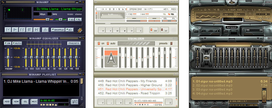
Back in its heyday, Winamp was one of the most popular apps for designers to create themes and change the way the interface looked. Up until version 3, you could change the UI by designing around the app’s template for the various windows that housed the main player, the EQ sliders, and your playlists, like so:
From version 3 onwards, your skins could be completely freeform, which meant that you could shape windows however you liked, decide where buttons would go, and which features would be accessible through the interface. That allowed for far more freedom for designers, who embraced various styles that ranged from minimal to skeuomorphic, and let their imaginations run wild.
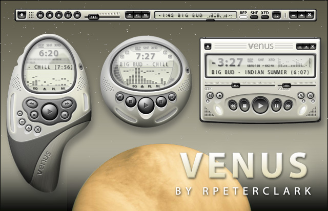
Through high school and college, I managed the Skin & Themes section for Deviantart, an online design and art community with millions of contributing members and enthusiasts. I got a ringside view of how these incredible skins came about, and how much work designers put into these interactive works of art that they released for free. It was incredible to watch them develop their skills and techniques over time, so as to create more compelling skins that truly showcased their styles and approaches to interface design.
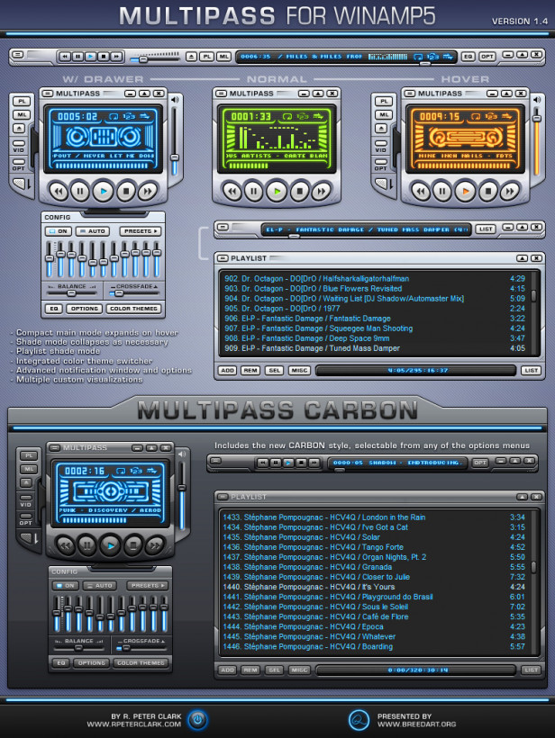
Most modern apps strive for clean designs that bring content to the forefront. But I sorely miss the days when you could skin Winamp to look like a device from an alien spaceship, a minimalist interface that docked to the top of your screen while taking up as little room as possible, or a gadget you might hold in the palm of your hand.

That isn’t to say that app design is dead in 2018, but it’s no longer about personalization. As someone who’s grown up with a wide range of software that allowed to customize the way it looked (what up, KewlpÄd fans?), I sorely miss the availability of skins and themes, as well as the vibrant communities of designers and artists who came together to make their favorite apps look their best.
Radionomy hasn’t shared much more about its plans for the next version of Winamp, and I’ve written to ask if it’ll support skins.
Get the TNW newsletter
Get the most important tech news in your inbox each week.


