
Wikipedia is one of the Web’s most visited properties. From quantum mechanics to Laurel and Hardy, the online encyclopedia delivers good primers on just about any topic you can think of. But doesn’t the interface sometimes feel as though it belongs to a previous era? The Wikipedia of August 2004 reveals not a lot has changed, aesthetically at least. This is where WikiWand wants to help.
WikiWand is the handiwork of Lior Grossman, who co-founded the startup back in 2013 before recently tying up $600,000 in funding to build the Wikipedia of the Future. Available as an extension for Chrome, Firefox and Safari, WikiWand takes seconds to install and serves up instant access to a very different ‘look and feel’ for Wikipedia each time you click a link to the site.
How it looks
Tapping the open Wikipedia API, WikiWand reels in all the elements from any Wikipedia article and presents them on its own domain with its own interface. As you can see here by comparing the Google entry from WikiWand and Wikipedia, the former livens articles up with big, immersive cover photos, as well as more prominent thumbnails.
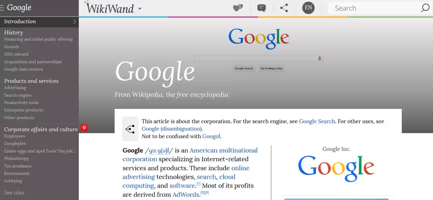
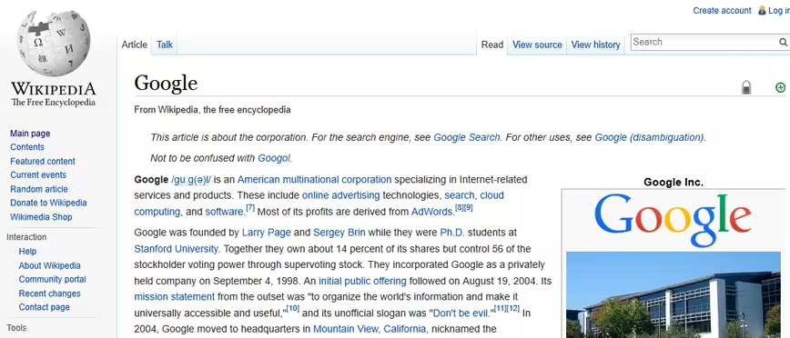
Each WikiWand page also has a ‘Share’ button to make it easy to propagate articles across the Web. But it’s only when you begin navigating the platform when you start noticing the little improvements that make a big difference.
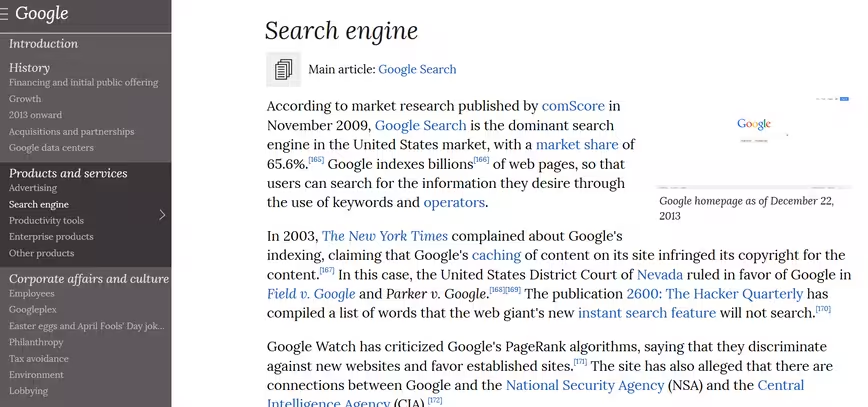
For example, when scrolling a long page, Wikipedia can get a little annoying when you have to jump back to the top to peruse the main sub-section menu. With WikiWand, you have a fixed ‘Contents’ table on the left that’s always visible regardless of where you are on the page.
Helpfully, the relevant section in the menu always highlights where you currently are in the main article – and you can easily jump to a new section by clicking on a specific ‘broad’ category.
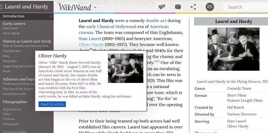
Moreover, any additional URLs contained within a Wikipedia article have a link preview in WikiWand, which gives you the general gist of a related topic without having to click through.
If you’re looking to edit articles, there is an option to do so from within the main WikiWand menu, but it merely links you through to the editing pane on WikiPedia, which is to be expected really.
![]() The more you use WikiWand, the more you notice little design touches that add to the overall experience. For example, when you enter a search term, you’ll see a list of relevant results with different icons representing location, people, companies and more.
The more you use WikiWand, the more you notice little design touches that add to the overall experience. For example, when you enter a search term, you’ll see a list of relevant results with different icons representing location, people, companies and more.
Once you’ve used WikiWand for a while, it’s actually difficult going back to the main Wikipedia portal, as its age really starts to show. If you do wish to return to the original entry, there is an option in the main menu to ‘Read on Wikipedia’, though any subsequent links you click on will take you back to WikiWand – so this will require a full uninstall/disable if you no longer wish to use it.
It’s still early days, but WikiWand shows a lot of potential and it will be interesting to see where it goes from here. With $600,000 in its coffers, the company says it plans to introduce native mobile apps by the end of the year.
Furthermore, it has also given some indication as to how it plans to monetize in the future. While the Wikimedia Foundation garners its funds from user donations, WikiWand says it plans to integrate “contextually-relevant ads for textbooks, articles and courses”, with 30 percent of its profits being donated to the Wikimedia Foundation.
You can download WikiWand for Chrome, Firefox and Safari now.
➤ WikiWand
Main Image Credit: Shutterstock
Get the TNW newsletter
Get the most important tech news in your inbox each week.


