Wikipedia is now officially rolling out a redesigned mobile site to users globally this week, following testing on its experimental Beta site.
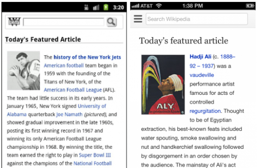
As Wikipedia explains, the updated design features a greatly improved navigation system that “makes it easier to explore [Wikipedia’s] content” and includes a number of “visual improvements aimed at increasing the readability of articles.” Judging from Wikipedia’s last mobile site redesign, which occurred back in September 2011, this is without a doubt a major improvement in terms of both usability and general quality.
We’ve included the two designs below for comparison (see full-size here & here):

With this new design, Wikipedia is pushing typography more than anything else, explaining that it chose “new fonts for improved device compatibility, ease of scannability and reading, and, more generally, to better fit the high quality standards to which all Wikimedia projects strive.” Wikipedia adds that its “designers will continue to focus on typography going forward, since text is the primary way readers and editors interact with the site.”
Wikipedia’s goal of improving the accessibility and quality of its mobile site has definitely been achieved — judging by what we’ve observed while using the site today — and given that Wikipedia hopes to reach 4 billion mobile pageviews per month by June 2013, today’s redesign wont hurt. Add in the fact that Wikipedia is now completely free to use (i.e.: no data charges) for 230 million mobile users globally through Wikipedia Zero, and you’re left with a tons of potential eyes ready to play with the new site.
Check it out for yourself and tell us what you think in the comments.
Image credit: Thinkstock
Get the TNW newsletter
Get the most important tech news in your inbox each week.


