Wikipedia has just announced its updated site and logo. We’ll have a detailed run through the changes shortly but in the mean time this is what’s changed:
- Look and feel: We’ve introduced a new theme we call “Vector” which makes essential functions easier to find.
- Navigation: We’ve improved the navigation for reading and editing pages. Now, the tabs at the top of each page more clearly define whether you’re reading or editing a page. There’s also a collapsible navigation for the left sidebar that hides items that aren’t used often, but allows them to continue to be easily accessible.
- Editing improvements: We’ve reorganized the editing toolbar to make it easier to use. Now, formatting pages is simpler and more intuitive. And we’ve introduced a table wizard to make creating tables easier. You’ll also discover a new find and replace feature to simplify page editing.
- Link wizard: An easy-to-use tool allows you to add links to other pages on Wikipedia, or to pages on external sites.
- Search improvements: Search suggestions are now improved to get you to the page you are looking for more quickly.
- Pediapress book creator: Create a book by selecting Wikipedia articles and adding them to the Book Creator. Your articles will be turned into a PDF (or OpenDocument) file so you can easily take Wikipedia wherever you go.
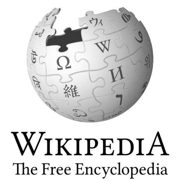
- Updated Puzzle globe and wordmark: The well-known Wikipedia globe and wordmark have been enhanced and improved. We’ve introduced Linux Libertine, an open source typeface to help support the creation of hundreds of localized Wikipedia wordmarks, and the internationally-recognized puzzle globe has been recreated in 3D and includes even more languages. Read more from our recent blog post.

via TechCrunch
Get the TNW newsletter
Get the most important tech news in your inbox each week.


