In the lead-up to Tech5 2017 – the annual competition organized by TNW and Adyen which celebrates Europe’s fastest-growing tech companies in the Netherlands, UK, Germany, Spain, France and Sweden – we’re launching a series of remarkable stories of businesses that experienced extreme growth. We asked these companies to tell us the data backed story on how key decisions were made, which growth hacks led to the much loved hockey stick curve, and how this impacted their company.
Today, Typeform’s Director of Growth Pedro Magriço shares the story of how Typeform built a Saas-tool that went viral.
Typeform is an online tool that helps people collect data more conversationally. Launched in 2013 as a free beta, our users now collect almost 10 million responses per month via various use cases including surveys, forms, questionnaires, and more.
The company started as a spinoff, when our cofounders Robert Muñoz and David Okuniev were running their separate design agencies. One of their clients — a toilet company — needed a nice-looking contact form to collect leads at an upscale trade show.
Since they couldn’t get their hands on anything that looked decent, Robert and David decided to completely redesign the experience of collecting information. They did that by following one basic objective: Emulate a real conversation.
The result? A flash-based form that was big on design and engaged respondents by asking just one question at a time. What happened next was a growth story that no one could have predicted.

Using virality to kick-start growth
Forms are inherently viral. Once people build them, they share them with large audiences to collect data. This is Typeform’s bread and butter. Every time someone fills in a typeform, they’re exposed to the brand, and they contribute to an echo of awareness that expands across the marketplace.
The Typeform Growth Team had a small eureka moment when realizing this. We thought that if we could maximize the Typeform brand presence within typeforms themselves, we could leverage our users’ audiences even more. So we looked into it and saw two main data points that validated our assumption:
- Most of our traffic was from clicks on our “powered-by-Typeform” button at the bottom of every form.
- Our second biggest traffic source was online searches for our brand. Our third? Direct traffic. How did these people hear about our brand in the first place? It had to be because they saw a typeform somewhere.
We were on to something. So we brought one of the core product developers onto our marketing team and got to work.
The first thing we did was play with the copy and landing page of our “Powered-by” button. We split tested 10 different variations and the winning one, “Create your own typeform…”, outperformed existing copy by 200 percent in CTR. “Not bad,” we thought.

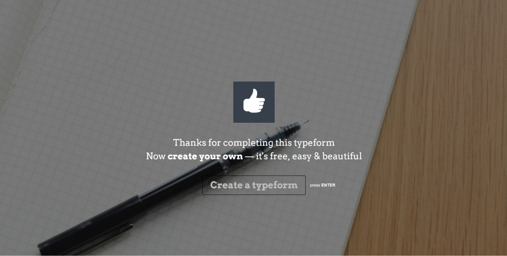
Still, this was just a small button in the footer — at times hardly visible to busy users answering typeforms. We had another idea: what if we leveraged the “thank you screen” at the end of every typeform to reinforce our brand presence?
The Growth Team tested this by making custom thank you screens a paid feature, and adding a default branded “thank you screen” for all new free users.

Again, the results were very good.

Building a proper tracking infrastructure
Next thing on our team’s list was to get serious about our tracking infrastructure since we weren’t using much more than Google Analytics.
This meant expanding Growth’s development team to get things running. As a first project, we set out to properly measure the virality of our product. We quickly found a big surprise: Our K-factor was around 0.5. This means that on average, every two new sign-ups generate an additional sign-up.
There are very few companies that manage to build truly viral products (K > 1). But we were game at giving it a try. After all, our calculations said that the changes we’d made had already improved the K-factor by five times.
But there was a problem.
All the low-hanging fruit was gone. We felt we couldn’t do much more on the typeforms themselves without pissing off our users.
So we decided to focus on the next step in our viral loop. The part where new users come in after seeing a typeform and try to actually build one themselves.
Onboarding: Rolling out the red carpet for new users
There are tons of articles and ebooks on product onboarding. All of them say to remove as much friction as possible, then quickly and clearly explain what your product does. This was particularly important to us, since people are usually intrigued by the format and design of typeforms, look us up after completing one, but don’t really have a need to build one (yet).
Most companies gate their products behind a sign-up page. This makes sense when you know exactly what you’re signing up for. So after talking with a few different companies who had done it, we tried moving our sign-up process later down the funnel.
This meant you could (and still can) build a typeform and use most features without signing up. To inspire new users, we also created a comprehensive typeform template gallery to match a ton of use cases, and added a few “awwww-inspiring” videos.
As we expected, we had a lot more new users creating typeforms, but a lot less actual sign-ups. We didn’t see a big increase in net active users. But overall, we felt great about this change since we were successfully exposing the product to more creators. At the same time, the extra traffic meant that we were now finally ready to start running experiments and get conclusive results in a decent amount of time.
Casino-style A/B testing
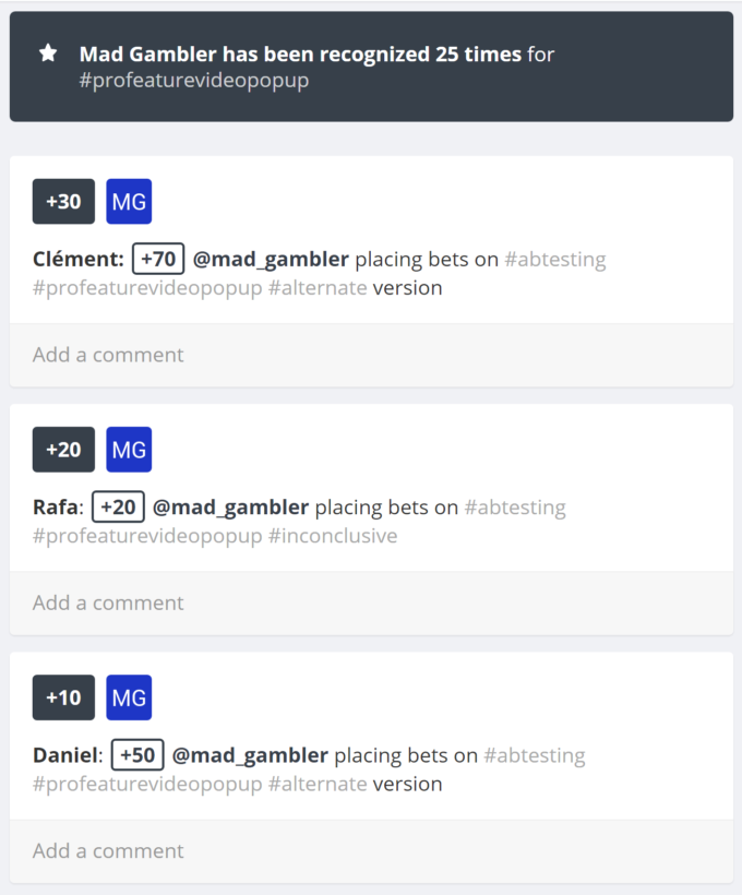
As we introduced an A/B testing infrastructure, running split tests became part of our workflow. However, A/B tests tend to be a dry subject. So we got the entire company involved by letting people bet on results. Bets were placed through a typeform and we used Bonusly to dish out the rewards. We called the initiative “Mad Gambler.”

But soon after the Growth Team launched the project, things went South. We tested small things we thought were low-hanging fruit, but we kept getting inconclusive results.
It’s natural for a growth team to get more “inconclusives” than winners, but we were getting about 80 to 90 percent, which is way too many. And exposing this to the entire company was making things worse. Other issues included hasty prioritization — we were only aiming for big 10x-type changes — a loose learning process, and the lack of an embedded designer.
(Since then, we’ve become a lot better with our A/B testing. Here’s the template we use to document our tests.)
During this period, we were also being siloed away from the rest of the product team. Marketing devs just weren’t cutting it. As the other half of the team was building Typeform version 2, we were still running A/B tests with inconclusive results. Not good. So we decided to kill the project, put onboarding on pause, and regroup.
Pricing, packaging, and scaling the team
The Growth Team started brainstorming about bigger things we could try. And we read. A lot. We learned that several SaaS companies invest heavily in pricing and packaging, but it was something we’d barely poked at.
Pricing is always a sensitive area, and getting buy-in from the executive team was difficult. But after building the case and running a few experiments, we soon saw that it was a massive growth lever we needed to pull. So we made some changes to our pricing.
Then we gradually ramped up the marketing side of things, using content as a way to build up our brand, develop our identity, and “humanize” the web. Because we think that resonating with customers through a cohesive identity is much, much stronger than a good product on its own.
Our Marketing Growth Team now handles organic and paid search, editorial content, and social media alongside our Product Growth Team. The department’s metrics? Generate brand awareness and sign-ups. Together, Growth accounts for new business MRR.
It’s important to remember that a brand is a long-term investment. Regardless of whether a company lives or dies, a brand exists forever. On the other hand, products change all the time — no matter how much you optimize them.
Going forward
Moving into the future, we’ll be working more closely with the rest of the team to make Typeform a more holistic product organization where everyone plays a part in growth. The thing is, when you call a team “growth”, it signals to the company that the topic is hands-off for every other team.
So we’ve put a plan in place to gradually evolve from a functional growth organization to embedding growth — as a methodology and impact-driven culture — across all product teams. Going forward, product teams will be formed around all stages of the user journey. And each team will touch on elements of growth. We look forward to letting you know how it goes!
Get the TNW newsletter
Get the most important tech news in your inbox each week.


