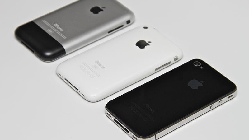
I remember the day like it was yesterday. The day was June 29, 2007, and the first generation iPhone hit Apple stores. People were excited, and couldn’t wait to get the device into their hands. I was one of them. With the iPhone, my expectations were low, because at the time I wasn’t someone who carried around a cell phone like my life depended on it.
Before the iPhone, I was toting around a Sidekick from T-Mobile. It served its purpose by letting me answer emails, text, jump on AIM, and take the occasional call. I never expected much more than that from it.
The iPhone changed my expectations and opinions of what a mobile device should be. Something Apple is really good at is giving you something you didn’t think you needed, and making it so that you feel like you can’t live without it. Most of that magic is the product itself, some of it is the marketing.
After recent months of thinking about what my expectations are for a mobile device, having owned every version of the iPhone and using every version of iOS, I realized that the iPhone isn’t for me anymore. Sadly, the iPhone has become “just another phone”. I am still an avid iPad, Apple TV, and MacBook Air user, though. Of course I’ll keep the iPhone to check out great apps, but it’s not going to be my go-to device anymore.
Hopefully this can shed a little light on why:
Social interactions
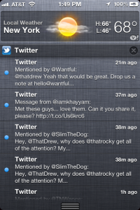 I find that my iPhone makes me antisocial. Most of this has to do with the notification system, as a few of my closest friends have observed. I’ve become numb to push notifications and alerts. The little red number that sits on top of apps bares no meaning to me anymore. It used to be that I’d react quickly to a missed call or text. The new iOS 5 notification system makes notifications a burden. The system which was obviously a spin on the Android platform notification system, doesn’t give me the information I need, when I need it.
Plain and simple, the iPhone makes me ignore it. The flow of information to the iPhone isn’t elegant, interactive, or useful to me. I don’t think I get more calls, texts, or tweets than most, but I miss way more interactions now than ever after the iOS 5 update. Yes, I can tweak settings to go back to the way it used to be, but those notifications didn’t work for me either.
Customization
This is where the iPhone has failed me the most. Both the Android and Windows Phone platforms allow for a certain ammount of customizations, mostly centered around widgets and live tiles. These widgets provide information that you want, and are constantly updated. You can view information without having to tap into an app.
Sadly, I can’t do that with my iPhone. I can only check the weather and stock market without going into each app separately. And just a tip that I’ve learned, the updating Stock app drains your battery big time. Plus, the iPhone only lets you change your background and lock screen, you can’t even change the theme color on the device.
General confusion
I really don’t understand how the iOS location system works on the back-end. It seems like all apps ask for your location, even if they don’t ever use it for a real feature. I find that my location icon is always on, which of course drains the battery. You can go into location services and turn them off, but I’d love to know how that system works and why apps trigger them if they’re running in the background. It’s not an invasion of privacy thing, it’s more of a “I’d like to know what my phone is doing” thing.
App fatigue
 All iPhone and Touch apps are starting to look the same to me. It seems as if the interface that Instagram made popular is getting used and re-used for no particular reason.
Toolbar at the bottom, slightly stylized action button placed directly in the center.
I’m not saying that iOS app development is easy. I worked for an iPhone development shop for almost three years, and I can tell you that it’s a pain to develop for iOS.
Having said that, it doesn’t seem like anyone is pushing the envelope with their designs anymore, and it might be because Apple is so strict on their development guidelines.
Then there was this gem below. When visiting the App Store this week, I was shocked by what I saw:
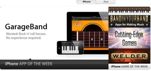
Yep, that’s an Apple app prominently displayed as this week’s “featured app”. I understand that Apple is a software company too, but if the company is saying that Garage Band is the best new app available this week, there’s a problem. As a developer, I’d be pretty irritated to see Apple leverage its own developer platform to keep all of the profits to itself.
It’s really difficult to get noticed on the App Store with new apps coming out every minute it seems. Good old marketing and having a great product will save the day though, and Apple should revamp the store to reward hard-working developers who have marketing talents.
Apple’s development guidelines
Apple’s iOS is like Alcatraz. If you attempt to scale any walls, or even pretty up your prison cell a bit, the company will find something wrong with it and come down on you. A lot of the developers that I’ve been talking to call the general iOS design “boxy” and “confining”, which is in turn causing developers to cut corners when it comes to building something beautiful.
Don’t get me wrong, the App Store has created a new environment for creative and talented people to make and sometimes sell things, bringing ideas to life in a brand new way. The whole system needs an update though. Boundaries need to be pushed, because developers are starting to look at other available platforms. Companies like Microsoft are even incentivizing developers to build on their latest Windows Phone platform.
Options
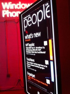 When the iPhone came out in 2007, there weren’t a lot of smartphone options. At least to mainstream audiences. I didn’t even know what a smartphone was until I used an iPhone. To me, a smartphone should interact with me, and not force me to interact with it constantly.
I feel like the design of iOS makes me use the iPhone more. I have to open each app, refresh a timeline, do something with it, then close it out. I’m pretty sure that Apple hoped that the new notification system would change that, but it’s not the case. Apple’s iOS feels stale to me, and that’s probably because is hasn’t gotten a huge visual or interactive overhaul since its initial release.
Now there are options. Google has its Android platform, and Windows Phone is an up-and-comer with Windows 7. At the end of the day though, people will use the device that has the best software. The iPhone is a gorgeous device, but if more developers build beautiful apps on other more open operating systems, the general public will take notice.
I want my phone to be social, and to interact with me more than I interact with it. I don’t want to feel like I’m using a mini computer anymore.
I’m ready to move on, now I just have to pick which non-iPhone to go with. It’s good to have options. Share your thoughts in the comments, how are you feeling about iOS and other platforms these days. It might be time to think outside of the iPhone box.
You can find all the latest Apple news and discussion every day at TNW Apple.
Get the TNW newsletter
Get the most important tech news in your inbox each week.


