This post was written by Jason Li and Herbert Lui. It’s a sample strategic side project teardown. Jason and Herbert will be doing monthly comprehensive teardowns of strategic side projects in this mailing list. Sign up to learn more
In an age when attention is scarcer than ever, side project marketing gets your company eyeballs. Yet because side projects by definition are exploratory and unconstrained, the term isn’t thoroughly defined.
Side projects create new revenue streams for entrepreneurs and help the unemployed get jobs. Side projects in general can produce many benefits and results:
- Tina Roth Eisenberg’s side projects are wildly successful and deliver huge ROI.
- Obama O’s and Cap’n McCain’s provided Airbnb with enough money to survive.
- Through a fun side project, I (Jason) got an opportunity to contract for Mark Cuban, which led to several freelance and full-time job opportunities.
- And through another fun side project, I (Herbert) got coverage forWonder Shuttle by TIME, Entertainment Weekly, and the Telegraph. Some other friends and I got our feet wet with video content withPrologue, a series that aims to educate aspiring artists by interviewing musicians like award-winning producer Ryan Lewis.
- Tiny Hearts (Herbert’s frequent collaborator) diversifies their revenue streams with Busy Building Things, an eCommerce side project that runs in parallel with their app studio.
Yet in each of these examples, you’ll notice something funny.
None of these side projects fit into the company’s core business.
WTF is a Strategic Side Project?
Strategic side projects are side projects that grow your core business.
A strategic side project saved Crew’s business. Whether it was intentional or not, Unsplash.com’s stock photos fit pretty well into their business — they attracted more designers for their marketplace.
We’ve both reaped the benefits of side projects, but realize how powerful it’d be if we were more strategic about it. The concept is pretty new, so we’re both still developing a proper framework to view things through.
Recently, we noticed an interesting pattern with strategic side projects, and the number of large and small companies that were exploring it. We wanted to dive into a few of these strategic side projects and break them down, to see how they fit into companies’ existing strategies and what benefits they brought.
We wanted to start off with Google Primer. Although Google Primer has been called a startup within Google, we think it fits into the definition of a side project. Here’s why:
- It follows Brian Clark’s rule of online marketing (found by Ali Mese): “Give Something Valuable Away in Order to Sell Something Related.”
- It doesn’t seem like a long-term play to build a wide audience and generate leads (like Google Insights).
- It doesn’t directly generate revenue.
- It seems like Google hasn’t poured significant resources into it (e.g., the team is extremely small), which implies the project was exploratory or created from leftover budget.
- It features content from non-Google affiliated experts.
Also, Google is no stranger to side projects. Google employees spend 20 percent of their time on side projects, which resulted in apps like Gmail and Google Maps.
Give Something Valuable Away in Order to Sell Something Related.
Enter Primer, which is one of Google’s most publicly visible experiments…
A Primer on Primer
Here’s how Primer describes itself on the iTunes App Store (at the time of writing):
“Primer is a fast, easy way to learn new digital marketing skills. We give you bite-sized lessons to do whenever you have 5 minutes free.”
Before it was known as Primer, it was called Learn10x. (Which fits well into Larry Page’s 10x philosophy.)
Let’s dive into our analysis on why Primer exists, the benefits it brings to Google, and how they built momentum and acquired users.
1. So why does Google Primer exist?
Clearly, Primer’s main goal is to help digital marketers. It does this by expanding their repertoire of knowledge and potential skills. Primer also serves as a fun distraction, helping them kill time when they’re waiting for something and they can learn something new (or at least feel like it).
The audience fits well, since Google sells a lot of products to digital marketers.

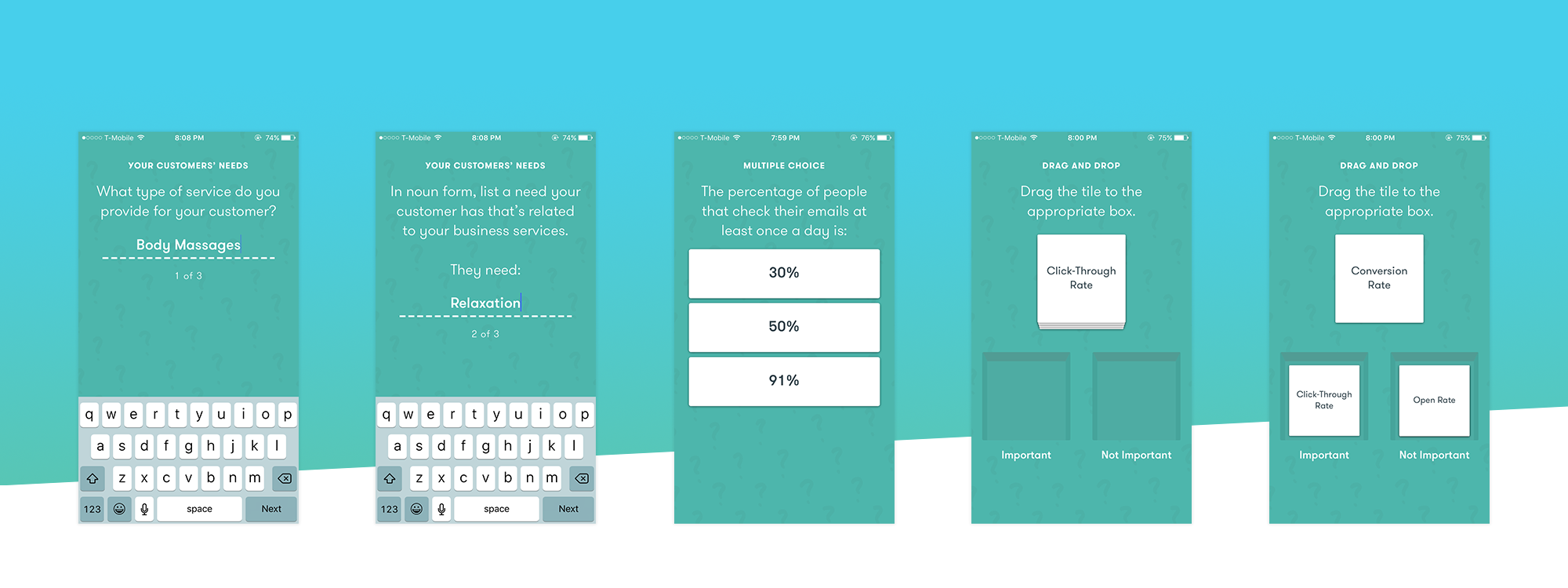
Through Primer, Google has the opportunity to collect email addresses and business data (from interactive quizzes, and through usage of the Primer app). They can potentially use this information to generate more leads and sell more products, improve their own advertising services, and engage more marketers.
The integrity of the data would depend on users’ answers. For example, in a quiz, you can choose to type in your real company name, or a hypothetical one (e.g., “Herbert’s Lemonade Stand”). I (Herbert) felt like I had more control over the data I was sharing (plus my professional data isn’t sensitive), which made me less protective and feel almost more relaxed about sharing it.
Primer also supports aspiring digital marketers by teaching them the fundamentals of digital marketing in really engaging ways. This targets a much wider range of people, which can range from students to designers, developers, or anyone else looking to pick up digital marketing skills on the side.
Again, this makes sense because Google makes a lot of money from digital marketers. With Primer, they can position themselves as the guru or initiator of an aspiring digital marketer.
Not only does Google collect all the data from this audience as well, they can also increase the usage of their services — not just from digital marketer specialists, but also from people who figure out digital marketing skills in addition to their full-time jobs.
2. What benefits does this bring to the company?
Creativity and innovation function best in an atmosphere of fun and foment. Creativity hardly functions at all in an atmosphere of politics and fear. — David Ogilvy (The Unpublished Ogilvy, p. 115)
So it definitely has the potential to increase their sales pipeline. Primer could also serve as a feedback source for Google to improve their service offering.
But side projects go deeper than that. Side projects breathe fresh air into the company. They’re not wrapped up and driven by direct bottom line implications. That’s why even though they’re a strategic fit, they’re still a breeding ground for innovation and creativity.
How does Google experiment with Primer?
From a product perspective, Primer appears to be a great sandbox to experiment with a new design language and interaction flows.
They definitely change their branding guidelines with it. Whereas a lot of Google’s products have pretty straightforward names (e.g., Gmail, Google Calendar, Google Drive, etc.), Primer doesn’t have the Google branding in front of it. In fact, there is no Google branding anywhere in the Primer app.

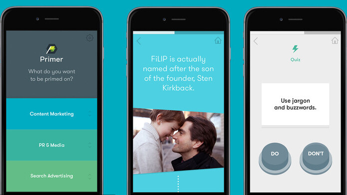
The Primer team also designed it very differently from Google’s standard apps. They noticeably atomize content into bite-sized, swipeable, cards. This is interesting when you consider how people now commonly consume and parse information (think Twitter and Tinder).
The branding and aesthetic of the Primer app also looks very different from the rest of Google’s products. While key features of Material Design are still evident throughout the app, Primer pushes the envelope with stronger use of colors and UI transitions. The layout of the app also stands out in contrast to the rest of Google’s apps. The app doesn’t even use Google’s traditional Roboto font that is usually seen across their brand.
Overall, Primer feels more fun and delightful, whereas the rest of Google’s suite of apps feel more serious and professional.
A beta version of Primer also soft launched on iOS first, prior to launching on Google Play. The official version of Primer launched on both platforms simultaneously just a month ago. Could that have been some sort of market experiment for the company?
High level strategy experimentation
Primer figures out a fundamentally new way for Google to deliver content on mobile.
Although this sounds redundant, it’s actually an important priority for Google. Consumer behavior on mobile is extremely different from that on desktop. People are spending a lot more time on mobile devices. Search usage seems to be decreasing, in large part because people don’t need to search on mobile — they spend a lot more time in apps.
So not only is Primer a fun experiment in gathering data from marketers, it also serves as an exercise in how Google can deliver content in new compelling ways on an extremely competitive medium that they haven’t quite fully captured yet.
Primer might also be a playground for Google to keep its product employees engaged with new, unconventional challenges. This is highly speculative, but I (Jason) will try to explain from a designer’s perspective.
Being at a large corporation like Google means there is an unlimited stream of design challenges to solve, which is great. However, the building blocks (UI patterns and components) to solve these challenges mostly don’t change.

Just look at the Gmail, Hangouts, and Google Maps apps — they all look relatively similar. While this makes complete sense from a branding and user experience standpoint, my intuition tells me that some designers get bored of playing with the same LEGO pieces.
Primer, being a non-traditional Google app, gives its designers a chance to freely experiment with a whole new set of building blocks. This keeps Google’s product designers engaged and happy.
3. Amplification: How do they connect with new audiences and acquire users for their side project?
As you’ve probably noticed already, Primer has an advantage in its distribution as it gets to leverage Google’s reputation and resources.
Through their association with Google (and perhaps some of Google’s press connections), they’re newsworthy. That means they can relatively easily secure coverage in mainstream publications whenever they have new product announcements and updates.
Similarly, they can also leverage Google’s reputation to connect with marketing thought leaders. They then take the content from these thought leaders, break the lessons down into smaller chunks, and host it on their app. These thought leaders subsequently share the Primer app through their social media, since their lessons are hosted there.
Lastly, Primer is also ripe for the startup community. For example, they built momentum on Product Hunt (where the same marketing thought leaders would advocate for the app in the comments section), and wrote up an extremely popular post on Medium.com.

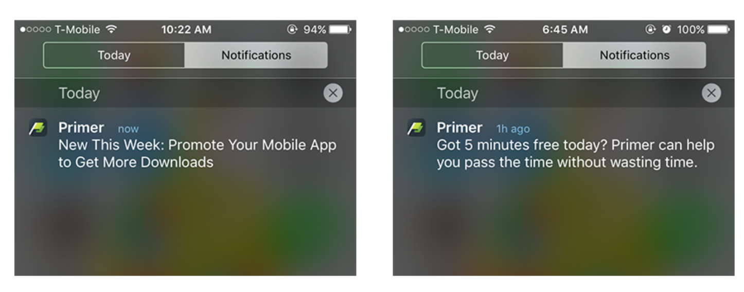
Primer re-engages users every couple of sessions, by sending an email with the subject line, “You’re on a Primer streak.” The email then has a call-to-action for the user to share Primer on their social networks. They also send cleverly worded push notifications that poke our guilt for wasting time.
A Mix of Strategy and Creativity
Jerome Bruner, the Harvard psychologist, says that there has never been a great scientific laboratory where the people weren’t having fun. The physicists who split the atom in Neils Bohr’s lab were always playing practical jokes on each other. — David Ogilvy (The Unpublished Ogilvy, p. 160)
In an era of unrelenting hockey stick demands and daily iterations of growth hacks, side projects bring in the fun element of innovation and creativity. Strategic side projects blend the best of both worlds — harnessing the element of creativity to grow the company’s core business.
Use your side projects well.
Get the TNW newsletter
Get the most important tech news in your inbox each week.


